Analysis of medical medical reports
In this demo, medical data will be analyzed using analytics tools.
During the analysis of the dataset, several metrics were calculated for the consistency and accuracy of doctors' work.
Libraries must be installed
You must manually specify the paths where the project is located in order to go to the working directory, as well as install the necessary dependencies.
!cd /user/Demo_public/biomedical/analis_medical_result
!pip install -r /user/Demo_public/biomedical/analis_medical_result/requirements.txt
import pandas as pd
import seaborn as sns
import matplotlib.pyplot as plt
from sklearn.metrics import cohen_kappa_score
from statsmodels.stats.inter_rater import fleiss_kappa
import numpy as np
from sklearn.metrics import accuracy_score, recall_score, confusion_matrix, balanced_accuracy_score, mean_squared_error
from sklearn.metrics import precision_recall_curve, average_precision_score, f1_score, fbeta_score, roc_auc_score,ConfusionMatrixDisplay, roc_curve, auc
from sklearn.preprocessing import MinMaxScaler
from scipy.stats import sem, t
Let's read the data and see what is contained in the first 5 lines of the dataframe.
focus = pd.read_csv('/user/Demo_public/biomedical/analis_medical_result/Date.csv')
focus.head()
focus = focus.drop('File ID', axis=1)
The files contain the markup of the images. Each of the 15 doctors made a conclusion based on 476 photographs in the absence or presence of pathology.
You can estimate the number of doctors who are confident in pathology for each picture and pre-evaluate where there really is pathology and where there is not. You can also look for strong discrepancies in the doctors' results. It is possible to determine how much doctors agree with each other in the definition of pathology.
We will evaluate the quality of each pathology doctor's markup.
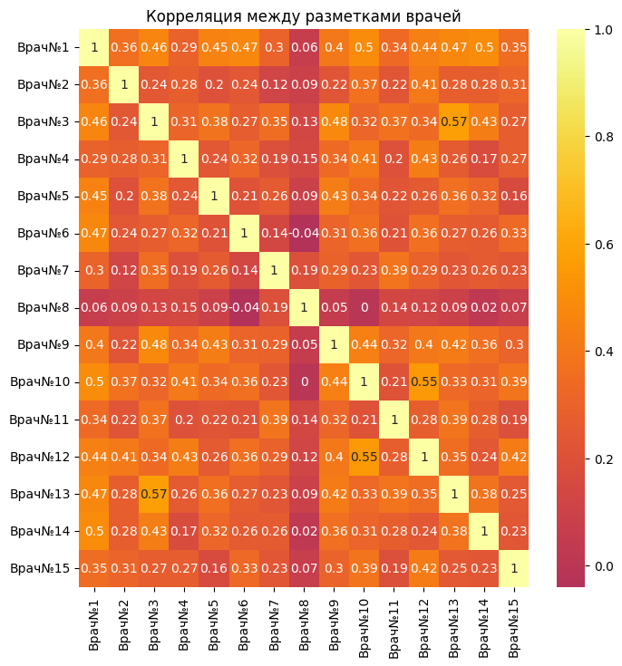
focus_corr = focus.corr(method='spearman')
filtered = focus_corr.where(focus_corr > 0.5).abs()
As can be seen from the correlation table, there are not many pairs of doctors whose decisions about gynecology coincide by at least 50 percent. There is a weak correlation.
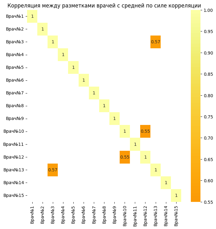
However, there are two pairs of doctors (3 and 13)(12 and 10) which have an average correlation strength. This makes it clear that these two pairs tend to make the same markings for most of the pictures. This may indicate a high level of consistency between them regarding whether there is pathology in the image or not.
focus_corr_ = focus.corr(method='spearman')
filtered_ = focus_corr_.where(focus_corr < 0.1)
There are also pairs of doctors who give completely opposite answers to each other, which means that their opinions are almost 100 percent different.
focus_corr_mean = focus_corr.mean(axis=1).sort_values(ascending=False)
focus_corr_mean
The table above shows the average correlation of each doctor with other doctors, this information makes it clear how much each doctor's opinion agrees with others.
plt.figure(figsize=(8,8))
sns.heatmap(focus_corr.round(2), annot=True, center=0, cmap='inferno')
plt.title('Correlation between doctors' markings')
plt.figure(figsize=(8,8))
sns.heatmap(filtered.round(2), annot=True, center=0, cmap='inferno')
plt.title('Correlation between doctors' markings with average correlation strength')
Let's see how many doctors are confident with pathology in percentage terms for each picture.
confidence = focus.sum(axis=1).sort_values(ascending=False) / focus.shape[1] * 100
confidence.head(20)
Thus, in the table above, you can observe the percentage probability of pathology in the picture of the corresponding ID, taking into account the decision of the doctors.
average_marking = focus.mean(axis=1)
average_doctor_deviation = focus.sub(average_marking, axis=0).abs().mean().sort_values(ascending=False)
average_doctor_deviation
Doctor No. 15 has the highest average deviation (0.2457), which means that his markings differ significantly from the average markings for all doctors. This may indicate possible errors in the markup.
Doctor No. 3 has the lowest average deviation (0.1069), which indicates a high consistency of his markings with the average markings for all doctors. This doctor most often marked up the pictures in the same way as most other doctors.
Thus, the average deviation from the average marking for all doctors was obtained here.
Next, we calculate the covariance matrix for the doctors' assessments
covariance_matrix = focus.cov()
covariance_matrix
covariance_matrix_mean = covariance_matrix.mean(axis=1).sort_values(ascending=False)
covariance_matrix_mean
Doctor No. 15 has the highest average covariance (0.0525). This suggests that the markup of Doctor No. 15 is, on average, more consistent with the markup of other doctors. This doctor most often notes the presence or absence of pathology in the same way as other doctors.
Doctor No. 8 has the lowest average covariance (0.0101). This indicates that the markup of Doctor No. 8 is, on average, less consistent with the markup of other doctors. This doctor most often evaluates the presence or absence of pathology differently than other doctors.
It can be seen that Doctor No. 15 has the highest average covariance and the highest average deviation. This may be due to the fact that the opinion of the doctor about the pathology in the picture agrees with the majority opinion, however, he may notice hidden features more often than others and overestimate them a little.
doctor_13 = focus['Doctor No. 13']
doctor_3 = focus['Doctor No. 3']
doctor_12 = focus['Doctor No. 12']
doctor_10 = focus['Doctor No. 10']
cohen_kappa_score(doctor_13, doctor_3), cohen_kappa_score(doctor_12, doctor_10)
This confirms the correlation table of the most highly consistent pairs according to the estimates of the images.
counts = np.zeros((focus.shape[0], 2), dtype=int)
for idx, row in focus.iterrows():
  counts[idx, 0] = (row == 0).sum()
  counts[idx, 1] = (row == 1).sum()
fleiss_kappa(counts)
This test shows consistency in the annotations of all doctors. As can be seen from the result, consistency is low, doctors have disagreements about the presence of pathology.
kappa_scores = pd.DataFrame(focus.columns, focus.columns)
for col in focus.columns:
  for col_ in focus.columns:
    kappa_scores.loc[col, col_] = cohen_kappa_score(focus[col], focus[col_])
kappa_scores = kappa_scores.drop([0], axis=1)
Thanks to this sign, you can find out which doctors agree with each other more.
kappa_scores_mean = kappa_scores.mean(1).sort_values(ascending=False)
kappa_scores_mean
It can be seen from this plate that doctor number 15 has one of the lowest average network consistency among doctors.
The Kappa Cohen coefficient, unlike the correlation table, regulates random coincidences
This may be due to the fact that the doctor often agrees with other doctors, but he makes more positive or negative diagnoses.
Let's calculate the standard deviation of the doctor's results from the average for doctors
standard_deviation_mean=focus.sub(focus.mean(axis=1), axis=0).pow(2).mean().sort_values(ascending=False)
standard_deviation_mean
In this case, the MSE from the average of doctors helps to understand which doctors have the highest deviation, who most often gives estimates that are inconsistent with other doctors for a particular snapshot.
std_mean=focus.std().sort_values(ascending=False)
std_mean
The COEX system helps to see the doctors who have the highest variation.
Next, we will get a "Reference score" for each picture, which will be calculated based on the sum of votes, that is, if most of the doctors are in favor of having a pathology, then we set 1, otherwise - 0.
diagnosis_major = pd.Series([0 if x > y else 1 for x, y in zip(counts[:, 0], counts[:, 1])])
accuracy_df = focus.apply(lambda x: accuracy_score(diagnosis_major, x)).sort_values(ascending=False)
accuracy_df
In the table above, the accuracy of the assessments of doctors' images was obtained in comparisons with reference estimates that were obtained on the basis of the majority concept, that is, the more confirmations of doctors' diagnoses a particular image has, the higher the probability that it is indeed a pathology.
recall_df = focus.apply(lambda x: recall_score(diagnosis_major, x)).sort_values(ascending=False)
recall_df
Recall can be used to assess how often the doctor correctly identifies the presence of pathologies in the images.
columns = focus.columns
confusion_matrices = {}
for column in columns:
  confusion_matrix_ = confusion_matrix(diagnosis_major, focus[column])
  confusion_matrices[column] = confusion_matrix_.sum() - np.diag(confusion_matrix_).sum()
errors_df = pd.DataFrame(list(confusion_matrices.items()), columns=['Doctor', 'Number of errors']).sort_values(ascending=False, by='Number of errors')
errors_df
By counting FP + FN, we can see which of the doctors has the most errors.
counts[:, 0].sum(), counts[:, 1].sum()
(6316, 839) - the total number of doctors' diagnoses. 6316 - the number of votes of doctors for the absence of pathology, 839 - the presence. As you can see, there is a slight class imbalance, let's try to apply accuracy_balanced from sklearn.
balanced_df = focus.apply(lambda x: balanced_accuracy_score(diagnosis_major, x)).sort_values(ascending=False)
balanced_df
Let's build graphs that visually display information about which doctor coped best with the diagnosis. In total, 10 metrics were calculated, and we will build 10 graphs.
colors = ['blue', 'green', 'red', 'purple', 'orange', 'yellow', 'brown', 'pink', 'gray', 'cyan', 'magenta', 'lime', 'teal', 'navy']

fig, axes = plt.subplots(nrows=5, ncols=2,figsize=(13, 24))
axes = axes.flatten()
axes[0].bar(focus_corr_mean.index.tolist(), focus_corr_mean.values.tolist(), color=colors[0])
axes[0].set_title('Average correlation by doctors')
axes[0].set_xlabel('Doctor')
axes[0].set_ylabel('Average correlation')
axes[0].tick_params(axis='x', rotation=45)
axes[1].bar(average_doctor_deviation.index.tolist(), average_doctor_deviation.values.tolist(), color=colors[1])
axes[1].set_title('Average deviation by doctors')
axes[1].set_xlabel('Doctor')
axes[1].set_ylabel('Average deviation')
axes[1].tick_params(axis='x', rotation=45)
axes[2].bar(covariance_matrix_mean.index.tolist(), covariance_matrix_mean.values.tolist(), color=colors[2])
axes[2].set_title('Average covariance by doctors')
axes[2].set_xlabel('Doctor')
axes[2].set_ylabel('Average covariance')
axes[2].tick_params(axis='x', rotation=45)
axes[3].bar(kappa_scores_mean.index.tolist(), kappa_scores_mean.values.tolist(), color=colors[3])
axes[3].set_title('Average Capo-Cohen score by doctors')
axes[3].set_xlabel('Doctor')
axes[3].set_ylabel('Average Capo-Cohen score')
axes[3].tick_params(axis='x', rotation=45)
axes[4].bar(standard_deviation_mean.index.tolist(), standard_deviation_mean.values.tolist(), color=colors[4])
axes[4].set_title('Standard deviation according to doctors')
axes[4].set_xlabel('Doctor')
axes[4].set_ylabel('Standard deviation')
axes[4].tick_params(axis='x', rotation=45)
axes[5].bar(std_mean.index.tolist(), std_mean.values.tolist(), color=colors[5])
axes[5].set_title('Average COE by doctors')
axes[5].set_xlabel('Doctor')
axes[5].set_ylabel('Average COE')
axes[5].tick_params(axis='x', rotation=45)
axes[6].bar(accuracy_df.index.tolist(), accuracy_df.values.tolist(), color=colors[6])
axes[6].set_title('Majority accuracy by doctors')
axes[6].set_xlabel('Doctor')
axes[6].set_ylabel('Majority accuracy')
axes[6].tick_params(axis='x', rotation=45)
axes[7].bar(recall_df.index.tolist(), recall_df.values.tolist(), color=colors[7])
axes[7].set_title('Majority completeness by doctors')
axes[7].set_xlabel('Doctor')
axes[7].set_ylabel('Majority completeness')
axes[7].tick_params(axis='x', rotation=45)
axes[8].bar(errors_df['Doctor'], errors_df['Number of errors'], color=colors[8])
axes[8].set_title('Errors by doctors')
axes[8].set_xlabel('Doctor')
axes[8].set_ylabel('errors in completeness')
axes[8].tick_params(axis='x', rotation=45)
axes[9].bar(balanced_df.index.tolist(), balanced_df.values.tolist(), color=colors[9])
axes[9].set_title('Majority balanced accuracy by doctors')
axes[9].set_xlabel('Doctor')
axes[9].set_ylabel('Majority balanced accuracy')
axes[9].tick_params(axis='x', rotation=45)
plt.subplots_adjust(hspace=0.6)
plt.tight_layout()
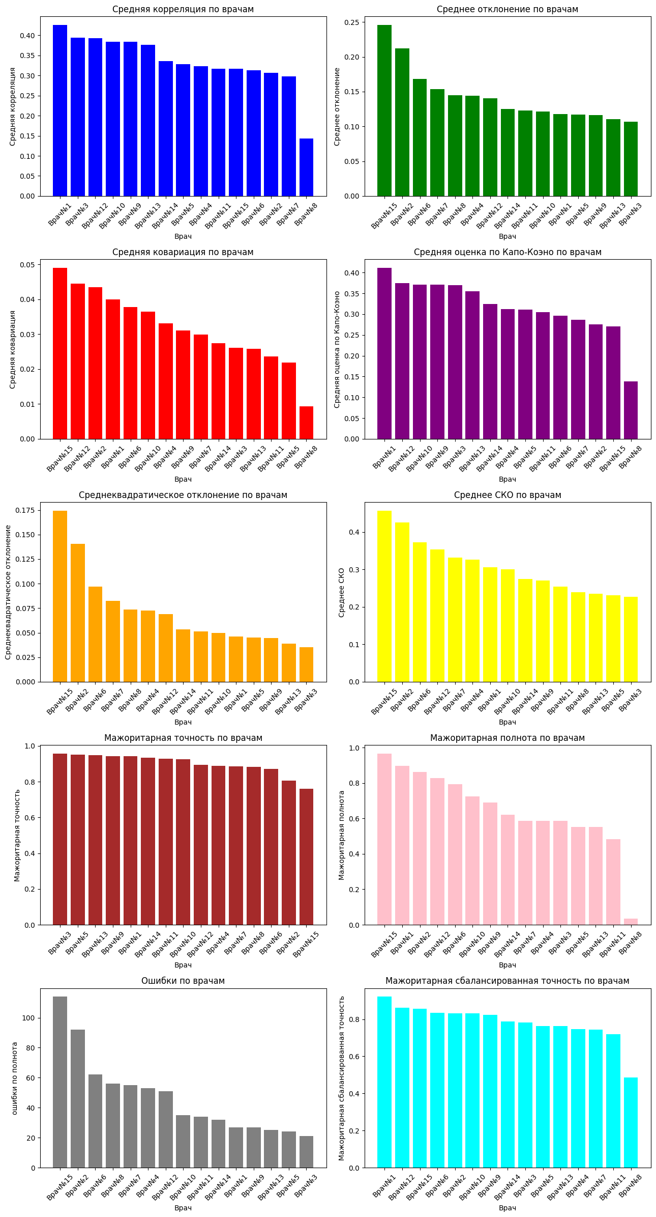
Let's analyze the graphs: doctors who have a high average correlation among doctors most often have the same opinion about the image as other doctors. High covariance is responsible for variability, that is, the higher this parameter, the more the results of a particular doctor differ from the opinion of all doctors on the image. The Copa-Cohen score helps to identify a doctor's alignment with other doctors' decisions. This score, unlike the average correlation, takes into account the randomness of medical decisions.
The average deviation, the standard deviation, helps to see how much the opinion of a particular doctor deviates from the average opinion of doctors, but the COE makes it clear numerically the variation in the average estimates of doctors, that is, roughly speaking, how far the opinion of a doctor is from the average.
The majority rating of each image was calculated, that is, pathology was evaluated based on the opinion of the majority. We will consider this a benchmark. Accuracy shows how well a doctor can correctly make a diagnosis (absence and presence of pathology), but completeness shows how well a doctor finds pathology in cases where it really exists. The balanced accuracy was calculated under the conditions that there are several times more cases predicted by doctors when there is no pathology than when there is, that is, a slight imbalance.
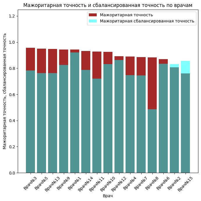
fig, axes = plt.subplots(figsize=(7, 7))
axes.bar(accuracy_df.index.tolist(), accuracy_df.values.tolist(), color=colors[6], alpha=1, label='Majority accuracy')
axes.set_title('Majority accuracy and balanced accuracy by doctors')
axes.set_xlabel('Doctor')
axes.set_ylabel('Majority accuracy, balanced accuracy')
axes.tick_params(axis='x', rotation=45)
axes.bar(balanced_df.index.tolist(), balanced_df.values.tolist(), color=colors[9], alpha=0.5, label='Majority balanced accuracy')
axes.legend()
axes.set_ylim(0, 1.25)
plt.tight_layout()
plt.figure(figsize=(8, 6))
sns.boxplot(data=confidence, orient='v', color='lightblue')
plt.ylabel('The probability of pathology (%)')
plt.title('Probability distribution of pathology')
plt.tight_layout()
plt.show()
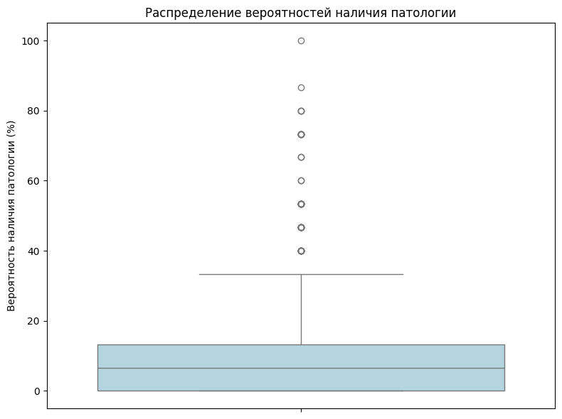
As you can see from the graph above, most of the images do not have a 100percent guarantee that there is pathology there. In just one picture, all the doctors said there was a pathology.
Let's try to create a single metric that combines all of the above
Let's select the worst doctors for each of the pathologies.
metrics_df = pd.concat([focus_corr_mean, average_doctor_deviation, covariance_matrix_mean, kappa_scores_mean, standard_deviation_mean, std_mean, accuracy_df, recall_df, balanced_df, errors_df.set_index('Doctor')['Number of errors']], axis=1)
metrics_df.columns=['focus_corr_mean', 'average_doctor_deviation', 'covariance_matrix_mean', 'kappa_scores_mean', 'standard_deviation_mean', 'std_mean', 'accuracy_df', 'recall_df', 'balanced_df', 'errors_df']
metrics_df
Let's summarize the metrics
scaler = MinMaxScaler()
normalized_df = pd.DataFrame(scaler.fit_transform(metrics_df), index=metrics_df.index, columns=metrics_df.columns)
normalized_df
Let's set a weighting factor for each of the metrics
weights = {
    'kappa_scores_mean': 0.3,
    'covariance_matrix_mean': -0.2,
    'average_doctor_deviation': -0.25,
    'focus_corr_mean': 0.25,
    'balanced_accuracy': 0.25,
    'recall': 0.25,
    'accuracy': 0.25,
    'std_mean': -0.15,
    'standard_deviation_mean': -0.10,
    'errors_df': -0.2
}
Let's calculate the combined metric as multiplying the weighting coefficients by the normalized metrics, summing them up
normalized_df['final_score'] = (normalized_df * pd.Series(weights)).sum(axis=1)
normalized_df['final_score'].sort_values(ascending=False)
Thus, based on existing metrics, we wrote our own metric, calculated it, and received a "rating" of doctors.
plt.figure(figsize=(10, 6))
sns.barplot(x=normalized_df['final_score'].sort_values(ascending=False).values, y=normalized_df['final_score'].sort_values(ascending=False).index, palette='coolwarm')
plt.title('Rating of doctors')
plt.xlabel('Rating')
plt.ylabel('Doctor')
plt.show()
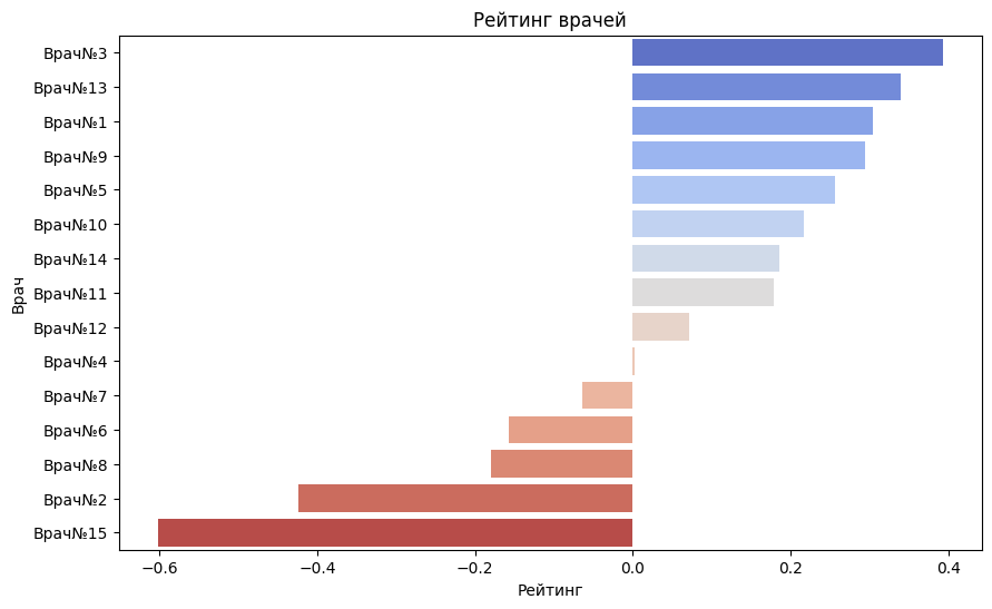
As you can see from the graph above, the worst doctors are - 15, 2, 8, 6, 7
Let's form the final markup and calculate the doctors' confidence.
You can take into account the overall rating of doctors, that is, if 14 out of 15 doctors put 1, then there is pathology, etc. However, the rating of doctors can be taken into account.
Let's calculate the final diagnoses
votes = focus.sum(axis=1)
f = focus * normalized_df['final_score']
final_votes = (f.sum(1) > 0.4).astype(int)
confidence__ = focus.sum(axis=1)
weights_ = {
    'doctor' : 0.4,
    'confidence': 0.6
}

Diagnosis_weights = ((confidence__ / focus.shape[1]) * weights_['confidence'] + (f.sum(1) > 0.4).astype(int) * weights_['doctor'])
Diagnosis = (Diagnosis_weights >= 0.36).astype(int)
Diagnosis.sum()
Let's calculate the doctors' confidence
normalized_diagnosis_weights = (Diagnosis_weights - np.min(Diagnosis_weights)) / (np.max(Diagnosis_weights) - np.min(Diagnosis_weights))
confidence = normalized_diagnosis_weights * 100
confidence.sort_values(ascending=False)
Let's calculate the confidence interval
mean = np.mean(Diagnosis_weights)
std_err = sem(Diagnosis_weights)

confidence_level = 0.95
n = len(Diagnosis_weights)
h = std_err * t.ppf((1 + confidence_level) / 2, n - 1)

lower_bound = mean - h
upper_bound = mean + h

# Confidence interval output
print(f"Confidence interval: [{lower_bound}, {upper_bound}]")
Let's analyze the received data.
The pd.Series Diagnosis contains summary labels about the exact diagnosis of a particular image. The diagnosis was calculated based on the rating of the doctors, and the probability of a pathology was also taken into account. This probability for a particular image was calculated as the average of the doctors' marks on the image.
The final probability of whether there is a pathology in the image, based on the above data, was calculated as a weighted sum of the above components
The rating of doctors was calculated with a weight of 0.4, the probability weight based on the average was 0.6. These weights were chosen due to the fact that if 14 out of 15 doctors confirm that there is no pathology, and 1 doctor with the highest rating, for example, 0.4, says that there is a pathology, then the weighted sum will be high and there will be a false positive the result. normalized_diagnosis_weights - weighted sum.
normalized_diagnosis_weights - the certainty of whether there is pathology in the image. She was paying off. Based on this confidence, the final label for the image was selected.
I took the threshold of 0.4, that is, if the weight of the diagnosis is more than 0.4, then there is pathology. The result: 25 images with pathology were revealed.
The confidence interval for the certainty of diagnoses is also calculated, with a 95% probability that the majority of probabilities are in [0.07206422989620075, 0.1021915353029607], that is, the final diagnosis for most of the images is 0
df = pd.concat([Diagnosis, confidence], axis=1)
df.columns = ['Diagnosis', 'Probability, %']
df['Probability, %'] = df.apply(lambda row: 100 - row['Probability, %'] if row['Diagnosis'] == 0 else row['Probability, %'], axis=1)
df
The dataframe above contains the final diagnosis and the percentage probability that the diagnosis is indeed correct. For each picture, the diagnosis and the probability that the diagnosis is correct are recorded.
Let's evaluate the final quality of the markup for each of the pathologies.
mean_probability = np.mean(Diagnosis_weights)
print(f"Average probability: {mean_probability}")

# Standard deviation of probabilities
std_deviation = np.std(Diagnosis_weights)
print(f"Standard deviation of probabilities: {std_deviation}")

# Maximum and minimum probability
max_probability = np.max(Diagnosis_weights)
min_probability = np.min(Diagnosis_weights)
print(f"Maximum probability: {max_probability}")
print(f"Minimum probability: {min_probability}")
As you can see, most of the diagnoses are negative, that is, there is no pathology.
accuracy_d = accuracy_score(diagnosis_major, Diagnosis)
recall_d = recall_score(diagnosis_major, Diagnosis)
balanced_accuracy_d = balanced_accuracy_score(diagnosis_major, Diagnosis)
F1_d = f1_score(diagnosis_major, Diagnosis)
fbeta_d = fbeta_score(diagnosis_major, Diagnosis, beta=0.5)
roc_auc_d = roc_auc_score(diagnosis_major, Diagnosis)
print(f"Accuracy: {accuracy_d}")
print(f"Completeness: {recall_d}")
print(f"Balanced Accuracy: {balanced_accuracy_d}")
print(f"F1: {F1_d}")
print(f"Fbeta: {fbeta_d}")
print(f"roc-auc: {roc_auc_d}")
The high accuracy (96.2%) indicates that most of the predictions are correct.
Completeness (62.1%) indicates that some positive cases are missing.
Balanced accuracy (80.3%) and ROC-AUC (80.3%) - good class discrimination ability.
The F1-score (66.7%) and Fbeta-score (69.8%) indicate a balanced quality of final diagnoses.
confusion_matrix_ = confusion_matrix(diagnosis_major, Diagnosis)
disp = ConfusionMatrixDisplay(confusion_matrix_)
disp.plot(cmap=plt.cm.Blues)
plt.title('Confusion Matrix')
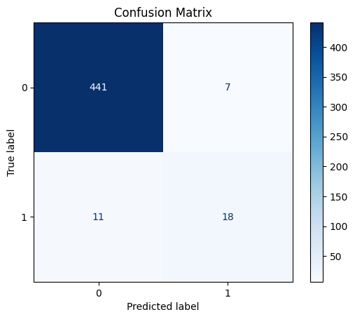
The error matrix makes it clear that there are not many misdiagnoses.
precision, recall, _ = precision_recall_curve(diagnosis_major, Diagnosis)
average_precision = average_precision_score(diagnosis_major, Diagnosis)

plt.figure()
plt.step(recall, precision, where='post', color='b', alpha=0.2, linestyle='-', linewidth=2, label='Precision-Recall curve')
plt.fill_between(recall, precision, step='post', alpha=0.2, color='b')
plt.xlabel('Recall')
plt.ylabel('Precision')
plt.title('Precision-Recall curve: AP={0:0.2f}'.format(average_precision))
plt.legend(loc="lower left")
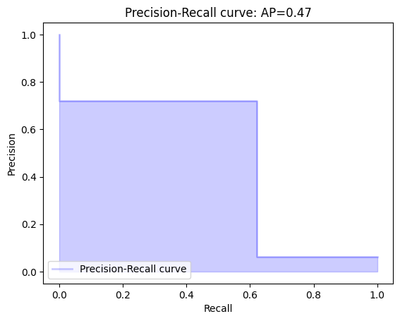
As can be seen from the graph above, accuracy prevails quite a bit over completeness, however, as can be seen from the graph, precision is slightly lower than accuracy, which indicates inaccurate positive diagnoses.
As can be seen from the markup quality assessment above, the markup is quite well executed, there are small gaps. However, it is worth taking into account the fact that the "Reference marks", so to speak, targets, calculated as an average score by doctors, may not accurately reflect reality. This is because some doctors have a low rating, and even the average may be inaccurate. However, it is worth considering the fact that doctors, although low, have consistency, which may indicate the correctness of the consistency of the final markup.
Conclusions
In this example, the analysis of doctors' conclusions was carried out using data analytics methods.