创建插页图
|
该页面正在翻译中。 |
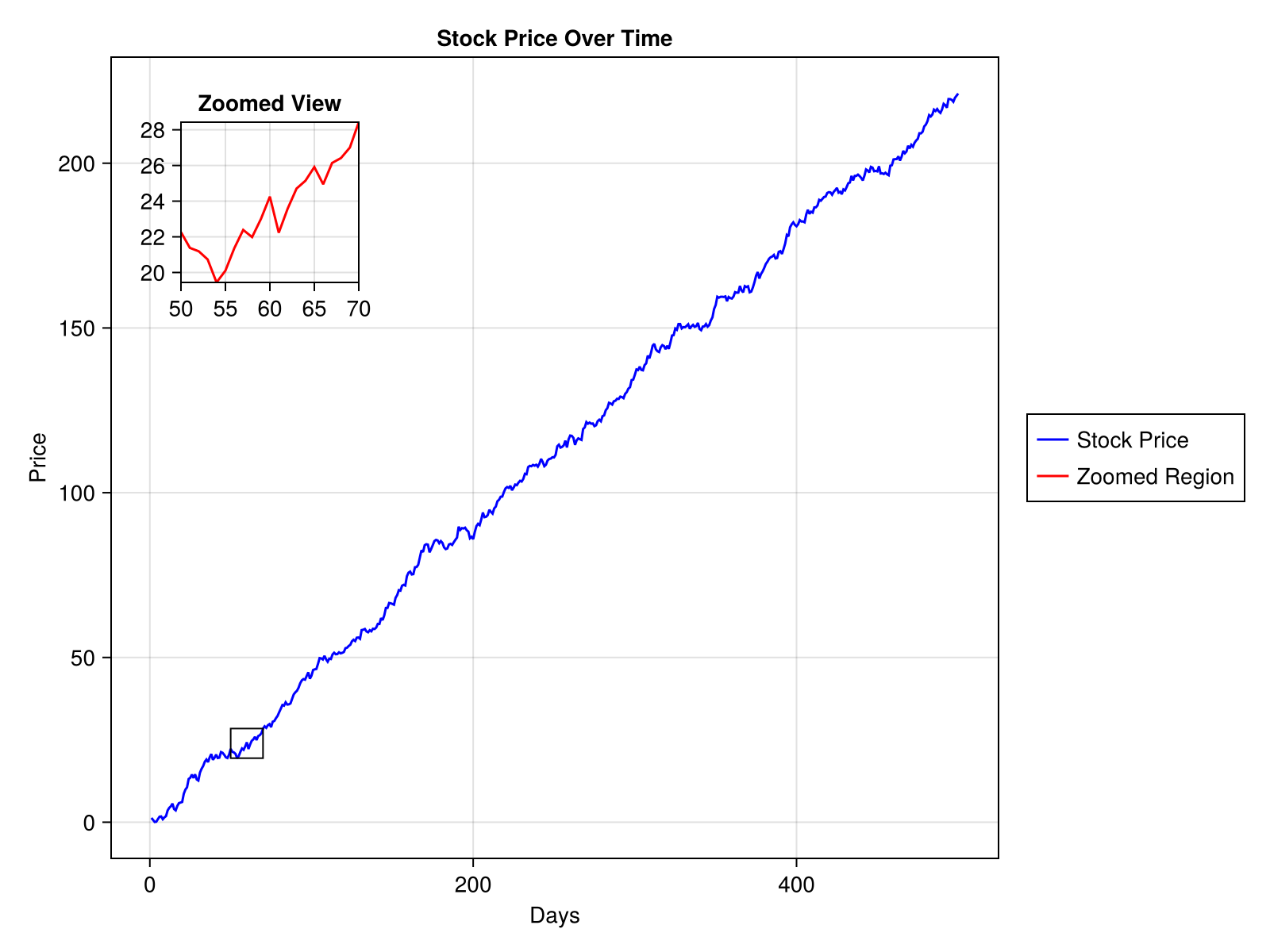
插入图 (或 插入轴*)是嵌入在较大图中的小图。 它通常用于放大感兴趣的特定区域,显示数据子集的详细视图或在主图旁边提供其他上下文信息。 插页图是增强数据可视化的宝贵工具,使其广泛用于研究、商业和演示。 在本教程中,我们将讨论如何在Makie中创建插入图。
例如,在显示股票价格随时间变化的图中,插图可用于显示特定时间段的放大视图,以更清楚地突出价格波动。
让我们来看看如何创建这个情节。
1. 加载软件包
首先加载CairoMakie后端包和随机包。
using CairoMakie
using Random
2. 准备主图数据
然后我们将生成主图所需的数据(500天内的股价数据)。
Random.seed!(123)
time = 1:500
stock_price = cumsum(randn(500) .+ 0.5)
500-element Vector{Float64}:
1.3082879284649667
0.6862154203507933
0.08157931802149743
0.16458668285656408
0.9521746634804198
1.6819933615322875
1.7602246971325948
0.9046340760313978
1.4740932171232914
1.856770412592478
⋮
217.60712784289905
216.83141499099918
219.47251374914612
219.4544230097809
219.23434002120027
218.64612150726398
219.84987983305626
220.4932057262938
221.1415810929699
3. 创建主图
fig = Figure(size = (800, 600))

ax_main = Axis(fig[1, 1],
    title="Stock Price Over Time",
    xlabel="Days",
    ylabel="Price")

line_main = lines!(ax_main, time, stock_price, color=:blue)
fig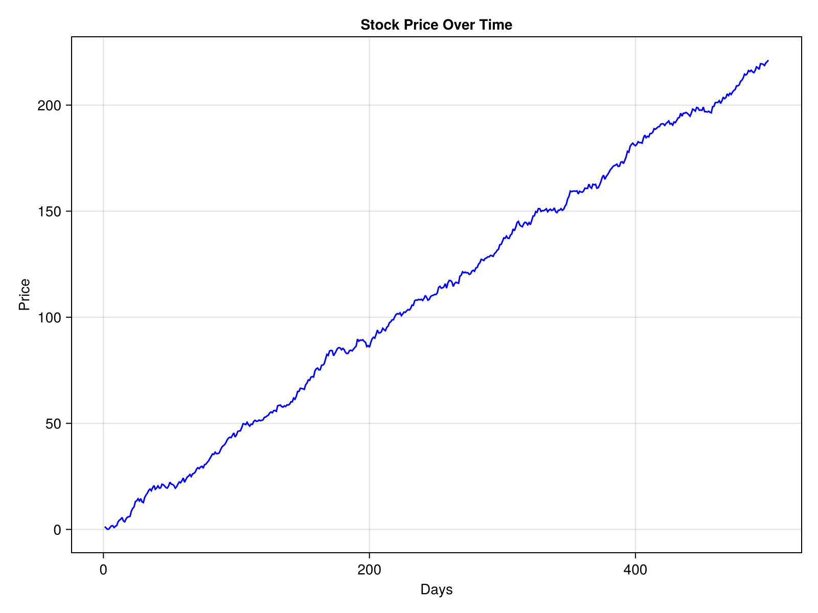
4. 添加插入轴
现在让我们在主图中添加一个插入轴。 我们将使用相同的 轴心() 功能,但调整其大小和位置以将其嵌入主图中。
ax_inset = Axis(fig[1, 1],
    width=Relative(0.2),
    height=Relative(0.2),
    halign=0.1,
    valign=0.9,
    title="Zoomed View")
带有0图的轴:
要调整轴大小,请使用 阔度 和 身高 属性。 要调整轴位置,请使用 哈林 和 n.英勇,英勇 属性。
5. 插图中的绘图数据
xlims!(ax_inset, 50, 70)
min_price, max_price = extrema(stock_price[50:70])
ylims!(ax_inset, min_price, max_price)
line_inset = lines!(ax_inset, time, stock_price, color=:red)
fig
6. 控制轴的绘制顺序
重要的是要确保插入图呈现在主图上方。 这是通过在translate中设置z值来完成的! 函数为正值。
translate!(ax_inset.blockscene, 0, 0, 150)3-element Vec{3, Float64} with indices SOneTo(3):
0.0
0.0\n 150.0
7. 添加图例
让我们添加一个图例来澄清每行代表的内容。
Legend(fig[1, 2], [line_main, line_inset], ["Stock Price", "Zoomed Region"])This adds a legend to the right of the figure, associating the blue line with the main plot and the red line with the inset plot.
### 8. Mark the Zoomed Section
Indicate the zoomed section of the main plot by drawing a border around the selected region.
<a id="example-47a1586" />
```julia
border_rect = Rect2(50, min_price, 20, max_price - min_price)
lines!(ax_main, border_rect, color=:black, linewidth=1)
fig
完整代码示例
这是完整的代码片段。
# Load the packages
using CairoMakie
using Random

# Generate dummy stock price data
Random.seed!(123)
time = 1:500
stock_price = cumsum(randn(500) .+ 0.5)

# Create a figure
fig = Figure(size=(800, 600))

# Main plot
ax_main = Axis(fig[1, 1],
    title="Stock Price Over Time",
    xlabel="Days",
    ylabel="Price")

line_main = lines!(ax_main, time, stock_price, color=:blue)

# Inset axis
ax_inset = Axis(fig[1, 1],
    width=Relative(0.2),
    height=Relative(0.2),
    halign=0.1,
    valign=0.9,
    title="Zoomed View")

# Set xlims for a selected time data range
xlims!(ax_inset, 50, 70)

# Calculate and set ylims dynamically for the selected time data range
min_price, max_price = extrema(stock_price[50:70])
ylims!(ax_inset, min_price, max_price)

# Plot the data in the inset axis
line_inset = lines!(ax_inset, time, stock_price, color=:red)

# Z-Ordering for rendering order
translate!(ax_inset.blockscene, 0, 0, 150)

# Legend
Legend(fig[1, 2], [line_main, line_inset], ["Stock Price", "Zoomed Region"])

# Mark the zoomed section (x, y, width, height)
border_rect = Rect2(50, min_price, 20, max_price - min_price)
lines!(ax_main, border_rect, color=:black, linewidth=1)

fig
关键要素及相关信息的说明
1. 像素单位与插入轴大小和位置的相对单位
像素单位:以像素为单位指定精确大小。 适用于固定尺寸布局中的精确尺寸。 例子:: 宽度=200 将宽度设置为200像素。
相对单位:将大小定义为父容器大小的分数。 适用于创建适应不同图形大小的可扩展布局。 例子:: 宽度=相对(0.2) 将宽度设置为父图形宽度的20%。
哈林 和 n.英勇,英勇 将插页图相对于图形放置,其值范围为0(左侧或底部)至1(右侧或顶部)。
2. 翻译! 功能和Z排序
z-order(深度)确定元素的渲染顺序,较高的z值出现在较低的元素前面。 这对于确保插图轴在主图及其元素上方可见至关重要。 通过使用翻译显式设置z值! 功能,可以根据需要对元素进行分层。 如果翻译! 函数被省略或z值太低,插入图可能呈现在主图后面,使其不可见或部分模糊。
在Makie中,轴中各种元素的z阶通常为-100到+20;0(默认情况下)。 要使插入轴可靠地显示在主轴和用户图的前面,它的z值必须至少为+100。 如果要为主轴添加自定义z值,请确保插入轴的z值大于主轴中的最高z值加100。
main_axis_translate<inset_axis_translate-100
允许的最大z值为10,000。
translate!(obj, 0, 0, some_positive_z_value)
3. 标记插入轴显示的部分
直观地指出主图的哪个部分对应于插页轴通常是有帮助的。 为了达到这个目的,我们可以在选定的区域周围画一个边界。 我们创建一个矩形来标记感兴趣的区域。 其限制计算使用:
-
的x轴范围(例如50到70)来标记时间段。
-
的y轴范围(
最低价格和最大价格)从该时间范围内的数据动态计算。
台词!() 将照顾绘制矩形的轮廓。 颜色和线宽等参数可以根据可见性和样式进行调整。
border_rect = Rect2(50, min_price, 20, max_price - min_price)
lines!(ax_main, border_rect, color=:black, linewidth=1)
标记选定区域的另一种方法是使用https://juliaaplavin.github.io/MakieExtraDocs.jl/notebooks/examples.html#3526c688-aea9-411b-a837-dc02ff81a7ee[zoom_lines]功能从https://juliapackages.com/p/makieextra[MakieExtra.jl]包。 该功能不仅标记了区域,而且用引导线将其连接到插页轴,增强了主图和插页图之间的视觉联系。