创建复杂的布局
|
该页面正在翻译中。 |
在本教程中,您将学习如何使用Makie的布局工具创建复杂的图形。
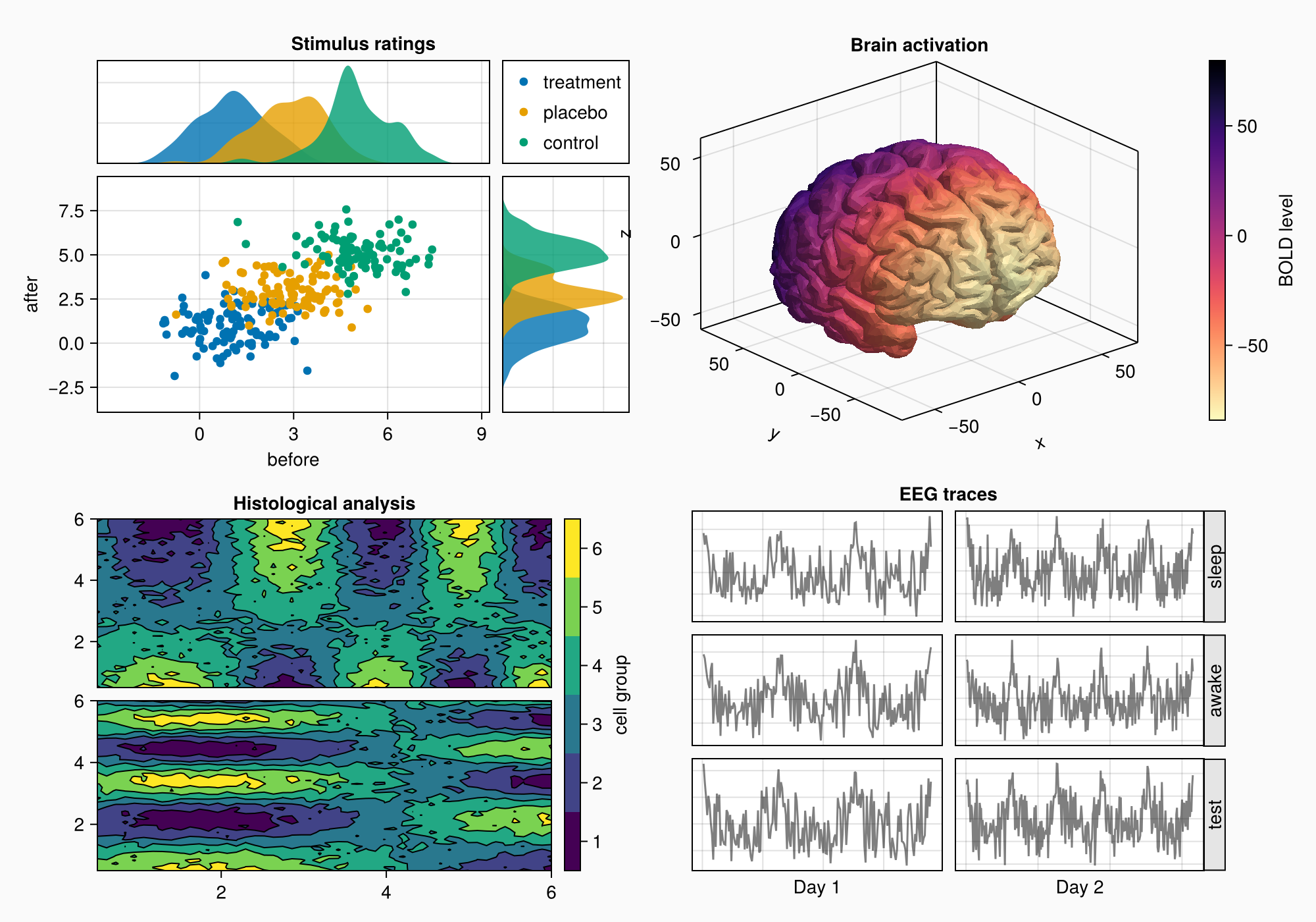
假设我们要创建下图:

以下是完整的代码以供参考:
using CairoMakie
using Makie.FileIO
CairoMakie.activate!() # hide
f = Figure(backgroundcolor = RGBf(0.98, 0.98, 0.98),
size = (1000, 700))
ga = f[1, 1] = GridLayout()
gb = f[2, 1] = GridLayout()
gcd = f[1:2, 2] = GridLayout()
gc = gcd[1, 1] = GridLayout()
gd = gcd[2, 1] = GridLayout()
axtop = Axis(ga[1, 1])
axmain = Axis(ga[2, 1], xlabel = "before", ylabel = "after")
axright = Axis(ga[2, 2])
linkyaxes!(axmain, axright)
linkxaxes!(axmain, axtop)
labels = ["treatment", "placebo", "control"]
data = randn(3, 100, 2) .+ [1, 3, 5]
for (label, col) in zip(labels, eachslice(data, dims = 1))
scatter!(axmain, col, label = label)
density!(axtop, col[:, 1])
density!(axright, col[:, 2], direction = :y)
end
ylims!(axtop, low = 0)
xlims!(axright, low = 0)
axmain.xticks = 0:3:9
axtop.xticks = 0:3:9
leg = Legend(ga[1, 2], axmain)
hidedecorations!(axtop, grid = false)
hidedecorations!(axright, grid = false)
leg.tellheight = true
colgap!(ga, 10)
rowgap!(ga, 10)
Label(ga[1, 1:2, Top()], "Stimulus ratings", valign = :bottom,
font = :bold,
padding = (0, 0, 5, 0))
xs = LinRange(0.5, 6, 50)
ys = LinRange(0.5, 6, 50)
data1 = [sin(x^1.5) * cos(y^0.5) for x in xs, y in ys] .+ 0.1 .* randn.()
data2 = [sin(x^0.8) * cos(y^1.5) for x in xs, y in ys] .+ 0.1 .* randn.()
ax1, hm = contourf(gb[1, 1], xs, ys, data1,
levels = 6)
ax1.title = "Histological analysis"
contour!(ax1, xs, ys, data1, levels = 5, color = :black)
hidexdecorations!(ax1)
ax2, hm2 = contourf(gb[2, 1], xs, ys, data2,
levels = 6)
contour!(ax2, xs, ys, data2, levels = 5, color = :black)
cb = Colorbar(gb[1:2, 2], hm, label = "cell group")
low, high = extrema(data1)
edges = range(low, high, length = 7)
centers = (edges[1:6] .+ edges[2:7]) .* 0.5
cb.ticks = (centers, string.(1:6))
cb.alignmode = Mixed(right = 0)
colgap!(gb, 10)
rowgap!(gb, 10)
brain = load(assetpath("brain.stl"))
ax3d = Axis3(gc[1, 1], title = "Brain activation")
m = mesh!(
ax3d,
brain,
color = [tri[1][2] for tri in brain for i in 1:3],
colormap = Reverse(:magma),
)
Colorbar(gc[1, 2], m, label = "BOLD level")
axs = [Axis(gd[row, col]) for row in 1:3, col in 1:2]
hidedecorations!.(axs, grid = false, label = false)
for row in 1:3, col in 1:2
xrange = col == 1 ? (0:0.1:6pi) : (0:0.1:10pi)
eeg = [sum(sin(pi * rand() + k * x) / k for k in 1:10)
for x in xrange] .+ 0.1 .* randn.()
lines!(axs[row, col], eeg, color = (:black, 0.5))
end
axs[3, 1].xlabel = "Day 1"
axs[3, 2].xlabel = "Day 2"
Label(gd[1, :, Top()], "EEG traces", valign = :bottom,
font = :bold,
padding = (0, 0, 5, 0))
rowgap!(gd, 10)
colgap!(gd, 10)
for(i,label)in enumerate(["睡眠","清醒","测试"])
Box(gd[i,3],color=:gray90)
标签(gd[i,3],标签,旋转=pi/2,tellheight=false)
结束
科尔加普!(gd,2,0)
n_day_1=长度(0:0.1:6pi)
n_day_2=长度(0:0.1:10pi)
科尔斯特!(gd,1,自动(n_day_1))
科尔斯特!(gd,2,自动(n_day_2))
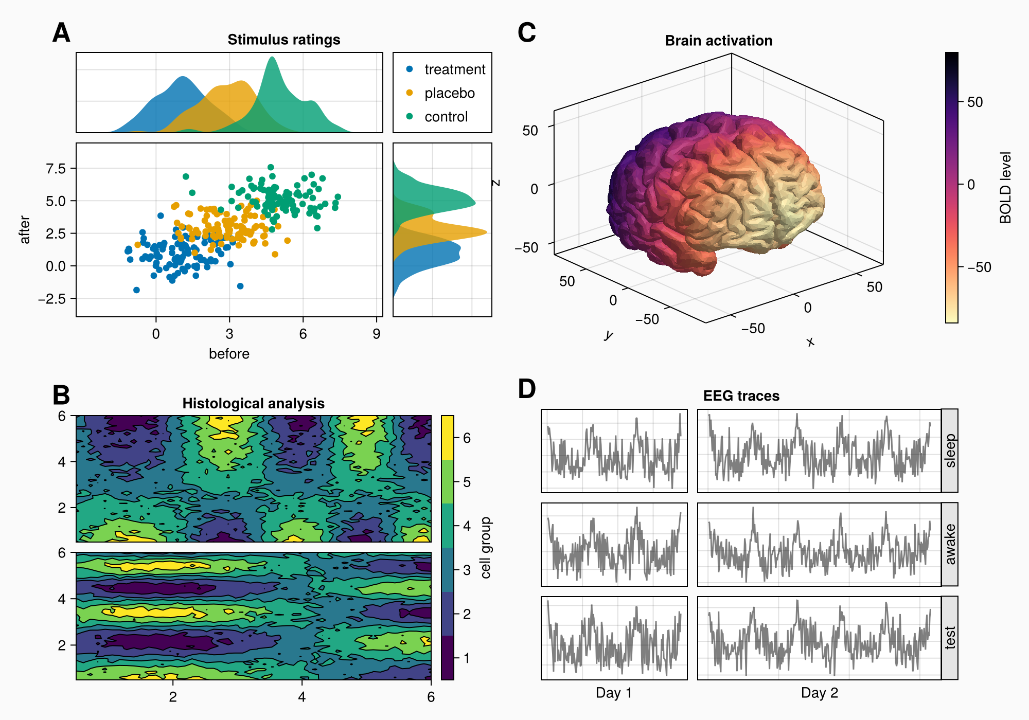
对于(标签,布局)在zip(["A","B","C","D"],[ga,gb,gc,gd])
标签(布局[1,1,TopLeft()],标签,
字体大小=26,
字体=:粗体,
填充物= (0, 5, 5, 0),
halign=:右)
结束
科尔斯特!(f.布局,1,自动(0.5))
rowsize!(gcd,1,自动(1.5))
f我们如何处理这项任务?
在以下部分中,我们将逐步介绍该过程。 我们并不总是使用尽可能短的语法,因为主要目标是更好地理解逻辑和可用选项。
基本设计图
在构建数字时,你总是用矩形框来思考。 我们希望找到包含有意义的内容组的最大框,然后我们使用以下方法实现这些框 网格布局 或者通过将内容对象放置在那里。
如果我们看一下我们的目标图,我们可以想象在每个标记区域a,B,C和D周围有一个盒子。但是A和C不在一行,B和D也不在一行。这意味着我们不使用2x2GridLayout,但必须更具创造性。
我们可以说A和B在一列中,C和D在一列中。 我们可以通过一个大的嵌套来为两个组设置不同的行高 网格布局 在第二列中,我们放置C和D。这样,列2的行与列1解耦。
using CairoMakie
using FileIO

f = Figure(backgroundcolor = RGBf(0.98, 0.98, 0.98),
    size = (1000, 700))
设置网格布局
现在,让我们制作四个嵌套的GridLayouts来保存a,B,C和D的对象。还有将C和D放在一起的布局,因此行与A和B分开。
|
请注意,首先创建单独的并不是绝对必要的 |
ga = f[1, 1] = GridLayout()
gb = f[2, 1] = GridLayout()
gcd = f[1:2, 2] = GridLayout()
gc = gcd[1, 1] = GridLayout()
gd = gcd[2, 1] = GridLayout()
小组A
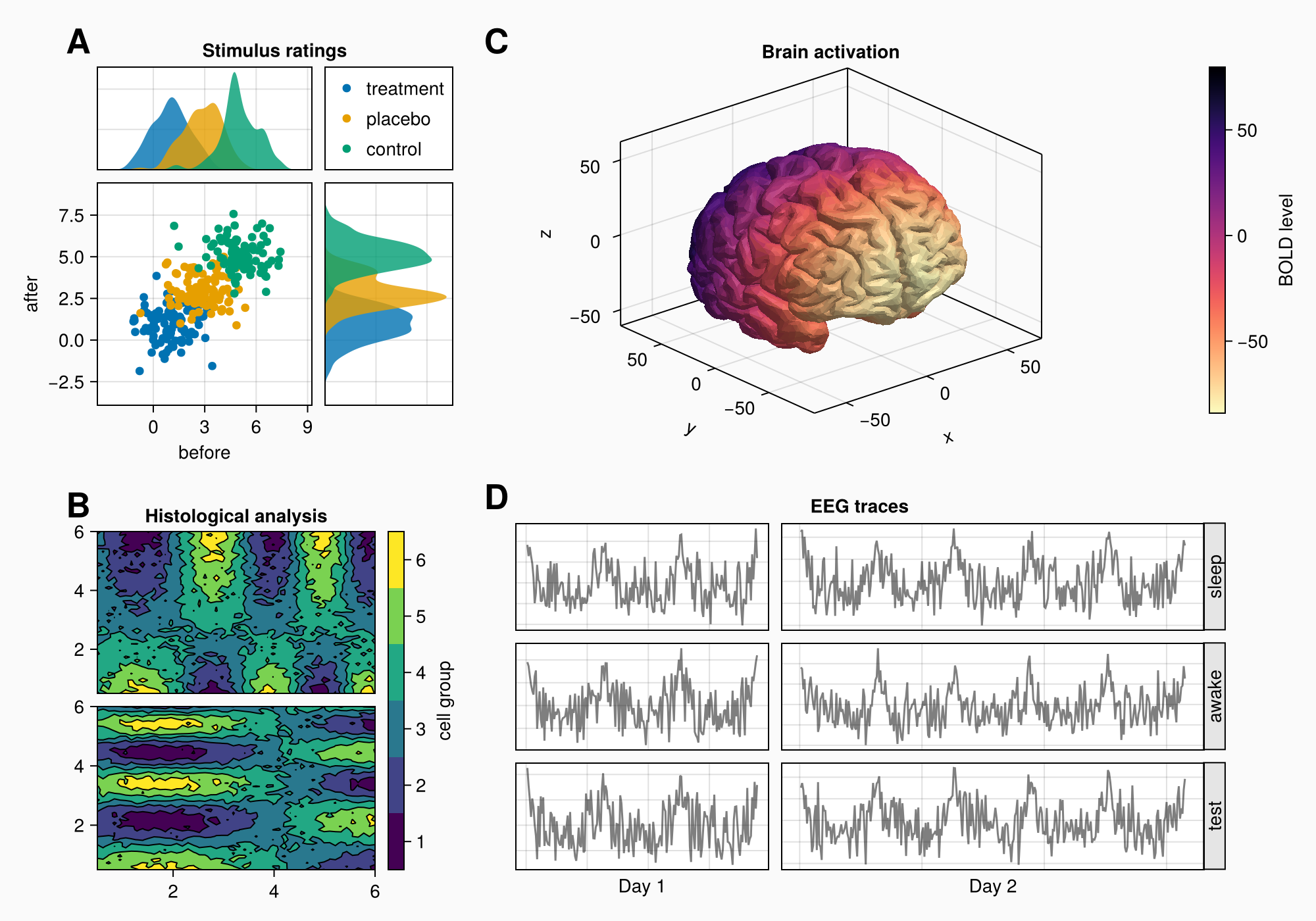
现在我们可以开始将对象放入图中。 我们从A开始。
axtop = Axis(ga[1, 1])
axmain = Axis(ga[2, 1], xlabel = "before", ylabel = "after")
axright = Axis(ga[2, 2])

linkyaxes!(axmain, axright)
linkxaxes!(axmain, axtop)

labels = ["treatment", "placebo", "control"]
data = randn(3, 100, 2) .+ [1, 3, 5]

for (label, col) in zip(labels, eachslice(data, dims = 1))
    scatter!(axmain, col, label = label)
    density!(axtop, col[:, 1])
    density!(axright, col[:, 2], direction = :y)
end

f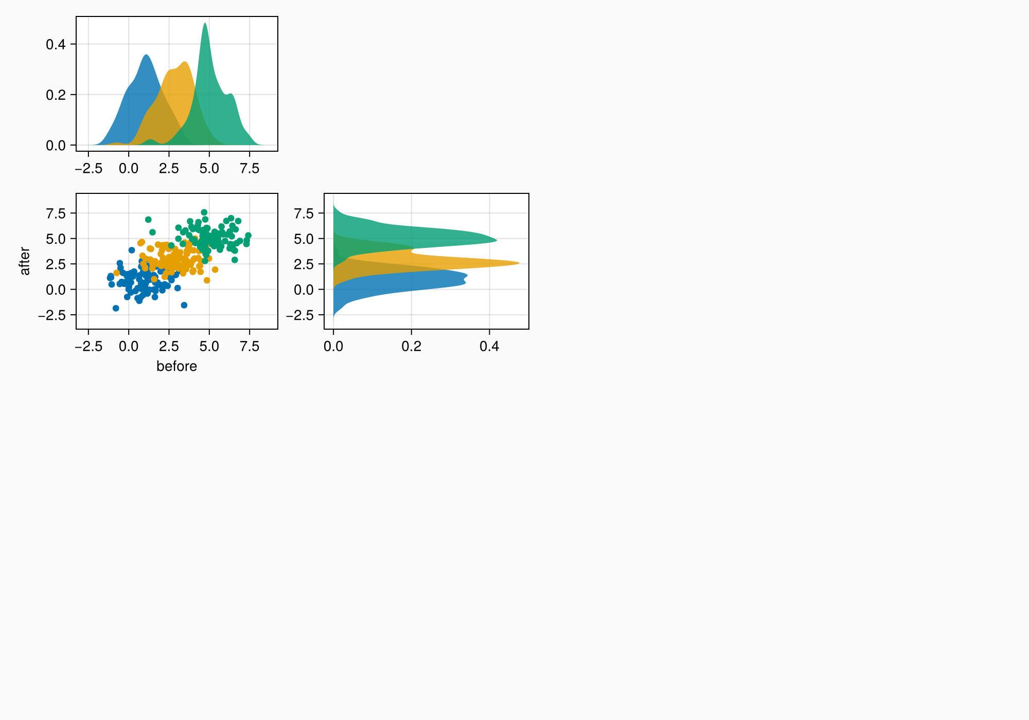
ylims!(axtop, low = 0)
xlims!(axright, low = 0)

f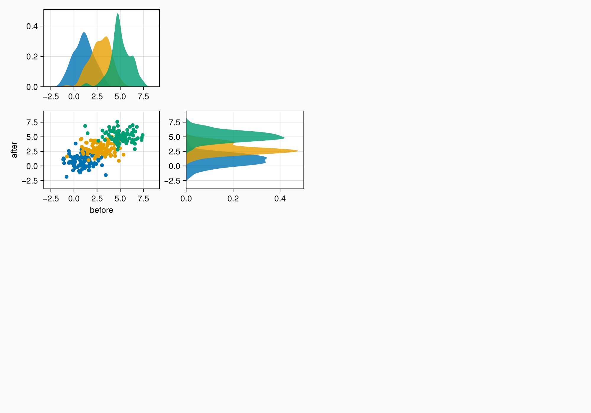
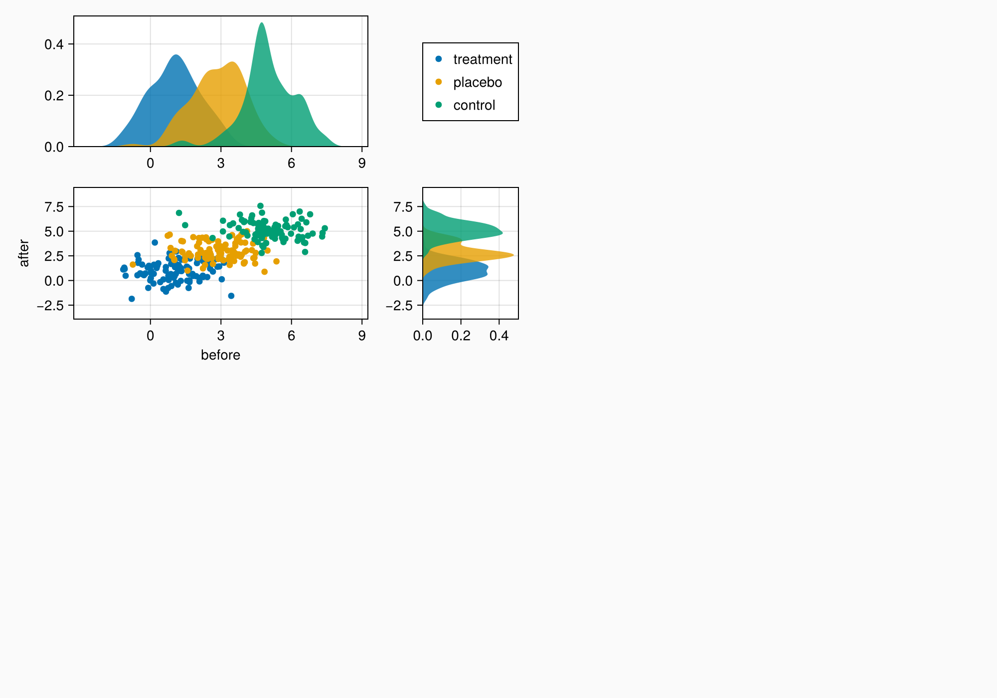
axmain.xticks = 0:3:9
axtop.xticks = 0:3:9

f

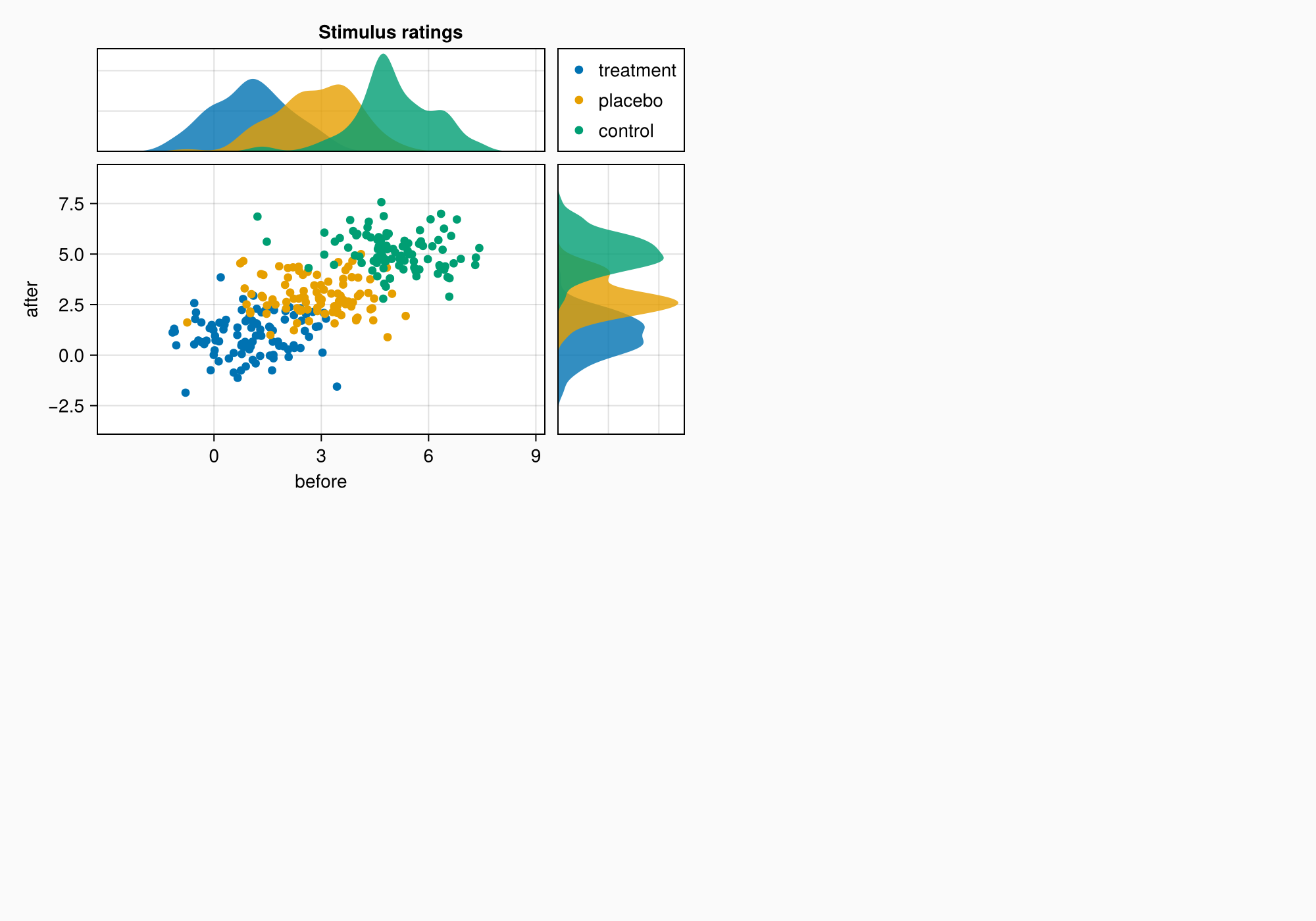
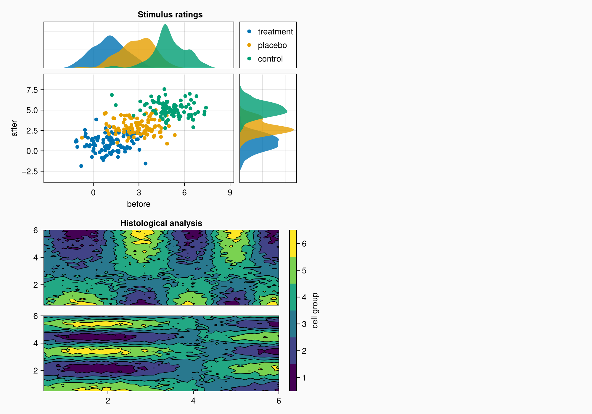
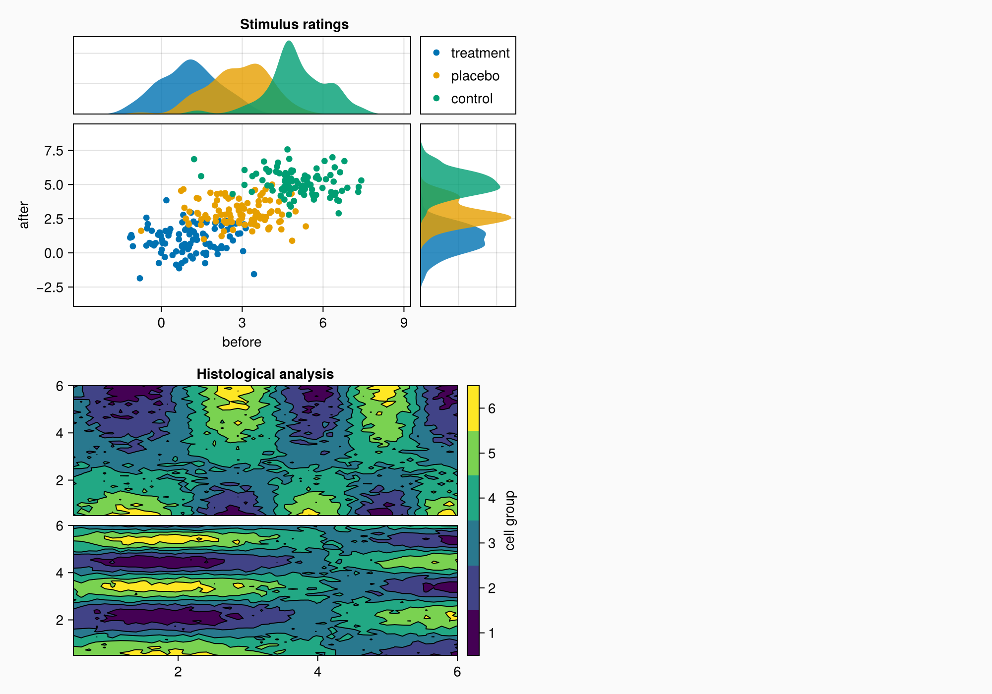
小组B
xs = LinRange(0.5, 6, 50)
ys = LinRange(0.5, 6, 50)
data1 = [sin(x^1.5) * cos(y^0.5) for x in xs, y in ys] .+ 0.1 .* randn.()
data2 = [sin(x^0.8) * cos(y^1.5) for x in xs, y in ys] .+ 0.1 .* randn.()

ax1, hm = contourf(gb[1, 1], xs, ys, data1,
    levels = 6)
ax1.title = "Histological analysis"
contour!(ax1, xs, ys, data1, levels = 5, color = :black)
hidexdecorations!(ax1)

ax2, hm2 = contourf(gb[2, 1], xs, ys, data2,
    levels = 6)
contour!(ax2, xs, ys, data2, levels = 5, color = :black)

f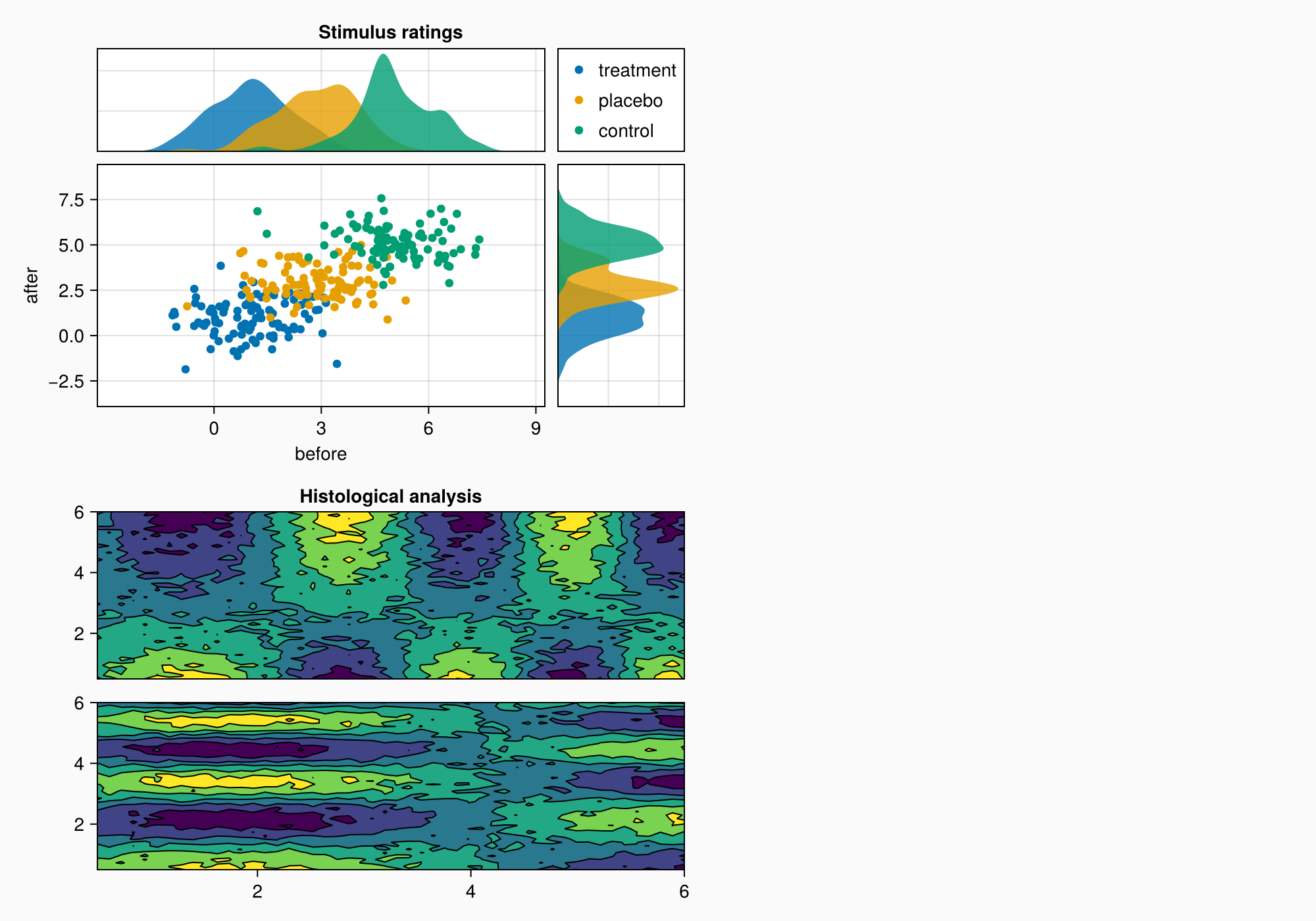
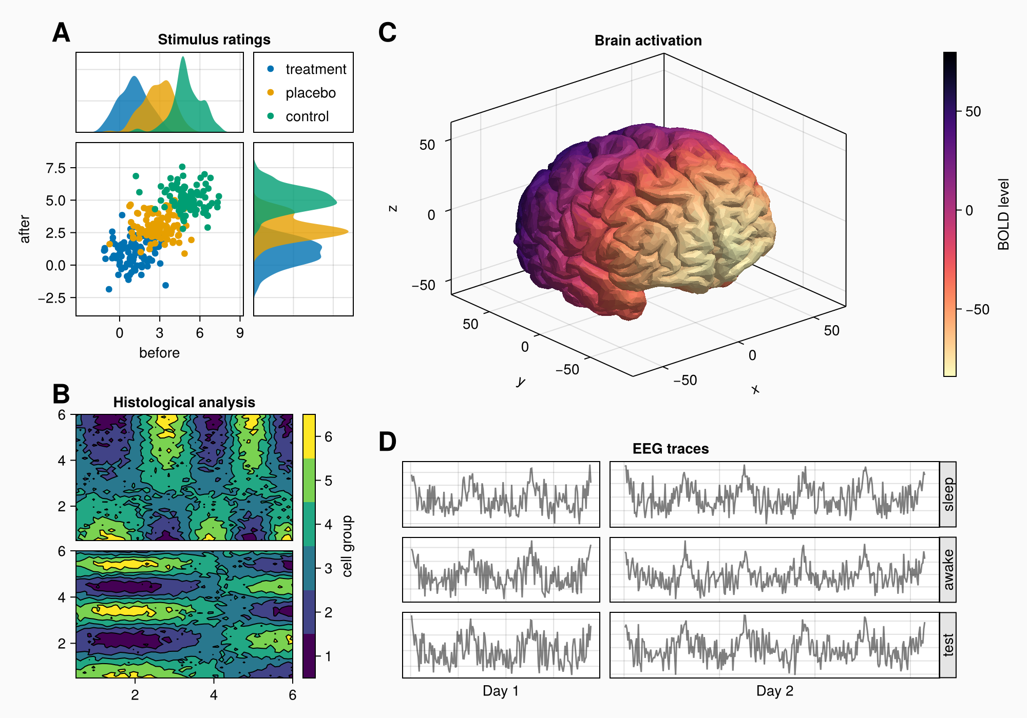
小组C
brain = load(assetpath("brain.stl"))

ax3d = Axis3(gc[1, 1], title = "Brain activation")
m = mesh!(
    ax3d,
    brain,
    color = [tri[1][2] for tri in brain for i in 1:3],
    colormap = Reverse(:magma),
)
Colorbar(gc[1, 2], m, label = "BOLD level")

f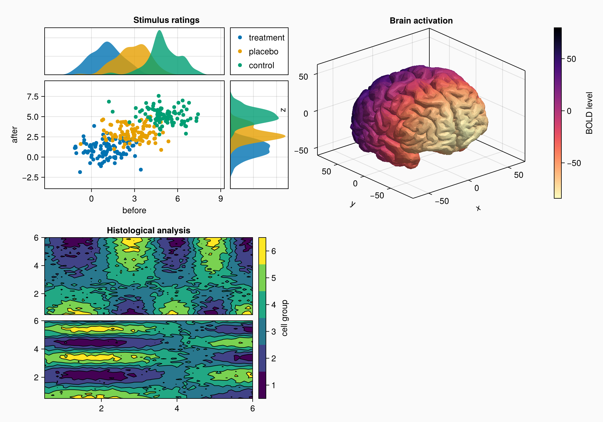
请注意,z标签与左侧的绘图重叠了一点。 轴心3 不能有自动突起,因为标签位置随着投影和轴的像元大小而变化,这与2D不同 轴心,轴心.
您可以设置属性 ax3。突起物 到四个值(左,右,底部,顶部)的元组,但在这种情况下,我们只是继续绘制,直到我们拥有我们想要的所有对象,然后再查看是否需要这样的小调整。
小组D
axs = [Axis(gd[row, col]) for row in 1:3, col in 1:2]
hidedecorations!.(axs, grid = false, label = false)

for row in 1:3, col in 1:2
    xrange = col == 1 ? (0:0.1:6pi) : (0:0.1:10pi)

    eeg = [sum(sin(pi * rand() + k * x) / k for k in 1:10)
        for x in xrange] .+ 0.1 .* randn.()

    lines!(axs[row, col], eeg, color = (:black, 0.5))
end

axs[3, 1].xlabel = "Day 1"
axs[3, 2].xlabel = "Day 2"

f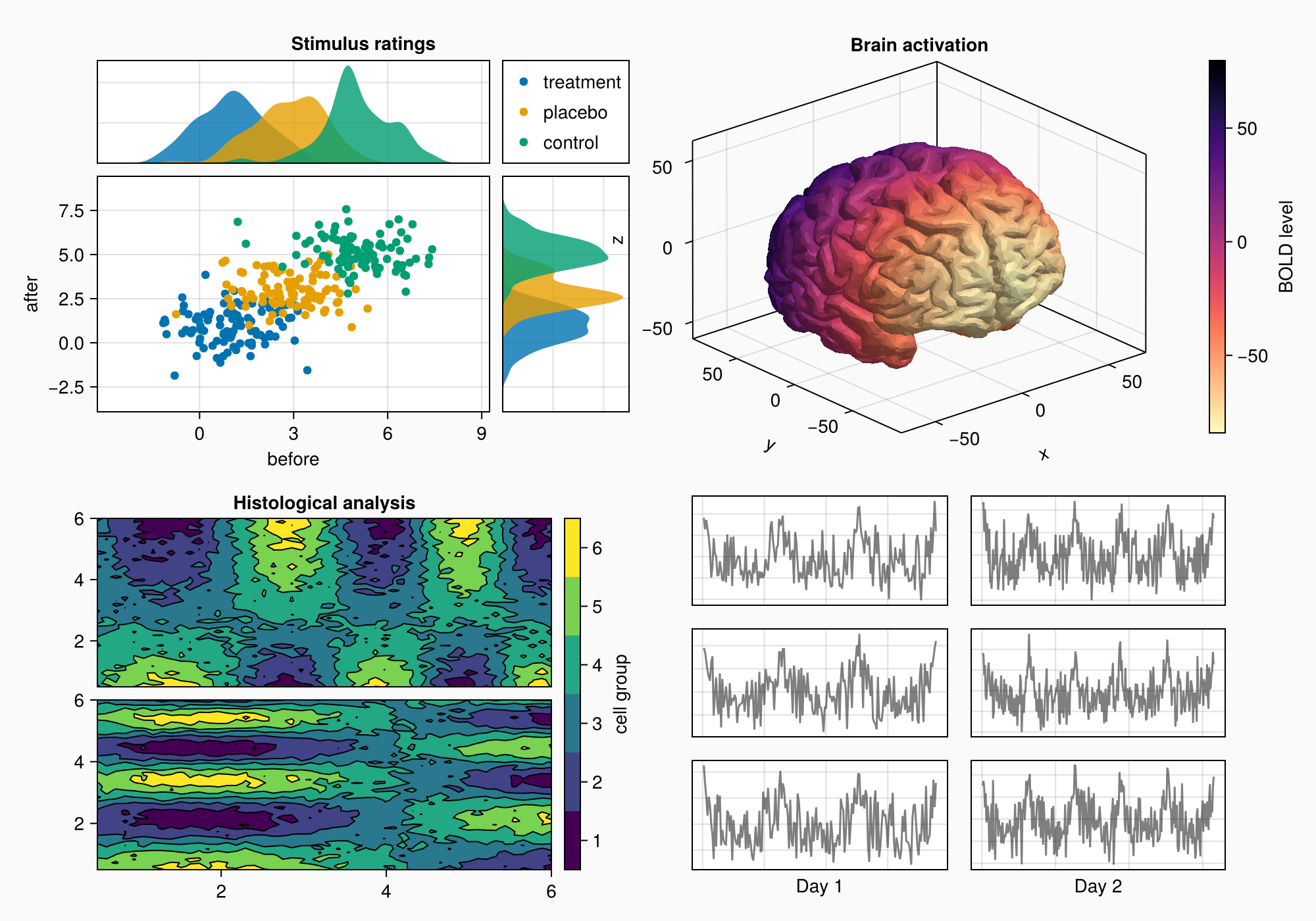
Label(gd[1, :, Top()], "EEG traces", valign = :bottom,
    font = :bold,
    padding = (0, 0, 5, 0))

f
rowgap!(gd, 10)
colgap!(gd, 10)

f