Slider
|
Страница в процессе перевода. |
Простой ползунок без метки. Создать метку можно, например, с помощью объекта Label. Необходимо указать диапазон, который ограничивает возможные значения ползунка.
Текущий выбранный интервал находится в атрибуте value. Не изменяйте это значение вручную, а воспользуйтесь функцией set_close_to!(slider, value). Это необходимо для того, чтобы значения действительно присутствовали в атрибуте range.
Дважды щелкните ползунок, чтобы вернуть для него значения (приблизительные), указанные в startvalue.
Если задать атрибут snap = false, ползунок будет двигаться непрерывно во время перетаскивания и перейдет к ближайшему доступному значению только при отпускании кнопки мыши.
using GLMakie

fig = Figure()

ax = Axis(fig[1, 1])

sl_x = Slider(fig[2, 1], range = 0:0.01:10, startvalue = 3, update_while_dragging=false)
sl_y = Slider(fig[1, 2], range = 0:0.01:10, horizontal = false, startvalue = 6)

point = lift(sl_x.value, sl_y.value) do x, y
    Point2f(x, y)
end

scatter!(point, color = :red, markersize = 20)

limits!(ax, 0, 10, 0, 10)

fig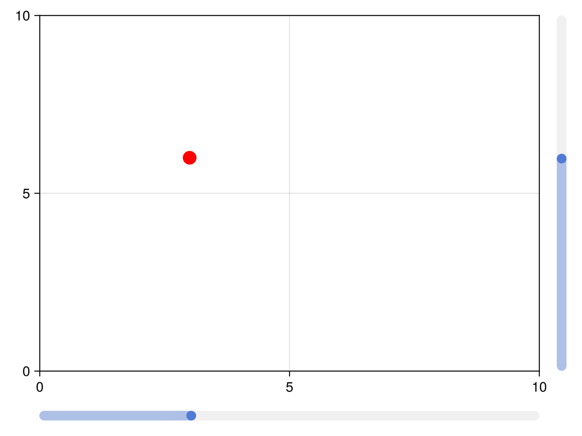
Ползунки и сетки с метками
Функции labelslider! и labelslidergrid! устарели, используйте вместо них SliderGrid.
Атрибуты
color_active
Значение по умолчанию: COLOR_ACCENT[]
Цвет ползунка меняется при щелчке мыши и перетаскивании ползунка.
color_active_dimmed
Значение по умолчанию: COLOR_ACCENT_DIMMED[]
Цвет ползунка при наведении на него курсора мыши.
color_inactive
Значение по умолчанию: RGBf(0.94, 0.94, 0.94)
Цвет ползунка, когда с ним не взаимодействуют.
halign
Значение по умолчанию: :center
Горизонтальное выравнивание элемента в предполагаемой ограничивающей рамке.
horizontal
Значение по умолчанию: true
Определяет, имеет ли ползунок горизонтальную ориентацию или нет.
snap
Значение по умолчанию: true
Контролирует, фиксируется ли кнопка в нужном положении или перемещается свободно
startvalue
Значение по умолчанию: 0
Начальное значение ползунка или значение, которое находится ближе всего к диапазону ползунка.
tellheight
Значение по умолчанию: true
Определяет, может ли родительский макет подстраиваться под высоту этого элемента
tellwidth
Значение по умолчанию: true
Определяет, может ли родительский макет подстраиваться под ширину этого элемента
update_while_dragging
Значение по умолчанию: true
Если значение равно false, ползунок обновляет значение только после прекращения перетаскивания
valign
Значение по умолчанию: :center
Вертикальное выравнивание элемента в предполагаемой ограничивающей рамке.