Plotting graphs tutorial
Plotting using Plots
To visualize the data, you need to download the Plots package.:
using PlotsLet’s look at some typical charting tasks using the Plots package.:
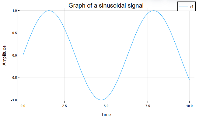
Plot a single signal — Use the Plots package to work with data visualization and plot your signal.
using Plots # downloads the Plots package
x = 0:0.01:10 # creates a time vector from 0 to 10 in increments of 0.01
y = sin.(x) # the sine is calculated for each element of the time vector (x)
plot(x, y, xlabel="Time", ylabel="The amplitude", title="Graph of a sinusoidal signal") # plots a sine wave with a time axis on the x axis and an amplitude on the y axis.
After executing the code, you will automatically receive a graph of the sinusoidal signal.:
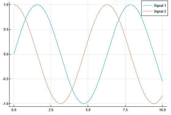
Plot multiple signals — Use the Plots package to plot multiple signals on a single graph.
using Plots
x = 0:0.01:10
y1 = sin.(x)
y2 = cos.(x)
plot(x, y1, label="Signal 1")
plot!(x, y2, label="Signal 2") # plot is being used! with an exclamation mark to add a new signal to the chart
After executing the code, you will automatically receive two graphs of the sine and cosine signals, respectively.:
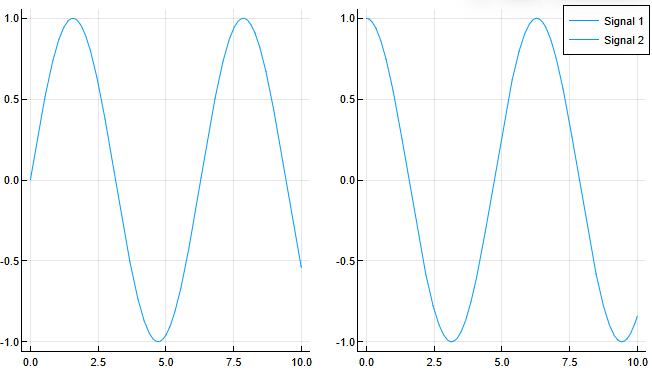
You can display the signals on separate charts, then the code will look like this:
using Plots

x = 0:0.01:10
y1 = sin.(x)
y2 = cos.(x)

plot(
    plot(x, y1, label="Signal 1"),
    plot(x, y2, label="Signal 2"),
    layout = 2 # the number of graphs is set, the value cannot be lower than the number of plots described (in our case, at least 2)
)
After executing the code, you will automatically receive a graph of the sine and cosine signals.:
Customize the Graph — Customize the graph display according to your preferences.
| A more detailed list of attributes for chart settings is provided in Attributes. |
Let’s say there is a graph of a sinusoidal signal:
using Plots
x = 0:0.01:10
y = sin.(x)
plot(x, y, xlabel="Time", ylabel="The amplitude")
On the graph, you can set a name for the legend using the construction label="Name of the legend". For example:
using Plots
x = 0:0.01:10
y = sin.(x)
plot(x, y, label="The sine wave", xlabel="Time", ylabel="The amplitude") # instead of y1, the legend was named "Sinusoid"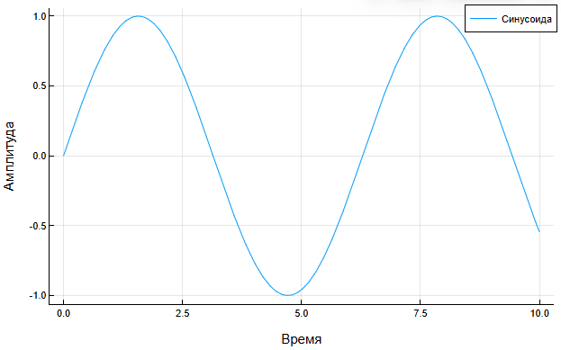
You can remove the legend completely by specifying legend = false:
using Plots
x = 0:0.01:10
y = sin.(x)
plot(x, y, ylabel="The amplitude", xlabel="Time", legend = false)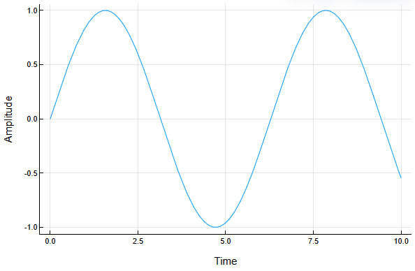
You can also set a range of values along the axes, for example:
using Plots
x = 0:0.01:10
y = sin.(x)
plot(x, y, xlims=(0, 5), ylims=(-1, 1), xlabel="Time", ylabel="The amplitude")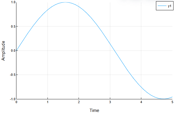
|
This approach does not limit the data, it only changes the visible range of the graph, leaving the complete data set unchanged. Filtering must be used to limit the data, for example: Here, the code is built only for the first half of the sine wave, and the arrays x and y correspond to the specified range. |
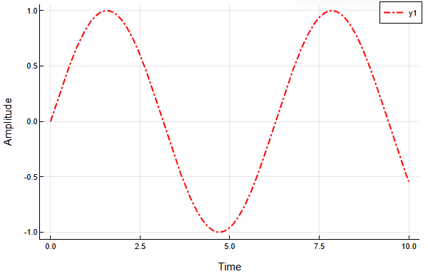
The Plots package has extensive customization options for the type of graph itself, for example:
using Plots
x = 0:0.01:10
y = sin.(x)
plot(x, y, line=:dashdot, color=:red, linewidth=2, xlabel="Time", ylabel="The amplitude")
Here the graph line has changed to a dotted line with a dot (line=:dashdot), the color of the line has changed to red (color=:red), and its width has become two (linewidth=2).
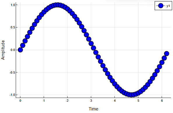
In some cases, setting up data point markers is useful, for example:
using Plots
x = 0:0.1:2π
y = sin.(x)
plot(x, y, xlabel="Time", ylabel="The amplitude", marker=:circle, markersize=8, markerstrokewidth=2, markerstrokealpha=0.8, color=:blue)
Here is a graph of a sine wave with axis signatures (xlabel, ylabel), markers in the form of circles (marker=:circle), the size of the markers 8 (markersize=8), the width of the outline 2 (markerstrokewidth=2), transparency of the outline 0.8 (markerstrokealpha=0.8), and the blue color of the line (color=:blue).
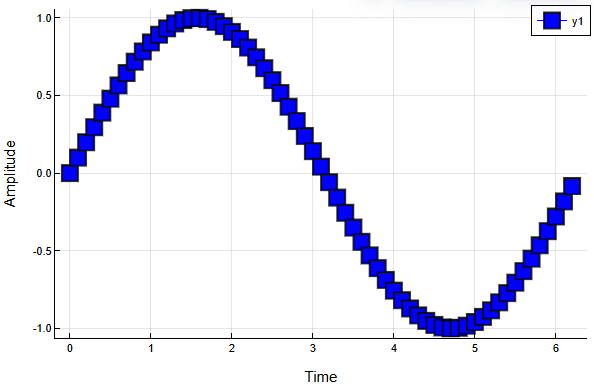
Squares or other supported geometric shapes, such as squares, can be used instead of circle markers.:
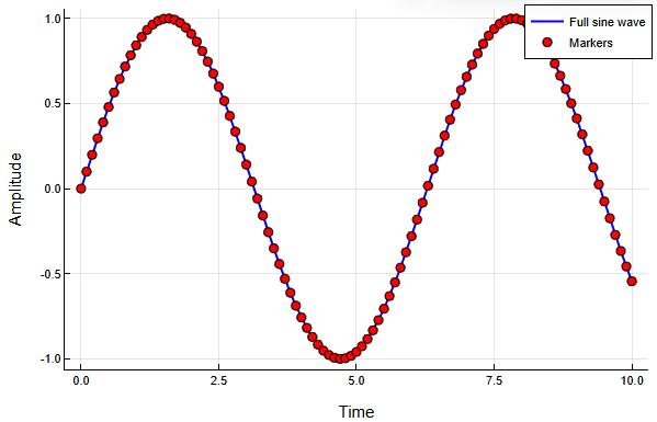
One of the most popular design options for graphs is to reduce the number of markers while completely preserving the line, for example:
x = 0:0.1:10 # We use the same step.
y = sin.(x)

plot(x, y, xlabel="Time", ylabel="The amplitude", label="Full sine wave", color=:blue, linewidth=2)
scatter!(x, y, label="Markers", color=:red)
Team scatter!(x, y, label="Markers", color=:red) adds red markers to the existing graph based on the data x and y, with the legend "Markers" displayed.
Save the graph as an image — save the resulting graph using the savefig command to the Engee file browser.
savefig("my_plot.png")After executing the code, you will receive a message about the path of the saved file.:
Output:
"/user/my_plot.png"|
A graph built using Plots in command prompt, will be displayed in the visualization window
|
There are several different backend graphics display methods in the Plots package. Which backend to choose depends on your task. The table below will help you choose a more appropriate method.
|
Using the library PlotlyJS.jl for creating three-dimensional graphs, it can lead to problems when converting scripts to HTML/PDF formats, as well as when publishing in the community. When using the library Plots.jl there is no such problem with the plotlyjs backend. |
| Visualization requirements | Backend graphics |
|---|---|
Speed |
gr, unicodeplots |
Interactivity |
plotlyjs |
Beauty |
plotlyjs, gr |
Building on the command line |
unicodeplots |
Construction of spatial curves |
plotlyjs, gr |
Building surfaces |
gr |
Two-dimensional graphs
Any backend can handle the construction of a two-dimensional curve. To scale the graph and select specific points on the curve, enable the graph display method plotlyjs:
plotlyjs();The plot function is used to create two-dimensional graphs.
| If you put a semicolon at the end of the plotting command, the command will be executed, but the graph will not be shown. |
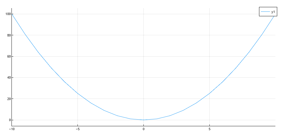
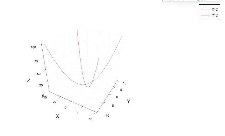
x = [-10:10;];
y = x.^2;
plot(x,y)
Output
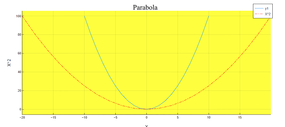
To add a graph to an existing one, add an exclamation mark to make it plot!(). You can label the axes and graph, add a title, and change the style of the line and background.:
plot!(2x, y, xlabel="X", ylabel="X^2", title="The parabola", linecolor =:red, bg_inside =:yellow, line =:dashdot, label = "X^2")Output
Plotting using PlotlyJS
The second way to visualize the data is to use an alternative library PlotlyJS.
using PlotlyJSIf you have previously used the Plots library, there may be function name conflicts. Therefore, we will call the charting functions as follows:
PlotlyJs.<function_name>One of the disadvantages of the PlotlyJS library is the requirement of strict typing. So, to build a surface, additional type transformations will have to be performed. But when working with PlotlyJS, you don’t need to select and connect external dependencies!
Two-dimensional graphs
To build a graph, you need to create an object that describes the curve, surface, etc. You can build a two-dimensional graph using the scatter function by specifying the line type in the settings.
... mode = "lines"In this example, the selected type is a line with a marker.
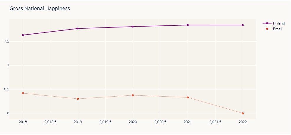
line1 = PlotlyJS.scatter(x=2018:2022, y=[7.632, 7.769, 7.809, 7.842, 7.841], mode="lines+markers", name="Finland", line_color="purple");
line2 = PlotlyJS.scatter(x=2018:2022, y=[6.419, 6.300, 6.376, 6.330, 6,125], mode="lines+markers", name= "Brazil", line_width=0.5);
Now you can create an object in which the graph appearance parameters will be set. This approach is useful if there is a need for a unified chart style. The library allows you to use a variety of appearance settings. You can sign the graph, choose the line thickness, and colors (and the color selection can be set in different ways).
layout = PlotlyJS.Layout(title="Gross National Happiness", xaxis_range=[2018, 2022], yaxis_range=[5, 8], paper_bgcolor="RGB(250,249,245)", plot_bgcolor="#F5F3EC");The plot function is used for plotting. If you want to plot multiple graphs in one, they should be written as a vector.:
PlotlyJS.plot([line1, line2], layout)Output
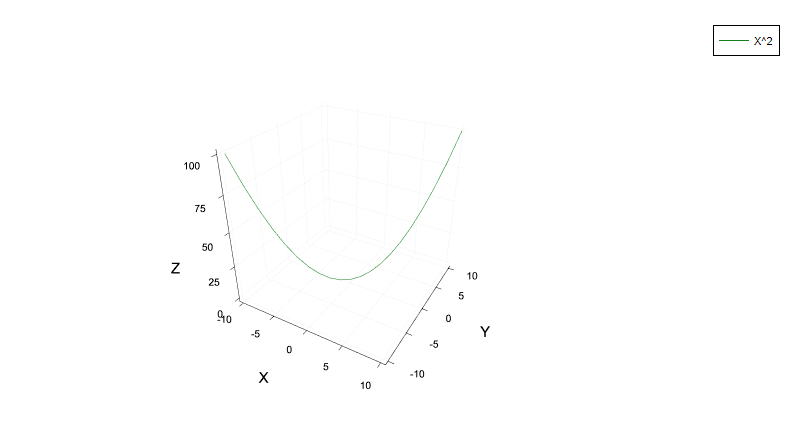
Spatial curves
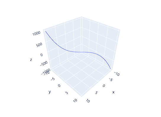
The object for constructing the spatial curve is created by the scatter3d function.
x = [-10.0:10.0;];cubic = PlotlyJS.scatter3d(x=x, y=-x, z=x.^3, mode="lines");
PlotlyJS.plot(cubic)Output
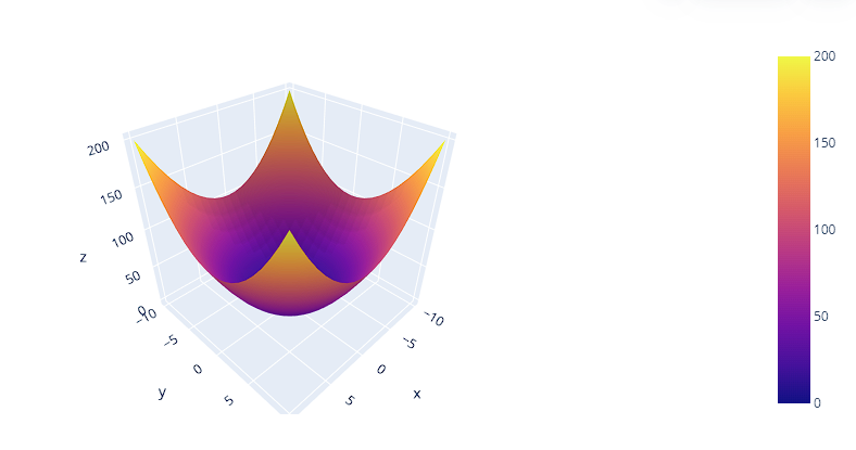
Surfaces
Let’s construct a surface defined by a paraboloid using the surface function. First, you need to make sure that the data types are correct. Coordinates in x and y They can be either one-dimensional or two-dimensional arrays. When transposing a vector y = x' the result type is not an array:
println("Type y = x': " ,typeof(x'));Therefore, it is important to convert the vector type before constructing the surface. y:
y = vec(collect(x'));
z = (x.^2).+((x').^2);
Let’s check the data types:
println("Type x: " ,typeof(x));
println("Type y: " ,typeof(y));
println("Type Z: " ,typeof(z));
paraboloid = PlotlyJS.surface(x=x, y=y, z=z);
PlotlyJS.plot(paraboloid)Output