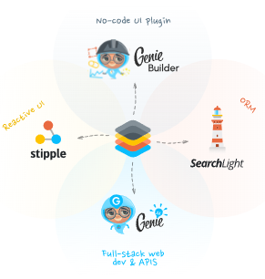
Gallery of the main components of Stipple.jl
The article presents a gallery of the main graphical components used in Engee when working with web interfaces based on the framework. Genie.
To create various information panels and user interfaces, use Stipple.jl is a reactive UI framework for the Julia language, which is part of Genie and provides a convenient set of ready-made interface elements.
Stipple components.jls are based on the library Quasar (Vue.js) and allow you to create interactive panels, buttons, forms, tables and other elements that are used inside Engee to display data and build user interfaces.
The main components of Stipple are described below.jl for working in Engee, as well as examples of their use. In the article Gallery of auxiliary components of Stipple.jl Auxiliary components are presented, which can also be extremely useful in less popular tasks.
Pin
Icon
Show the code
-
JULIA
-
HTML
badge("1.0.0+", color = "primary")<q-badge color="primary" label="1.0.0+"></q-badge>Programmatic use
badge()The icon component allows you to create a small icon to display contextual information that needs to be highlighted and made visible. It is often used together with other elements, such as the user’s avatar, to show the number of new messages or notifications.
Examples:
-
Model:
julia> @vars BadgeModel begin myicon = "bluetooth" end -
View:
julia> Html.div("Badge", class = "text-h6", [
         badge("1.0.0+", color = "primary")
       ])
Arguments
-
Content
-
floating::Bool— display the icon in the upper-right corner relative to the parent element. -
transparent::Bool— enable semi-transparent mode (approximately 0.8 opacity); useful for "floating" icons. -
multiline::Bool— allow text to be moved to multiple lines. -
label::Union{String,Int}— the main text of the icon; overlaps the default slot. -
align::String— vertical alignment of content (for example:top,middle,bottom). -
outline::Bool— contour style (colored outline and text without fill).
-
-
Style
-
color::String— the background color of the icon from the Quasar palette (for example:primary,teal-10). -
textcolor::String— text color (also from the Quasar palette). -
rounded::Bool— rounded shape of the icon (pill-style).
-
A large number
A large number

Show the code
-
JULIA
-
HTML
bignumber(number = "7")<st-big-number title="" number="7"></st-big-number>Programmatic use
bignumber(
    label::Union{String,Symbol} = "",
    number::Union{Symbol,Number,Nothing} = nothing,
    args...;
    kwargs...,
)
Displays the interface element of a large number.
Arguments
-
label::Union{String,Symbol} -
number::Union{String,Symbol,Nothing,String} -
icon::Union{String,Symbol} -
color::Union{String,Symbol} = «positive»|«negative» -
arrow::Union{String,Symbol} = «up»|«down»
Button
Button
Show the code
-
JULIA
-
HTML
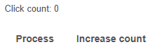
[
    p("Click count: {{Button_count}}"),
    btn("Process", @click(:Button_process)),
    btn("Increase count", @click("Button_count = Button_count+1")),
]
<p>Click count: {{ Button_count }}</p>
<q-btn label="Process" @click="Button_process"></q-btn>
<q-btn label="Increase count" @click="Button_count = Button_count+1"></q-btn>Button with an icon
Show the code
-
JULIA
-
HTML
[
    btn("Mail", icon = "mail", color = "primary", class = "q-mr-sm"),
    btn("Send", var"icon-right" = "send", color = "secondary", class = "q-mr-sm"),
    btn("Send", icon = "mail", var"icon-right" = "send", color = "orange"),
]
<q-btn color="primary" label="Mail" icon="mail" class="q-mr-sm"></q-btn>
<q-btn color="secondary" label="Send" class="q-mr-sm" icon-right="send"></q-btn>
<q-btn color="orange" label="Send" icon="mail" icon-right="send"></q-btn>A button with a hint

Show the code
-
JULIA
-
HTML
[btn("Mail", icon = "mail", color = "primary", [tooltip("Send email")])]<q-btn color="primary" label="Mail" icon="mail">
<q-tooltip>
Send email
</q-tooltip>
</q-btn>Button with progress indicator

Show the code
-
JULIA
-
HTML
[
    btn(
        "Process",
        @click(:ButtonProgress_process),
        loading = :ButtonProgress_process,
        color = "primary",
        class = "q-mr-sm",
    ),
    btn(
        "Process",
        @click(:ButtonProgress_process),
        loading = :ButtonProgress_process,
        percentage = :ButtonProgress_progress,
        color = "green",
    ),
]
Reactive code
@app begin
    @in ButtonProgress_process = false
    @in ButtonProgress_progress = 0.0
    @onbutton ButtonProgress_process begin
        for ButtonProgress_progress = 0:0.1:1
            @show ButtonProgress_progress
            sleep(0.5)
        end
        ButtonProgress_progress = 0.0
    end
end
<q-btn color="primary" :loading="ButtonProgress_process" label="Process" v-on:click="ButtonProgress_process = true" class="q-mr-sm"></q-btn>
<q-btn color="green" :loading="ButtonProgress_process" :percentage="ButtonProgress_progress" label="Process" v-on:click="ButtonProgress_process = true"></q-btn>The flag
Flag

Show the code
-
JULIA
-
HTML
checkbox("Checked", :Checkbox_checked)Reactive code
@app begin
    @in Checkbox_checked = true
end
<q-checkbox label="Checked" v-model="Checkbox_checked"></q-checkbox>Multiple checkboxes
Show the code
-
JULIA
-
HTML
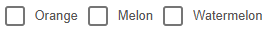
[
    checkbox("Orange", :selection, val = "orange", color = "orange"),
    checkbox("Melon", :selection, val = "melon", color = "green"),
    checkbox("Watermelon", :selection, val = "watermelon", color = "red"),
]
Reactive code
@app begin
    @in CheckboxMultiple_checked = (true, @in(selection = []))
end
<q-checkbox color="orange" val="orange" label="Orange" v-model="selection"></q-checkbox>
<q-checkbox color="green" val="melon" label="Melon" v-model="selection"></q-checkbox>
<q-checkbox color="red" val="watermelon" label="Watermelon" v-model="selection"></q-checkbox>Programmatic use
checkbox(
    label::Union{String,Symbol} = "",
    fieldname::Union{Symbol,Nothing} = nothing,
    args...;
    kwargs...,
)
The "checkbox" component is another basic element for user input. It can be used to give the user the ability to switch options.
Examples:
-
Model:
julia > @vars CheckboxModel begin valone::R{Bool} = true end -
View:
julia > checkbox(label = "Apples", fieldname = :valone, dense = true, size = "xl")
Arguments
-
Behaviour
-
name::String— the name of the control; useful if the form is sent directly to the URL and you need to distinguish the fields by name. -
indeterminatevalue::Union{String,Float64,Int,Bool}— the value of the model that should be considered "undefined" (indeterminate). -
toggleorder::String— the order of switching the two states (t— conditiontrue,f— conditionfalse). Iftoggle-indeterminate = true, the order is as follows:indet → first state → second state → indet(and so on in a circle). Otherwise:indet → first state → second state → first state → second state → …. Examples:"tf","ft". -
toggleindeterminate::Bool— iftruewhen clicking/tapping on a component, the state will go through "undefined" (indeterminate). -
keepcolor::Bool— if specified, the color of the component (if specified) remains even when the switch is turned off/off.
-
-
Common
-
tabindex::Union{Int,String}— the value of the HTML attributetabindex.
-
-
Mark
-
label::Union{String,Symbol}— the text of the label displayed next to the component. -
leftlabel::Bool— iftrue, the label (if specified) is displayed to the left of the component.
-
-
Model
-
fieldname::Symbol— the name of the component model field. -
val::Union{String,Float64,Int,Bool}— used when the model (value) has a typeArray. Defines the value that will be added/removed when the checkbox is checked/unchecked. -
truevalue::Union{Int,Float64,String}— the value of the model, which is considered the "enabled/marked" state. -
falsevalue::Union{Int,Float64,String}— the value of the model, which is considered the "off/unchecked" state.
-
-
Condition
-
disable::Bool— put the component in an inactive (disabled) state.
-
-
Style
-
size::String— size in CSS units (indicating the unit of measurement) or one of the standard size names (xs|sm|md|lg|xl). Examples:"16px","2rem","xs","md". -
color::String— the color name of the component from Quasar palettes, for example:primary,teal-10. -
dark::Bool— informs the component that the background is dark under it. -
dense::Bool— Compact mode; the component takes up less space.
-
Chip
Chip
Show the code
-
JULIA
-
HTML
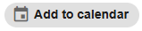
chip("Add to calendar", icon = "event")<q-chip icon="event">
Add to calendar
</q-chip>The clickable chip
Show the code
-
JULIA
-
HTML
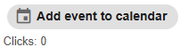
[
    chip(
        "Add event to calendar",
        icon = "event",
        clickable = true,
        @click(:chipClick_clicked)
    ),
    p("Clicks: {{chipClick_clicks}}"),
]
Reactive code
@app begin
    @in chipClick_clicked = false
    @out chipClick_clicks = 0
    @onbutton chipClick_clicked begin
        chipClick_clicks += 1
    end
end
<q-chip clickable="" icon="event" v-on:click="chipClick_clicked = true">
Add event to calendar
</q-chip>
<p>
Clicks: {{chipClick_clicks}}
</p>Programmatic use
chip(args...; kwargs...)The "chip" component is a simple blocky user interface entity that compactly displays, for example, more complex basic data such as a contact.
The chips can contain entities such as an avatar, text or icon, as well as, optionally, a pointer. They can also be closed or deleted if provided by the settings.
Examples:
-
View:
julia > chip("Add to calendar", icon = "event")
Arguments
-
Content
-
icon::String— the name of the icon according to the Quasar conventions. An installed icon library is required if the prefix is not used.img:. If you specify the line"none", the icon will not be rendered (but a place will still be reserved for it). Examples:map,ion-add,img:https://cdn.quasar.dev/logo/svg/quasar-logo.svg,img:path/to/some_image.png. -
iconright::String— the name of the icon displayed on the right, according to the same rules asicon. -
iconremove::String— the name of the icon for the "delete" action (delete button), according to the same rules asicon. -
iconselected::String— the name of the icon displayed for the selected state, according to the same rules asicon. -
label::Union{String,Int}— the text content of the component; overlaps the default slot. Examples:"Joe Doe","Book",42.
-
-
Common
-
tabindex::Union{Int,String}— the value of the HTML attributetabindex(for example:0,100).
-
-
Model
-
value::Bool— the model that determines whether the chip should be displayed. Meaningtrueby default, it means that the component is visible. -
selected::Bool— the model that determines whether the chip is selected or not. Requires a modifier.sync.
-
-
Condition
-
clickable::Bool— makes the chip clickable; in this mode, it responds to pointing and generates an eventclick. -
removable::Bool— adds a delete button; when clicked, the corresponding delete events are generated. -
disable::Bool— puts the component in an inactive state (disabled).
-
-
Style
-
ripple::Union{Bool,Dict}— setting up the "ripple" material decor (click effect). You can disable (false) or pass a configuration object (e.g.true,center: true,color: "teal"). -
dense::Bool— Compact mode; the component takes up less space. -
size::String— the size of the chip by name or in CSS units. Examples:xs,sm,md,lg,xl,1rem. -
dark::Bool— informs the component that the background under it is dark (for correct color selection). -
color::String— the color of the component from Quasar palettes, for example:primary,teal-10. -
square::Bool— reduces the rounding of corners compared to the default value, making the shape closer to a square. -
outline::Bool— includes a "contour" style: colored border and text without fill.
-
Column
Column
Show the code
-
JULIA
-
HTML
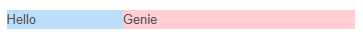
[
    row([
        column(span("Hello"), size = 2, class = "bg-blue-2"),
        column(span("Genie"), size = 4, class = "bg-red-2"),
    ]),
]
<div class="row">
<div class="bg-blue-2 column col-2">
Hello
</div>
<div class="bg-red-2 column col-4">
Genie
</div>
</div>Date field
Date field

Show the code
-
JULIA
-
HTML
datefield(
    "Start date",
    :Datefield_start_date,
    datepicker_props = Dict(:todaybtn => true, :nounset => true),
    textfield_props = Dict(:bgcolor => "green-1"),
)
Reactive code
@app begin
    @in Datefield_start_date = today()
end
<q-input filled="" label="Start date" v-model="Datefield_start_date" clearable="" bg-color="green-1">
<q-icon name="event" class="cursor-pointer" style="height: 100%;">
<q-popup-proxy cover="" transition-show="scale" transition-hide="scale">
<q-date today-btn="" v-model="Datefield_start_date" no-unset="" mask="YYYY-MM-DD"></q-date>
</q-popup-proxy>
</q-icon>
</q-input>Programmatic use
datefield(args...; kwargs...)A complex type of input that combines a text field with an icon, a date picker, and a pop-up window. The date selector is hidden by default and is displayed when the icon is clicked. The popup window is used to hide the date picker when the user clicks outside of it. A number of common arguments are defined that are passed to a text field, icon, pop-up window, and date selector. In addition, keyword arguments can be passed to each of these components individually using keyword arguments. textfield_props, icon_props, popup_proxy_props and datepicker_props.
Examples:
datefield(
"Start date",
:start_date,
datepicker_props = Dict(:todaybtn => true, :nounset => true),
textfield_props = Dict(:bgcolor => "green-1"),
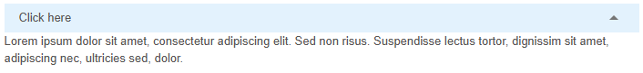
)Expansion
Extension
Show the code
-
JULIA
-
HTML
[
    expansionitem(
        label = "Click here",
        dense = true,
        var"dense-toggle" = true,
        var"expand-separator" = true,
        var"header-class" = "bg-blue-1",
        p(
            "Lorem ipsum dolor sit amet, consectetur adipiscing elit. Sed non risus. Suspendisse lectus tortor, dignissim sit amet, adipiscing nec, ultricies sed, dolor.",
        ),
    ),
]
<q-expansion-item expand-separator="" label="Click here" dense="" header-class="bg-blue-1" dense-toggle="">
<p>
Lorem ipsum dolor sit amet, consectetur adipiscing elit. Sed non risus. Suspendisse lectus tortor, dignissim sit amet, adipiscing nec, ultricies sed, dolor.
</p>
</q-expansion-item>Programmatic use
expansionitem(args...; kwargs...)The "extension" component allows you to hide content that is not directly related to the user. Think of it as accordion elements that open when you click on them. It is also called collapsible.
In fact, these are components of elements endowed with additional functionality. Thus, they can be included in the list and inherit the properties of the element’s components.
Examples:
-
Model:
julia > @vars ExpansionModel begin dummy::R{Bool} = true end -
View:
julia > list(
    bordered = true,
    class = "rounded-borders",
    [
        expansionitem(
            expandseparator = true,
            icon = "perm_identity",
            label = "Account settings",
            caption = "John Doe",
            [
                card([
                    cardsection(
                        "Lorem ipsum dolor sit amet, consectetur adipisicing elit. Quidem, eius reprehenderit eos corrupti
            commodi magni quaerat ex numquam, dolorum officiis modi facere maiores architecto suscipit iste
            eveniet doloribus ullam aliquid.",
                    ),
                ]),
            ],
        ),
        expansionitem(
            expandseparator = true,
            icon = "signal_wifi_off",
            label = "Wifi settings",
            [
                card([
                    cardsection(
                        "Lorem ipsum dolor sit amet, consectetur adipisicing elit. Quidem, eius reprehenderit eos corrupti
            commodi magni quaerat ex numquam, dolorum officiis modi facere maiores architecto suscipit iste
            eveniet doloribus ullam aliquid.",
                    ),
                ]),
            ],
        ),
        expansionitem(
            expandseparator = true,
            icon = "drafts",
            label = "Drafts",
            [
                card([
                    cardsection(
                        "Lorem ipsum dolor sit amet, consectetur adipisicing elit. Quidem, eius reprehenderit eos corrupti
            commodi magni quaerat ex numquam, dolorum officiis modi facere maiores architecto suscipit iste
            eveniet doloribus ullam aliquid.",
                    ),
                ]),
            ],
        ),
    ],
)
Arguments
-
Behaviour
-
duration::Int— animation duration (in milliseconds). Example:duration="1000". -
default-opened::Bool— expand the default element during the first rendering. Redefined by the model (ReactiveModel), if it is in use. -
expandiconrotategc::Bool— apply expansion events only to the disclosure icon, and not to the entire header of the element. -
group::String— registers an item in the disclosure group. All the items in the group must have the same group name. It is used to create behavior in the accordion style. Example:my-emails. -
popup::Bool— display a drop-down list in the "popup" mode.
-
-
Content
-
icon::String— the name of the icon according to the Quasar conventions. If the icon library is not installed, use the prefiximg:. If the value isnone, the icon is not drawn (but the space under it takes up space). Examples:map,ion-add,img:https://cdn.quasar.dev/logo/svg/quasar-logo.svg,img:path/to/some_image.png. -
expandicon::String— the name of the icon for the "expand" status. The requirements are similar to the usual onesicon:. It only works whenexpandsonitem = false. -
expandedicon::String— the name of the icon for the "collapse" state. The requirements are the same as forexpandicon:. Using it disables the animation of the icon rotation. -
label::Union{String,Symbol}— header label. -
labellines::Union{Int,String}— crop by the number of lines if the text does not fit. If you specify more than 1 line, it only works in WebKit-based browsers (due to-webkit-line-clamp). Example:labellines="2". -
caption::String— subtitle (header sub-label). Example:Unread message: 5. -
captionlines::Union{Int,String}— trim the subtitle by the number of lines (similarlylabellines). -
headerinsetlevel::Int— apply indentation at the header level (except when using a slotheader). Useful if the avatar is missing, but you need a leveling padding. Example:headerinsetlevel="1". -
contentinsetlevel::Int— apply indentation to the content part. Example:contentinsetlevel="1". -
expandseparator::Bool— add a separator between the title and the content (as a visual delimiter).
-
-
Condition
-
disable::Bool— disable the component (disabled mode).
-
-
Style
-
expand-icon-class::Union{Vector,String,Dict}— apply custom CSS classes to the disclosure icon. Example:text-purple. -
dark::Bool— indicate to the component that the background of the page is dark. -
dense::Bool— Compact mode, takes up less vertical space. -
densetoggle::Bool— Apply compact mode only to the disclosure icon. -
headerstyle::Union{Vector,String,Dict}— apply custom styles to the component header. Example:'#ff0000' headerstyle=opts( backgroundColor: "#ff0000").
-
Footer
Footer

Show the code
-
JULIA
-
HTML
footer("Genie app footer", class = "bg-blue-1")<footer class="bg-blue-1">
Genie app footer
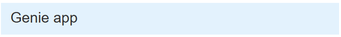
</footer>Headlines
Headlines
Show the code
-
JULIA
-
HTML
heading("Genie app", class = "bg-blue-1")<header class="bg-blue-1 st-header q-pa-sm">
<h1 class="st-header__title text-h3">
Genie app
</h1>
</header>Icon
Icon
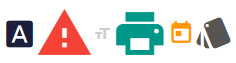
Show the code
-
JULIA
-
HTML
[
    icon("font_download", class = "text-primary", style = "font-size: 32px;")
    icon("warning", class = "text-red", style = "font-size:4rem;")
    icon("format_size", style = "color: #ccc; font-size: 1.4em;")
    icon("print", class = "text-teal", style = "font-size: 4.4em;")
    icon("today", class = "text-orange", style = "font-size: 2em;")
    icon("style", style = "font-size: 3em;")
]
<q-icon name="font_download" class="text-primary" style="font-size: 32px;"></q-icon>
<q-icon name="warning" class="text-red" style="font-size:4rem;"></q-icon>
<q-icon name="format_size" style="color: #ccc; font-size: 1.4em;"></q-icon>
<q-icon name="print" class="text-teal" style="font-size: 4.4em;"></q-icon>
<q-icon name="today" class="text-orange" style="font-size: 2em;"></q-icon>
<q-icon name="style" style="font-size: 3em;"></q-icon>Programmatic use
icon(
    name::Union{String,Symbol},
    args...;
    content::Union{String,Vector,Function} = "",
    kwargs...,
)
Stipple supports by default: Material Icons, Font Awesome, Ionicons, MDI, Eva Icons, Themify Icons, Line Awesome and Bootstrap Icons.
In addition, you can add support yourself for any icon library.
Examples:
-
View:
julia > icon("font_download", class = "text-primary", style = "font-size: 32px;")
julia > icon("warning", class = "text-red", style = "font-size:4rem;")
julia > icon("format_size", style = "color: #ccc; font-size: 1.4em;")
julia > icon("print", class = "text-teal", style = "font-size: 4.4em;")
julia > icon("today", class = "text-orange", style = "font-size: 2em;")
julia > icon("style", style = "font-size: 3em;")
Arguments
-
Content
-
tag::String— An HTML tag that will be used to render the icon if the icon itself is not specified or an SVG icon is used. Examples:div,i. -
left::Bool— used when the icon is positioned to the left of the text/content; adds a standard indentation to the right of the icon. -
right::Bool— used when the icon is positioned to the right of the text/content; adds a standard indentation to the left of the icon.
-
-
Model
-
name::String— icon name. It is necessary that the icon library is installed (if the prefix is not usedimg:). If you specify the value"none", the icon will not be rendered (but the space for it will remain reserved). Examples:map,ion-add,img:https://cdn.quasar.dev/logo/svg/quasar-logo.svg,img:path/to/some_image.png.
-
-
Style
-
size::String— size in CSS units (indicating the unit of measurement) or one of the standard size names. Examples:16px,2rem,xs,md. -
color::String— the color name of the component from the Quasar palette. Examples:primary,teal-10.
-
Image
Image
Show the code
-
JULIA
-
HTML
imageview(
    src = "https://learn.genieframework.com/assets/docs/guides/intro/genieframeworkdiagram.svg",
    style = "height: 200px; width: 200px",
)
<q-img src="https://learn.genieframework.com/assets/docs/guides/intro/genieframeworkdiagram.svg" style="height: 200px; width: 200px"></q-img>Image with caption
Show the code
-
JULIA
-
HTML
imageview(
    src = "https://learn.genieframework.com/assets/docs/guides/intro/genieframeworkdiagram.svg",
    Html.div(class = "absolute-bottom text-subtitle1 text-center", "Caption"),
    style = "height: 250px; width: 250px",
)
<q-img src="https://learn.genieframework.com/assets/docs/guides/intro/genieframeworkdiagram.svg" style="height: 250px; width: 250px">
<div class="absolute-bottom text-subtitle1 text-center">
Caption
</div>
</q-img>Programmatic use
imageview(args...; kwargs...)Component imageview It simplifies working with images (of any format), and also adds a pleasant loading effect and many other features (for example, the ability to set the aspect ratio).
Examples:
-
Model:
julia > @vars Model begin url::R{String} = "https://placeimg.com/500/300/nature" end -
View:
julia >
imageview(src = :url, spinnercolor = "white", style = "height: 140px; max-width: 150px")
julia > imageview(
    src = :url,
    style = "height: 140px; max-width: 150px",
    [
        template(
            "",
            "v-slot:loading",
            [spinner(:gears, color = "white", wrap = StippleUI.NO_WRAPPER)],
        ),
    ],
)
Arguments
-
Behaviour
-
transition::String— the name of the animation (one of the embedded). Examples:fade,slide-down. -
nativecontextmenu::Bool— enables the native browser context menu for the image.
-
-
Content
-
ratio::Union{String,Int}— forced compliance with the aspect ratio. Examples:"4/3","16/9",1. -
alt::String— alternative text displayed if the image cannot be loaded. -
basic::Bool— disables animations and transitions; works faster. -
contain::Bool— ensures that the image fits completely into the display area (even if there are empty margins around the edges).
-
-
Model
-
src::String— the path to the image. Examples:src="img/something.png"(from a public folder);src="assets/my-img.gif"(from assets);src="https://placeimg.com/500/300/nature"(URL). -
srcset::String— a set of image options for different resolutions. Examples:elva-fairy-320w.jpg 320w, elva-fairy-480w.jpg 480w. -
sizes::String— CSS image selection criteria. Examples:(max-width: 320px) 280px, (max-width: 480px) 440px, 800px. -
width::String— fixed image width (in px or %). Example:280px,70%. -
height::String— fixed image height. Example:300px. -
placeholdersrc::String— static displayed before the image is uploaded. Example:src="assets/my-img.gif"src="https://placeimg.com/500/300/nature"(URL).
-
-
Style
-
color::String— the color theme of the component from Quasar palettes. Example:primary,teal-10. -
imgclass::Union{Vector,String,Dict}— additional CSS classes for the image container. Example:imgclass! = { 'my-special-class': <condition> }. -
imgstyle::Dict— CSS styles for the image container. Example:imgstyle="{transform: 'rotate(45deg)'}". -
spinnercolor::String— the color of the loading indicator (if used). Example:primary,teal-10. -
spinnersize::String— the size of the loading indicator (it works in the absence of its own loader slot). Example:16px,2rem.
-
Text input
Text input

Show the code
-
JULIA
-
HTML
textfield(
    "Label",
    :Text_text,
    bottomslots = "",
    counter = "",
    maxlength = "12",
    dense = "",
    [
        template(
            var"v-slot:append" = "",
            [
                icon(
                    "close",
                    @iif("Text_text !== ''"),
                    @click("Text_text = ''"),
                    class = "cursor-pointer",
                ),
            ],
        ),
    ],
)
Reactive code
@app begin
    @in Text_text = ""
    @onchange Text_text begin
        println(Text_text)
    end
end
<q-input maxlength="12" bottom-slots="" label="Label" v-model="Text_text" counter="" dense="">
<template v-slot:append="">
<q-icon name="close" v-if="Text_text !== ''" v-on:click="Text_text = ''" class="cursor-pointer"></q-icon>
</template>
</q-input>Text input mask
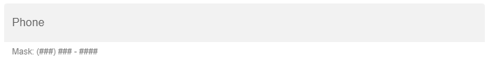
Show the code
-
JULIA
-
HTML
textfield(
    "Phone",
    :TextMask_phone,
    filled = "",
    mask = "(###) ### - ####",
    hint = "Mask: (###) ### - ####",
)
Reactive code
@app begin
    @in TextMask_phone = ""
end
<q-input filled="" hint="Mask: (###) ### - ####" label="Phone" v-model="TextMask_phone" mask="(###) ### - ####"></q-input>Checking the correctness of text input

Show the code
-
JULIA
-
HTML
textfield(
    "Required Field",
    :TextValidation_text,
    ref = "inputRef",
    filled = "",
    var":rules" = "[ val => val.length <= 3 || 'Please use maximum 3 characters']",
)
Reactive code
@app begin
    @in TextValidation_text = ""
end
<q-input filled="" label="Required Field" v-model="TextValidation_text" :rules="[ val => val.length <= 3 || 'Please use maximum 3 characters']" ref="inputRef"></q-input>Programmatic use
textfield(fieldname, args...; kwargs...)Examples:
-
Model:
julia > @vars TextField begin name::R{String} = "" end -
View:
julia > textfield(
    "What's your name *",
    :name,
    name = "name",
    @if(:warin),
    :filled,
    hint = "Name and surname",
    "lazy-rules",
    rules = "[val => val && val.length > 0 || 'Please type something']",
)
Arguments
-
General properties
-
type::String— field type. Maybe one of the:text(by default),textarea,email,tel,number,password,url. It also affects which keyboard will be displayed on mobile devices.
-
-
Behaviour
-
name::String— the name of the component. Useful when working with forms. If not specified, the value is takenforif it exists. Example:car_id. -
mask::String— an input mask or one of the predefined mask values (for example,date,datetime,fulltime,phone,card). -
fillmask::Union{Bool,String}— whether to fill the mask with special characters (or use a value string instead ofBool). Example:true,"0_*". -
reversefillmask::Bool— fill in the mask from right to left. Example: for a mask of monetary values. -
unmaskedvalue::Bool— if enabled, the model will receive the value without the mask’s service characters. -
error::Bool— whether the field has an error. -
rules::Vector— a set of validation rules. If the element is a string, it must match the name of the built—in rule. Example:rules = ["fulltime", val → length(val) < 3 || "Maximum 3 characters"]. -
reactiverules::Bool— iftruethe rules are checked every time the model is updated. It is disabled by default (for the sake of performance). -
lazyrules::Union{Bool,String}— iftruevalidation is performed only after the first loss of focus. If"ondemand", then the rules are checked only manually. -
loading::Bool— display the loading indicator; can be configured through the slotloading. -
clearable::Bool— shows the cleaning icon if the value is notundefinedornull. -
autofocus::Bool— Automatically focus the field after the display. -
for::String— setsidthe component and binds to it<label>. Ifnameif not specified, then this value is also used forname.
-
-
Content
-
errormessage::String— validation error text (displayed iferror=true). Example:Username must have at least 5 characters. -
noerroricon::Bool— hide the error icon. -
label::Union{String,Symbol}— the text of the field header. -
stacklabel::Bool— the title is always fixed above the field, even if it is empty. -
hint::String— explanatory text under the field. -
hidehint::Bool— hide the hint if the field is out of focus and does not haveerror. -
prefix::String— prefix before the input text (for example,$). -
suffix::String— a suffix after the text (for example,@gmail.com). -
loading::Bool— display of the loading indicator (if the slot isloadingnot used). -
clearicon::String— cleaning icon; if not specified, the default value is used. -
labelslot::Bool— iftrue, instead oflabelThe slot is being usedlabel. -
bottomslots::Bool— includes the bottom slot (errors, hints, counter).
-
-
Condition
-
disable::Bool— disables the field. -
readonly::Bool— makes the field read-only.
-
-
Style
-
labelcolor::String— header color (different fromcolorbecause it always works, even when the field is out of focus). Example:primary. -
color::String— field color from Quasar palettes. Example:teal-10. -
dark::Bool— the background is dark. -
filled::Bool— field "fill" style. -
outline::Bool— the style of the "contour" field. -
standout::Union{Bool,String}— the style of the highlighted field. -
borderless::Bool— Unframed style. -
hidebottomspace::Bool— remove the backup space for errors/hints/counter. -
rounded::Bool— slight rounding of the corners. -
square::Bool— remove the rounding, completely square style. -
dense::Bool— Compact version, takes up less space. -
itemalign::Union{Vector,String,Dict}— alignment of the content. -
inputclass::Union{Vector,String,Dict}— CSS classes for<input>. -
inputstyle::Union{Vector,String,Dict}— styles<input>For example:inputstyle = "{ backgroundColor: '#ff0000' }".
-
-
Model
-
debounce::Union{String,Int}— model update delay in milliseconds. Example:500. -
maxlength::Union{String,Int}— maximum string length. Example:12.
-
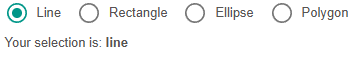
Switch
Switch

Show the code
-
JULIA
-
HTML
Stipple.Html.div(
    class = "q-pa-md",
    [
        Stipple.Html.div(
            class = "q-gutter-sm",
            [
                radio("Line", :Radio_shape, val = "line"),
                radio("Rectangle", :Radio_shape, val = "rectangle"),
                radio("Ellipse", :Radio_shape, val = "ellipse"),
                radio("Polygon", :Radio_shape, val = "polygon"),
            ],
        ),
        Stipple.Html.div(
            class = "q-px-sm",
            ["Your selection is: ", strong("{{Radio_shape }}")],
        ),
    ],
)
Reactive code
@app begin
    @in Radio_shape = "line"
end
<div class="q-pa-md">
<div class="q-gutter-sm">
<q-radio val="line" label="Line" v-model="Radio_shape"></q-radio>
<q-radio val="rectangle" label="Rectangle" v-model="Radio_shape"></q-radio>
<q-radio val="ellipse" label="Ellipse" v-model="Radio_shape"></q-radio>
<q-radio val="polygon" label="Polygon" v-model="Radio_shape"></q-radio>
</div>
<div class="q-px-sm">
Your selection is:
<strong>
{{Radio_shape }}
</strong>
</div>
</div>Color switch
Show the code
-
JULIA
-
HTML
Stipple.Html.div(
    class = "q-pa-md",
    [
        Stipple.Html.div(
            class = "q-gutter-sm",
            [
                radio("Line", :RadioColor_shape, val = "line", color = "teal"),
                radio("Rectangle", :RadioColor_shape, val = "rectangle", color = "orange"),
                radio("Ellipse", :RadioColor_shape, val = "ellipse", color = "red"),
                radio("Polygon", :RadioColor_shape, val = "polygon", color = "blue"),
            ],
        ),
        Stipple.Html.div(
            class = "q-px-sm",
            ["Your selection is: ", strong("{{RadioColor_shape }}")],
        ),
    ],
)
Reactive code
@app begin
    @in RadioColor_shape = "line"
end
<div class="q-pa-md">
<div class="q-gutter-sm">
<q-radio color="teal" val="line" label="Line" v-model="RadioColor_shape"></q-radio>
<q-radio color="orange" val="rectangle" label="Rectangle" v-model="RadioColor_shape"></q-radio>
<q-radio color="red" val="ellipse" label="Ellipse" v-model="RadioColor_shape"></q-radio>
<q-radio color="blue" val="polygon" label="Polygon" v-model="RadioColor_shape"></q-radio>
</div>
<div class="q-px-sm">
Your selection is:
<strong>
{{RadioColor_shape }}
</strong>
</div>
</div>Programmatic use
radio(
    label::AbstractString = "",
    fieldname::Union{Symbol,Nothing} = nothing,
    args...;
    kwargs...,
)
The switch component is another basic element for user input. You can use it to give the user the option to select an option from multiple options.
Examples:
-
Model:
julia > @vars RadioModel begin shape::R{String} = "line" end -
View:
julia > radio("Line", :shape, val = "line")
julia > radio("Rectangle", :shape, val = "rectange")
julia > radio("Ellipse", :shape, val = "ellipse")
julia > radio("Polygon", :shape, val = "polygon")
Arguments
-
Behaviour
-
name::String— the name of the control; useful when working with forms that are sent directly to the URL. Example:car_id. -
keep-color::Bool— whether to keep the color (if set) when the checkbox is removed.
-
-
General
-
tabindex::Union{Int, String}— the value of the HTML attributetabindex.
-
-
Model
-
fieldname::Symbol— the name of the variable to which the binding is performed.
-
-
Mark
-
label::AbstractString— the label text. -
leftlabel::Bool— if specified, the label is displayed to the left of the checkbox.
-
-
Condition
-
disable::Bool— puts the component in the "unavailable" state.
-
-
Style
-
size::String— size in CSS units or standard size names (xs|sm|md|lg|xl). Example:16px,2rem,xs,md. -
color::String— the color of the component from the Quasar palette. Example:primary,teal-10. -
dark::Bool— informs the component that a dark background is being used. -
dense::Bool— compact mode that reduces vertical margins.
-
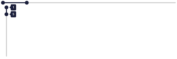
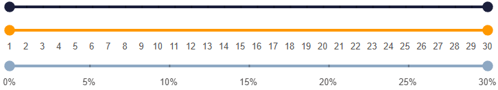
Range
Range
Show the code
-
JULIA
-
HTML
[
    range(1:1:30, :Range_r, label = true),
    range(1:1:30, :Range_r, vertical = true, labelalways = true),
]
Reactive code
@app begin
    @in Range_r = RangeData(1:5)
end
<q-range :min="1" v-model="Range_r" label="" :max="30" :step="1"></q-range>
<q-range vertical="" :min="1" v-model="Range_r" :max="30" label-always="" :step="1"></q-range>Range with markers
Show the code
-
JULIA
-
HTML
[
    range(1:1:30, :Range_Markers_r, markers = true, label = true),
    range(1:1:30, :Range_Markers_r, var"marker-labels" = true, color = "orange"),
    range(
        0:5:30,
        :Range_Markers_r,
        markers = true,
        var":marker-labels" = "Range_Markers_labels",
        color = "secondary",
    ),
]
Reactive code
@app begin
    @in Range_Markers_r = RangeData(0:30)
    @out Range_Markers_labels =
        [Dict(:value => i, :label => string(i) * "%") for i = 0:5:30]
end
<q-range :min="1" v-model="Range_Markers_r" label="" :max="30" markers="" :step="1"></q-range>
<q-range color="orange" :min="1" marker-labels="" v-model="Range_Markers_r" :max="30" :step="1"></q-range>
<q-range color="secondary" :marker-labels="Range_Markers_labels" :min="0" v-model="Range_Markers_r" :max="30" markers="" :step="5"></q-range>Programmatic use
range(start, stop, length)
range(start, stop; length, step)
range(start; length, stop, step)
range(; start, length, stop, step)
Create a specialized array with evenly spaced elements and optimized storage (AbstractRange) of the arguments. Mathematically, the range is uniquely determined by any three parameters: start, step, stop and length. Acceptable range parameters are:
-
A call range with any three parameters
start,step,stop,length. -
A call range with two parameters
start,stop,length. In this case, the step will be assumed to be one. If both arguments are integers, it will be returned UnitRange. -
A call range with one of the values
stoporlength. It is assumed that the values ofstartandstepequal to one.
Examples:
julia > range(1, length = 100)
1:100

julia > range(1, stop = 100)
1:100

julia > range(1, step = 5, length = 100)
1:5:496

julia > range(1, step = 5, stop = 100)
1:5:96

julia > range(1, 10, length = 101)
1.0:0.09:10.0

julia > range(1, 100, step = 5)
1:5:96

julia > range(stop = 10, length = 5)
6:10

julia > range(stop = 10, step = 1, length = 5)
6:1:10

julia > range(start = 1, step = 1, stop = 10)
1:1:10

julia > range(; length = 10)
Base.OneTo(10)

julia > range(; stop = 6)
Base.OneTo(6)

julia > range(; stop = 6.5)
1.0:1.0:6.0
If length not specified and stop - start is not an integer multiple of step, then a range will be created that ends before stop.
julia > range(1, 3.5, step = 2)
1.0:2.0:3.0
Special attention is paid to the rational calculation of intermediate values. To avoid such overhead costs, contact the designer. LinRange.
|
Additional help:
Function range returns Base.OneTo when the arguments are integers and:
-
Specified only
length; -
Specified only
stop.
Function range returns UnitRange when the arguments are integers and:
-
Only specified
startandstop; -
Specified
lengthandstop.
UnitRange is not created if the parameter is specified step, even if the step is one.
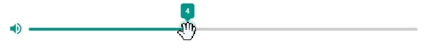
Slider
Slider

Show the code
-
JULIA
-
HTML
slider(1:1:10, :Slider_volume)Reactive code
@app begin
    @in Slider_volume = 4
end
<q-slider :min="1" v-model="Slider_volume" :max="10" :step="1"></q-slider>Slider with icon
Show the code
-
JULIA
-
HTML
item([
    itemsection(avatar = "", icon("volume_up", color = "teal")),
    itemsection(slider(0:1:10, :SliderIcon_volume, label = "", color = "teal")),
])
Reactive code
@app begin
    @in SliderIcon_volume = 4
end
<q-item>
<q-item-section avatar="">
<q-icon color="teal" name="volume_up"></q-icon>
</q-item-section>
<q-item-section>
<q-slider color="teal" :min="0" v-model="SliderIcon_volume" label="" :max="10" :step="1"></q-slider>
</q-item-section>
</q-item>Programmatic use
slider(
    range::AbstractRange{<:Union{Symbol,String,Real}},
    fieldname::Union{Symbol,Nothing} = nothing,
    args...;
    lazy = false,
    kwargs...,
)
The slider is a great way for the user to set a numeric value between the minimum and maximum value, with optional steps between acceptable values. The slider is also equipped with a focus indicator (dedicated slider button), which allows you to adjust the position of the slider using the keyboard.
Examples:
-
View:
julia > slider(1:5:100)
Arguments
-
Behaviour
-
name::String— the name of the control. It is useful when working with forms that are sent directly by URL. Example:car_id. -
snap::Bool— "sticking" the slider to acceptable values instead of moving freely. It is recommended to use it in conjunction with the parameterstep. -
reverse::Bool— enables the reverse direction of the slider (inversion). -
vertical::Bool— displays the slider in the vertical direction. -
labelalways::Bool— always display the item’s signature.
-
-
Content
-
label::Bool— Pop-up caption displayed when the slider is clicked/touched and moved. -
markers::Union{Bool, Int}— Display markers on the scale. You can show a marker for each possible model value or specify a step using a number. Example:markers="5". -
dragrange::Bool— The user can move the entire range, not just individual sliders. -
dragonlyrange::Bool— The user can move only the range, but not the individual sliders.
-
-
General
-
tabindex::Union{Int, String}— the value of the HTML attributetabindex. Example:100.
-
-
Signatures
-
labelcolorleft::String— the background color of the left caption from the Quasar color palette. Example:primary,teal-10. -
labeltextcolorleft::String— the color of the text of the left caption from the Quasar color palette. -
labelcolorright::String— the background color of the right caption from the Quasar color palette. -
labeltextcolorright::String— the color of the text of the right caption from the Quasar color palette. -
labelvalueleft::Union{String, Int}— redefines the signature for the minimum value. Example:model.min + "px". -
labelvalueright::Union{String, Int}— redefines the signature for the maximum value. Example:model.max + "px".
-
-
Model
-
range::AbstractRange{T}— the range of values available for selection. The format is usedmin:step:max. You can also use characters or strings to refer to the model fields. Example:range="1:2:max"myvalue. -
lazy::Bool— if installed intrue, the model value is updated only after releasing the slider.
-
-
Condition
-
disable::Bool— puts the component in a disabled state (unavailable for interaction). -
readonly::Bool— switches the component to read-only mode.
-
-
Style
-
color::String— the main color of the component from the Quasar color palette. Example:primary,teal-10. -
labelcolor::String— the color of the signature from the Quasar color palette. -
thumbpath::String— the path to the image for the custom slider. Example:M5 5 h10 v10 h-10 v-10. -
dark::Bool— indicates that the component is used on a dark background. -
dense::Bool— Compact display mode (takes up less space).
-
Tabs
Tabs

Show the code
-
JULIA
-
HTML
[
    tabgroup(
        :tab_selected,
        inlinelabel = true,
        class = "bg-primary text-white shadow-2",
        [
            tab(name = "photos", icon = "photos", label = "Photos"),
            tab(name = "videos", icon = "slow_motion_video", label = "Videos"),
            tab(name = "movies", icon = "movie", label = "Movies"),
        ],
    ),
    tabpanels(
        :tab_selected,
        animated = true,
        var"transition-prev" = "scale",
        var"transition-next" = "scale",
        [
            tabpanel(name = "photos", [p("Photos content")]),
            tabpanel(name = "videos", [p("Videos content")]),
            tabpanel(name = "movies", [p("Movies content")]),
        ],
    ),
]
Reactive code
@app begin
    @in tab_selected = "photos"
end
<q-tabs inline-label="" v-model="tab_selected" class="bg-primary text-white shadow-2">
<q-tab name="photos" icon="photos" label="Photos"></q-tab>
<q-tab name="videos" icon="slow_motion_video" label="Videos"></q-tab>
<q-tab name="movies" icon="movie" label="Movies"></q-tab>
</q-tabs>
<q-tab-panels transition-prev="scale" v-model="tab_selected" transition-next="scale" animated="">
<q-tab-panel name="photos">
<p>
Photos content
</p>
</q-tab-panel>
<q-tab-panel name="videos">
<p>
Videos content
</p>
</q-tab-panel>
<q-tab-panel name="movies">
<p>
Movies content
</p>
</q-tab-panel>
</q-tab-panels>Programmatic use
tabgroup(fieldname::Union{Symbol,Nothing} = nothing, args...; kwargs...)The tabs component is a convenient way to display the menu. It fits very well with the drop-down list, but is by no means limited to it.
Examples:
-
Model:
julia > @vars TabModel begin tab_m::R{String} = "tab" end -
View:
julia > tabgroup(
    :tab_m,
    inlinelabel = true,
    class = "bg-primary text-white shadow-2",
    [
        tab(name = "photos", icon = "photos", label = "Photos"),
        tab(name = "videos", icon = "slow_motion_video", label = "Videos"),
        tab(name = "movies", icon = "movie", label = "Movies"),
    ],
)
Arguments
-
Behaviour
-
target::Union{Bool, String}— breakpoint in pixels, at which the tab container automatically switches to alignment modejustify. Default value:600. Example:breakpoint != "500".
-
-
Content
-
vertical::Bool— vertical tab display (tabs are placed under each other, not horizontally). -
outsiderarrows::Bool— reserves space for the scroll arrows at the edges of the tabs (the arrows become translucent when inactive). -
mobilearrows::Bool— force the scroll arrows to display on mobile devices. -
align::String— horizontal alignment of tabs inside the container. Acceptable values:left,center,right,justify. Default value:center. Example:align = "right". -
breakpoint::Union{Int, String}— the width of the tab container (in pixels), at which the tabs automatically switch to the modejustify. Default value:600. Example:breakpoint != "500". -
lefticon::String— the name of the icon to replace the standard left scroll arrow used when tabs overflow. Example:arrow_left. -
righticon::String— the name of the icon to replace the standard right scroll arrow used when tabs overflow. Example:arrow_right. -
stretch::Bool— when used in a flex container, tabs stretch to the height of the parent. -
shrink::Bool— by default, tabs are stretched to the available width. When this option is enabled, the tabs stop stretching. Useful and sometimes necessary when placing tabs intoolbar. -
switchindicator::Bool— switches the position of the active tab indicator (on the left — for vertical mode, on the top — for horizontal). -
narrowindicator::Bool— makes the indicator the width of the tab content (text or icon), rather than the entire width of the tab. -
inlinelabel::Bool— the text of the tab is displayed in one line with the icon (if it is used). -
nocaps::Bool— disables automatic conversion of tab text to uppercase (by default, all tabs are displayed in capital letters).
-
-
Style
-
activeclass::String— CSS class applied to the active tab. -
activecolor::String— the text color of the active tab from the Color Palette. Examples:teal-10,primary. -
activebgcolor::String— the background color of the active tab. Examples:teal-10,primary. -
indicatorcolor::String— the color of the indicator (underline) of the active tab. Examples:teal-10,primary. -
contentclass::String— CSS class applied to the tab content container. -
dense::Bool— Compact display mode (takes up less space).
-
Tables
Table
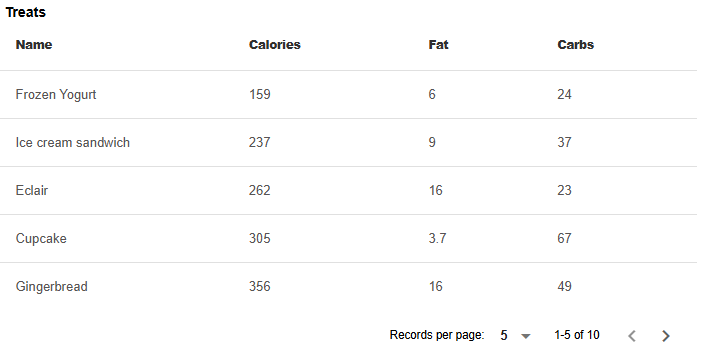
Show the code
-
JULIA
-
HTML
table(:Table_data, flat = true, bordered = true, title = "Treats")Reactive code
@app begin
    @out Table_data = DataTable(
        DataFrame(
            name = [
                "Frozen Yogurt",
                "Ice cream sandwich",
                "Eclair",
                "Cupcake",
                "Gingerbread",
                "Jelly bean",
                "Lollipop",
                "Honeycomb",
                "Donut",
                "KitKat",
            ],
            calories = [159, 237, 262, 305, 356, 375, 392, 408, 452, 518],
            fat = [6.0, 9.0, 16.0, 3.7, 16.0, 0.0, 0.2, 3.2, 25.0, 26.0],
            carbs = [24, 37, 23, 67, 49, 94, 98, 87, 51, 65],
        ),
    )
end
<q-table flat="" bordered="" :columns="Table_data.columns" v-model="Table_data" title="Treats" :data="Table_data.data" row-key="__id"></q-table>Pagination of the table
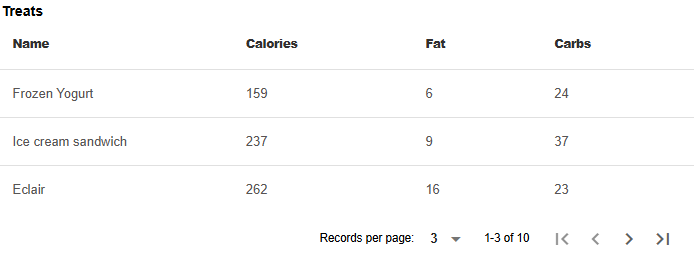
Show the code
-
JULIA
-
HTML
table(
    :TablePagination_data,
    pagination = :TablePagination_tpagination,
    flat = true,
    bordered = true,
    title = "Treats",
)
Reactive code
@app begin
    @out TablePagination_data = DataTable(
        DataFrame(
            name = [
                "Frozen Yogurt",
                "Ice cream sandwich",
                "Eclair",
                "Cupcake",
                "Gingerbread",
                "Jelly bean",
                "Lollipop",
                "Honeycomb",
                "Donut",
                "KitKat",
            ],
            calories = [159, 237, 262, 305, 356, 375, 392, 408, 452, 518],
            fat = [6.0, 9.0, 16.0, 3.7, 16.0, 0.0, 0.2, 3.2, 25.0, 26.0],
            carbs = [24, 37, 23, 67, 49, 94, 98, 87, 51, 65],
        ),
    )
    @in TablePagination_tpagination = DataTablePagination(rows_per_page = 3)
end
<q-table flat="" bordered="" :pagination="TablePagination_tpagination" :columns="TablePagination_data.columns" v-model="TablePagination_data" title="Treats" :data="TablePagination_data.data" row-key="__id"></q-table>The table with the search
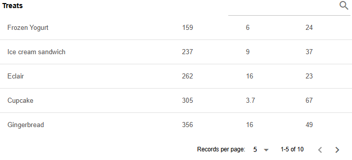
Show the code
-
JULIA
-
HTML
table(
    :TableSearch_data,
    flat = true,
    bordered = true,
    title = "Treats",
    var"row-key" = "name",
    filter = :TableSearch_dfilter,
    hideheader = "",
    template(
        var"v-slot:top-right" = "",
        textfield(
            "",
            :TableSearch_dfilter,
            dense = true,
            debounce = "300",
            placeholder = "Search",
            [template(var"v-slot:append" = true, icon("search"))],
        ),
    ),
)
Reactive code
@app begin
    @out TableSearch_data = DataTable(
        DataFrame(
            name = [
                "Frozen Yogurt",
                "Ice cream sandwich",
                "Eclair",
                "Cupcake",
                "Gingerbread",
                "Jelly bean",
                "Lollipop",
                "Honeycomb",
                "Donut",
                "KitKat",
            ],
            calories = [159, 237, 262, 305, 356, 375, 392, 408, 452, 518],
            fat = [6.0, 9.0, 16.0, 3.7, 16.0, 0.0, 0.2, 3.2, 25.0, 26.0],
            carbs = [24, 37, 23, 67, 49, 94, 98, 87, 51, 65],
        ),
    )
    @in TableSearch_dfilter = ""
end
<q-table flat="" bordered="" :columns="TableSearch_data.columns" v-model="TableSearch_data" title="Treats" hide-header="" :data="TableSearch_data.data" :filter="TableSearch_dfilter" row-key="name">
<template v-slot:top-right="">
<q-input debounce="300" label="" v-model="TableSearch_dfilter" placeholder="Search" dense="">
<template v-slot:append="">
<q-icon name="search"></q-icon>
</template>
</q-input>
</template>
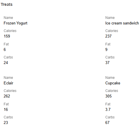
</q-table>Grid layout of the table
Show the code
-
JULIA
-
HTML
table(:TableGrid_data, flat = true, bordered = true, grid = true, title = "Treats")Reactive code
@app begin
    @out TableGrid_data = DataTable(
        DataFrame(
            name = [
                "Frozen Yogurt",
                "Ice cream sandwich",
                "Eclair",
                "Cupcake",
                "Gingerbread",
                "Jelly bean",
                "Lollipop",
                "Honeycomb",
                "Donut",
                "KitKat",
            ],
            calories = [159, 237, 262, 305, 356, 375, 392, 408, 452, 518],
            fat = [6.0, 9.0, 16.0, 3.7, 16.0, 0.0, 0.2, 3.2, 25.0, 26.0],
            carbs = [24, 37, 23, 67, 49, 94, 98, 87, 51, 65],
        ),
    )
end
<q-table flat="" bordered="" grid="" :columns="TableGrid_data.columns" v-model="TableGrid_data" title="Treats" :data="TableGrid_data.data" row-key="__id"></q-table>Programmatic use
table(fieldname::Symbol, args...; kwargs...)Examples:
-
Model:
julia > @vars TableModel begin data::R{DataTable} = DataTable( DataFrame(rand(100000, 2), ["x1", "x2"]), DataTableOptions(columns = [Column("x1"), Column("x2", align = :right)]), ) data_pagination::DataTablePagination = DataTablePagination(rows_per_page = 50) end -
View:
julia > table(
    :data;
    pagination = :data_pagination,
    style = "height: 350px;",
    title = "Random numbers",
)
Styling can be achieved using attributes. cell_class, cell_style, inner_class, inner_style, change_class, change_style, inner_change_class, inner_change_style.
ui() =
    table(:table, edit = ["name", "email", "age"], cell_type = ["text", "text", "number"])

ui() = table(:table, cell_class = "text-blue-10 bg-blue-2")
For more information about styling and more complex styles, see cell_templates.
Manual styling can also be applied as follows:
table(
    :table,
    template(
        @slot(:body - cell, :props),
        [
            StippleUI.td(
                textfield(
                    "",
                    R"props.row[props.col.name]",
                    :dense,
                    :borderless,
                    inputstyle = "font-weight: 400; font-size: 0.9rem; padding-top: 0; padding-bottom: 0",
                ),
            ),
        ],
    ),
)
Pay attention to the use of macros @slot, which is available starting with Stipple version 0.28.7. Otherwise, use var"v-slot:body-cell" = "props".
|