Gallery of auxiliary components of Stipple.jl
The article presents the auxiliary components of Stipple.jl, which complement the main gallery of user interface elements used in Engee. These components are used less frequently, but they can significantly simplify the development of individual interface modules, processing user actions, and building complex visual structures.
The main components for working with Stipple components.jl in Engee is described in detail in the article Gallery of the main components of Stipple.jl. The current article expands this collection to include additional elements that may be useful in certain scenarios and non-standard interface solutions.
A pen
Handle

Show the code
-
JULIA
-
HTML
knob(1:1:10, :knob_value, color = "primary")Reactive code
@app begin
    @in knob_value = 5
end
<q-knob color="primary" :min="1" v-model="knob_value" :max="10" :step="1"></q-knob>Programmatic use
knob(
    range::AbstractRange{T} where {T<:Real},
    fieldname::Union{Symbol,Nothing} = nothing,
    args...;
    kwargs...,
)
Displays the input element using a pen.
List
The list
Show the code
-
JULIA
-
HTML
list(
    bordered = true,
    separator = true,
    @recur("fruit in List_fruits"),
    item(clickable = true, item_section("{{fruit}}")),
)
Reactive code
@app begin
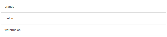
@out List_fruits = ["orange", "melon", "watermelon"]
end<q-list bordered="" v-for="fruit in List_fruits" separator="">
<q-item clickable="">
<q-item-section>
{{fruit}}
</q-item-section>
</q-item>
</q-list>A complex list
Show the code
-
JULIA
-
HTML
list(
bordered = true,
separator = true,
padding = true,
style = "width:400px",
[
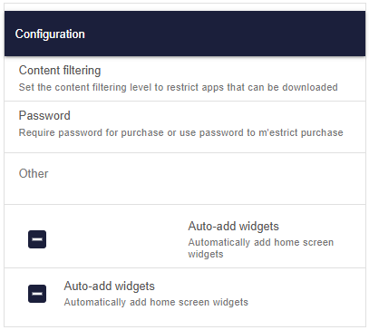
toolbar("Configuration", class = "bg-primary text-white shadow-2"),
item(
clickable = "",
vripple = "",
item_section([
item_label("Content filtering"),
item_label(
caption = true,
"Set the content filtering level to restrict apps that can be downloaded",
),
]),
),
item(
clickable = "",
vripple = "",
item_section([
item_label("Password"),
item_label(
caption = true,
"Require password for purchase or use password to m'estrict purchase",
),
]),
),
separator(spaced = true),
item_label(header = true, "Other"),
separator(spaced = true),
item(
var"v-ripple" = true,
[
item_section(checkbox("", :ListComplex_check)),
item_section([
item_label("Auto-add widgets"),
item_label(caption = true, "Automatically add home screen widgets"),
]),
],
),
item(
var"v-ripple" = true,
[
item_section(side = true, top = true, checkbox("", :ListComplex_check)),
item_section([
item_label("Auto-add widgets"),
item_label(caption = true, "Automatically add home screen widgets"),
]),
],
),
],
)Reactive code
@app begin
    @in ListComplex_check = "false"
end
<q-list padding="" bordered="" separator="" style="width:400px">
<q-toolbar class="bg-primary text-white shadow-2">
Configuration
</q-toolbar>
<q-item clickable="" v-ripple="">
<q-item-section>
<q-item-label>
Content filtering
</q-item-label>
<q-item-label caption="">
Set the content filtering level to restrict apps that can be downloaded
</q-item-label>
</q-item-section>
</q-item>
<q-item clickable="" v-ripple="">
<q-item-section>
<q-item-label>
Password
</q-item-label>
<q-item-label caption="">
Require password for purchase or use password to m'estrict purchase
</q-item-label>
</q-item-section>
</q-item>
<q-separator spaced=""></q-separator>
<q-item-label header="">
Other
</q-item-label>
<q-separator spaced=""></q-separator>
<q-item v-ripple="">
<q-item-section>
<q-checkbox label="" v-model="ListComplex_check"></q-checkbox>
</q-item-section>
<q-item-section>
<q-item-label>
Auto-add widgets
</q-item-label>
<q-item-label caption="">
Automatically add home screen widgets
</q-item-label>
</q-item-section>
</q-item>
<q-item v-ripple="">
<q-item-section top="" side="">
<q-checkbox label="" v-model="ListComplex_check"></q-checkbox>
</q-item-section>
<q-item-section>
<q-item-label>
Auto-add widgets
</q-item-label>
<q-item-label caption="">
Automatically add home screen widgets
</q-item-label>
</q-item-section>
</q-item>
</q-list>Programmatic use
list(args...; kwargs...)A list and an element are a group of components that can work together to represent multiple vertical positions as a single continuous element. They are best suited for displaying similar types of data as strings of information, such as a contact list, playlist, or menu. Each row is called an element. The item can also be used outside the list.
Examples:
-
View:
julia > list(
    bordered = true,
    separator = true,
    [
        item(clickable = true, vripple = true, [itemsection("Single line item")]),
        item(
            clickable = true,
            vripple = true,
            [
                itemsection([
                    itemlabel("Item with caption"),
                    itemlabel("Caption", caption = true),
                ]),
            ],
        ),
        item(
            clickable = true,
            vripple = true,
            [
                itemsection([
                    itemlabel("OVERLINE", overline = true),
                    itemlabel("Item with caption"),
                ]),
            ],
        ),
    ],
)
Arguments
-
Content
-
separator::Bool— adds a separator between nested elements. -
padding::Bool— adds vertical margins in the Material Design style (top and bottom).
-
-
Style
-
bordered::Bool— adds a standard border around the component. -
dense::Bool— "dense" mode; the component takes up less vertical space. -
dark::Bool— informs the component that the background is dark (changes the styling).
-
Evaluation
Rating

Show the code
-
JULIA
-
HTML
rating(:rating_value, icon = "thumb_up")Reactive code
@app begin
    @in rating_value = 5
end
<q-rating v-model="rating_value" icon="thumb_up"></q-rating>Programmatic use
rating(fieldname::Union{Symbol,Nothing} = nothing, args...; kwargs...)A rating is a component that allows users to rate products, commonly known as a "Star Rating".
Examples:
-
Model:
julia > @vars RatingModel begin myrating::R{Int} = 3 end -
View:
julia > rating(:myrating, size = "1.5em", icon = "thumb_up")
julia > rating(:myrating, size = "2em", color = "red-7", icon = "favorite_border")
julia > rating(:myrating, size = "2.5em", color = "purple-4", icon = "create")
Arguments
-
Behaviour
-
name::String— the name of the control; used, for example, when sending forms directly to the server by URL. Example:car_id.
-
-
Content
-
icon::Union{String, Vector}— basic icon. Make sure that the icon library is enabled (if the prefix is not usedimg:). If an array is passed, then each rating position uses the corresponding icon (indexing from 0). Example:icon = "map ion-add"orimg:https://cdn.quasar.dev/logo/svg/quasar-logo.svgorimg:path/to/some_image.png. -
iconselected::Union{String, Vector}— icon for the selected state (optional). It works similarlyicon, supports arrays (indexing from 0). -
iconhalf::Union{String, Vector}— an icon for the "half" rating status. Similar to the previous parameters, it can be a string or an array.
-
-
Mark
-
max::Union{Int, String}— the number of icons displayed. Example:max = "5".
-
-
Model
-
noreset::Bool— prohibits the standard behavior of resetting the rating to 0 when clicking on the selected icon again.
-
-
Condition
-
readonly::Bool— switches the component to read-only mode. -
disable::Bool— the component is disabled (inactive).
-
-
Style
-
size::String— size in CSS units or one of the standard values (xs|sm|md|lg|xl). Example:16px,2rem,md. -
color::Union{String, Vector}— icon color (Quasar palette). In versionsv1.5.0+when transmitting the array, each rating position uses its own color. Example:["accent", "grey-7"],primary,teal-10. -
colorselected::Union{String, Vector}— the color of the selected icons. It can also be an array. Example:primary teal-10. -
colorhalf::Union{String, Vector}— the color of the half icons. Example:primary teal-10. -
nodimming::Bool— Disables dimming (reducing transparency) for unselected icons.
-
Row
Row

Show the code
-
JULIA
-
HTML
[row(span("Hello"), class = "bg-blue-2"), row(span("Genie"), class = "bg-red-2")]<div class="bg-blue-2 row">
Hello
</div>
<div class="bg-red-2 row">
Genie
</div>Scroll Area
Scroll area
Show the code
-
JULIA
-
HTML
scrollarea(
style = "height: 200px; max-width: 300px;",
Html.div(
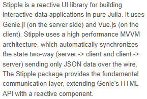
"Stipple is a reactive UI library for building interactive\n data applications in pure Julia. It uses Genie.jl (on the server side)\n and Vue.js (on the client). Stipple uses a high performance MVVM\n architecture, which automatically synchronizes the state two-way\n (server -> client and client -> server) sending only JSON data over\n the wire. The Stipple package provides the fundamental communication\n layer, extending Genie's HTML API with a reactive component.",
),
)<q-scroll-area style="height: 200px; max-width: 300px;">
<div>
Stipple is a reactive UI library for building interactive
data applications in pure Julia. It uses Genie.jl (on the server side)
and Vue.js (on the client). Stipple uses a high performance MVVM
architecture, which automatically synchronizes the state two-way
(server -> client and client -> server) sending only JSON data over
the wire. The Stipple package provides the fundamental communication
layer, extending Genie's HTML API with a reactive component.
</div>
</q-scroll-area>Programmatic use
scrollarea(args...; kwargs...)The scroll area component offers a convenient way to customize scrollbars by encapsulating your content. Imagine it as a DOM element with a function overflow: auto but with your own custom-styled scrollbar instead of the scrollbar used by the default browser, and a few nice features on top.
Examples:
-
View:
julia > StippleUI.scrollarea(
    style = "height: 200px; max-width: 300px;",
    [Html.div("Stipple is a reactive UI library for building interactive
     data applications in pure Julia. It uses Genie.jl (on the server side)
     and Vue.js (on the client). Stipple uses a high performance MVVM
     architecture, which automatically synchronizes the state two-way
     (server -> client and client -> server) sending only JSON data over
     the wire. The Stipple package provides the fundamental communication
     layer, extending Genie's HTML API with a reactive component.")],
)
Arguments
-
Behaviour
-
visible::Bool— manual control of scrollbar visibility; redefines the standard appearance/disappearance behavior when hovering the cursor. -
delay::Union{Int, String}— the delay (in milliseconds) during which the scrollbar remains visible after the content is changed; after the time expires, the scroll area disappears if the cursor is not above the component. Example:delay="500". -
horizontal::Bool— switches the scroll mode: horizontal instead of vertical (vertical by default). Affects the functions ofgetScrollPosition,getScrollPercentage,setScrollPosition,setScrollPercentage.
-
-
General
-
tabindex::Union{Int, String}— the value of the HTML attributetabindexFor example0or100.
-
-
Style
-
dark::Bool— informs the component that the background is dark (used to correct visual effects and contrast). -
barstyle::Union{Vector, String, Dict}— CSS styles for the design of scrollbars (vertical and horizontal). Example:barstyle="{ borderRadius: '5px', background: 'red', opacity: 1 }". -
contentstyle::Union{Vector, String, Dict}— CSS styles for the content container inside the scroll area.
-
Choice
Choice

Show the code
-
JULIA
-
HTML
select(:Select_fruit, options = :Select_fruit_list, label = "Fruits")Reactive code
@app begin
    @in Select_fruit = ["orange"]
    @out Select_fruit_list = ["orange", "melon", "watermelon"]
end
<q-select v-model="Select_fruit" label="Fruits" :options="Select_fruit_list"></q-select>Clear selection by typing

Show the code
-
JULIA
-
HTML
select(
    :SelectClearable_fruit,
    options = :SelectClearable_fruit_list,
    label = "Fruits",
    clearable = true,
    useinput = true,
)
Reactive code
@app begin
    @in SelectClearable_fruit = ["orange"]
    @out SelectClearable_fruit_list = ["orange", "melon", "watermelon"]
end
<q-select v-model="SelectClearable_fruit" label="Fruits" use-input="" clearable="" :options="SelectClearable_fruit_list"></q-select>Multiple choice with chips

Show the code
-
JULIA
-
HTML
select(
    :SelectMultiple_fruit,
    options = :SelectMultiple_fruit_list,
    label = "Fruits",
    clearable = "",
    multiple = true,
    usechips = true,
)
Reactive code
@app begin
    @in SelectMultiple_fruit = ["orange"]
    @out SelectMultiple_fruit_list = ["orange", "melon", "watermelon"]
end
<q-select v-model="SelectMultiple_fruit" label="Fruits" clearable="" multiple="multiple" use-chips="" :options="SelectMultiple_fruit_list"></q-select>Programmatic use
select(fieldname::Symbol, args...; options::Union{Symbol,Vector}, kwargs...)Examples:
-
Model:
julia > @vars SelectModel begin model::R{Vector{String}} = [] networks::R{Vector{String}} = ["Google", "Facebook", "Twitter", "Pinterest", "Reddit"] end -
View:
julia > select(
    :model,
    options = :networks,
    useinput = true,
    multiple = true,
    clearable = true,
    filled = true,
    counter = true,
    usechips = true,
    label = "Social Networks",
)
Arguments
-
Behaviour
-
name::String— the name of the control. Useful when working with forms; if not specified, the property value is used.forif it exists (for example,car_id). -
virtualscrollhorizontal::Bool— enables virtual scrolling in horizontal mode. -
error::Bool— indicates whether the field has validation errors. -
rules::Vector— an array of functions or strings with validation rules. If a string is used, it must match the name of one of the built-in validation rules. Example:["val ⇒ val.length ⇐ 3 || 'Use no more than 3 characters '"] -
reactiverules::Bool— by default (false) changing the rules does not trigger re-validation before the model is changed. Iftruechanging the rules immediately triggers validation. It has a performance overhead, use it only when necessary. -
lazyrules::Bool | String— "lazy" validation mode:-
true— the rules are checked only after the field receives focus for the first time. -
false— regular (standard) validation. -
"ondemand"— validation is performed only with a manual callvalidate().
-
-
loading::Bool— displays the loading indicator (spinner), signaling the completion of the process. The appearance can be redefined via the slotloading. -
clearable::Bool— adds a cleaning icon if the value is set (notnull). When clicked, the model value is reset tonull. -
autofocus::Bool— automatically sets the focus on the element at the first rendering. -
for::String— setsidthe control and the attributeforfor the linkedlabel. Ifnamenot specified, it is also used for it (for example,myFieldsId). -
hidedropdownicon::Bool— hides the drop-down list icon. -
fillinput::Bool— fills in the field with the current value; useful in conjunction withhideselected. Does not work together withmultiple. -
newvaluemode::String— defines the behavior when adding new values:-
add— add a value (even if it already exists); -
add-unique— add only unique values; -
toggle— add or remove a value depending on its availability. When using this parameter, listening for an eventnewvaluebecomes optional.
-
-
autocomplete::String— The HTML attribute of auto-completion, for exampleautocomplete="country". -
transitionshow::String— animation of the menu/dialog display. One of the built-in values, for examplefade,slide-down. -
transitionhide::String— animation of hiding the menu/dialog. One of the built-in values, for examplefade,slide-down. -
behavior::String— Redefines the standard dynamic behavior: displaying as a menu on a computer and as a dialog on mobile devices.
-
-
Content
-
tablecolspan::Union{Int, String}— the number of columns in the table (required if usedtable-layout: fixed). Example:tablecolspan="12". -
errormessage::String— validation error text (displayed only iferror = true). Example:Username must have at least 5 characters. -
noerroricon::Bool— hide the error icon. -
label::Union{String, Symbol}— the signature of the field that "floats" over the field when the focus is received. Example:Username. -
stacklabel::Bool— The signature is always displayed above the field, regardless of the content. -
hint::String— a hint (helper text) under the field. Example:Fill in between 3 and 12 characters. -
hidehint::Bool— Hide the hint when the field is out of focus. -
prefix::String— prefix before the entered value. Example:$. -
suffix::String— suffix after the value. Example:@gmail.com. -
loading::Bool— shows the loading indicator (spinner), signaling the completion of the process; can be customized through the slotloading. -
clearable::Bool— adds a cleaning icon if the value is set (notundefinedand notnull). When clicked, the model value is reset tonull. -
clearicon::String— custom icon for the cleaning button (used together withclearable). Example:close. -
labelslot::Bool— includes a slotlabel. You need to install intrueto force the use of a slotlabelif the parameterlabelnot specified. -
bottomslots::Bool— includes the lower slots (error,hint,counter). -
counter::Bool— displays an automatic character counter at the bottom right. -
dropdownicon::String— name of the drop-down list icon. An icon library is required (if not in useimg:). If the value is"none", the icon is not drawn (but the place for it can be saved). Examples:map,ion-add,img:https://cdn.quasar.dev/logo/svg/quasar-logo.svg,img:path/to/some_image.png. -
useinput::Bool— use an input field where the user can enter text. -
inputdebounce::Union{Int, String}— delay (debounce) of updating the input model in milliseconds. Example:500,600.
-
-
General
-
tabindex::Union{Int, String}— the value of the HTML attributetabindex. Example:0,100.
-
-
Model
-
multiple::Bool— allows multiple choice. In this mode, the model must be an array (Array). -
emitvalue::Bool— update the model with the value of the selected option, rather than the entire option object.
-
-
Options
-
options::Vector— a list of available options from which the user can choose. For better performance, it is recommended to "freeze" the list. Example:["BMW", "Samsung Phone"]. -
optionvalue::String— the name of the option property that contains its value. If a function is used, for better performance, you should refer to the function from the scope, rather than defining it as inline. Examples:optionvalue="modelNumber"optionvalue="(item) ⇒ item === null ? null : item.modelNumber". -
optionlabel::Union{String, Symbol}— the name of the option property that contains the displayed signature (label). Similarlyoptionvaluewhen using the function, it is recommended not to set it as inline. Examples:optionlabel="itemName"optionlabel="(item) ⇒ item === null ? null : item.itemName". -
optiondisable::String— the name of the option’s property, which determines whether the option is disabled. The value of the property must be logical (Bool). Example:optiondisable="cannotSelect"optiondisable="(item) ⇒ item === null ? null : item.cannotSelect". -
optionsdense::Bool— compact mode for displaying the list of options (takes up less space). -
optionsdark::Bool— The options menu is displayed in a dark color scheme. -
optionsselectedclass::String— CSS class for active/selected options. You can set an empty line to disable the standard layout (text + a wave of color). -
optionssanitize::Bool— forced usetextContentInstead ofinnerHTMLwhen rendering options. Use it if the options may be unsafe (they come from the user). Does not apply when using a slotoption. -
optionscover::Bool— the opened menu overlaps the component (does not work in conjunction withuseinput). -
menuShrink::Bool— allows the list of options to be narrower than the field itself (only in menu mode). -
mapoptions::Bool— an attempt to match model signatures with elements fromoptions. It has a small performance overhead. When usingemitvalue = trueusually you need to enablemapoptionsto display the signature text in the selection field instead of the value. For more information, see the Affecting model section.
-
-
Positioning
-
menuanchor::String— sets the starting point (anchor) for positioning the list of options relative to the field (used only in menu mode). Format: two positions. Examples of values:top left,top middle,top right,center left,center middle,center right,bottom left,bottom middle,bottom right,top start,top end,bottom start,bottom end. -
menuself::String— sets its own positioning point for the list of options relative to the target element (used only in menu mode). Format: two positions. Examples:top left,top right,center,bottom left -
menuoffset::Vector— an array of two numbers that sets the offset of the list of options horizontally and vertically in pixels (used only in menu mode). Example:[8, 8].
-
-
Choice
-
multiple::Bool— allows multiple choice. In this mode, the model must be an array (Array). -
displayvalue::Union{Int, String}— overrides the string representation of the selected default value. Used if not applicableselected slot/scoped slotand the attribute is not used.usechips. -
displayvaluesanitize::Bool— forced usetextContentInstead ofinnerHTMLto render the selected values. It is recommended to enable it if the selected values may be unsafe (for example, entered by the user). Does not apply when using slotsselecteditem. -
hideselected::Bool— hides the selected item. In this case, the input subject is used to display the signature (instead of outputting the selected value to the right of the field). It only works for single selection (notmultiple). -
maxvalues::Union{Int, String}— the maximum number of values that the user can select. Example:5. -
usechips::Bool— display the selected values as chips (chip).
-
-
Condition
-
disable::Bool— switches the component to disabled mode (disabled). -
readonly::Bool— switches the component to read-only mode.
-
-
Style
-
labelcolor::String— signature color (label) from Quasar color palettes. Overrides the propertycolor. As opposed tocolorthe caption always retains this color, even when the field is out of focus. Example:primary,teal-10. -
color::String— the main color of the component from Quasar color palettes. -
bgcolor::String— the background color of the component from Quasar color palettes. -
dark::Bool— indicates that the background of the component is dark. -
filled::Bool— use the "filled" style for the field. -
outlined::Bool— use a contour (outlined) style for the field. -
borderless::Bool— use a style without borders (borderless). -
standout::Union{Bool, String}— use the stylestandoutfor the field. You can specify CSS classes that will be applied when focusing (overriding the default behavior). Example:standout="bg-primary text-white". -
hidebottomspace::Bool— do not reserve space for areashint/error/counterif they are not in use. It also disables the animation of these elements and allows the error/hint areas to stretch vertically depending on the content. -
rounded::Bool— applies the standard small rounded corners for the square shape of the component. -
square::Bool— removes the rounding of corners, making the component strictly square. Redefines propertiesrounded. -
dense::Bool— Compact display mode, takes up less space. -
itemaligned::Bool— aligns the internal content according to the component elements. -
popupcontentclass::String— CSS classes for popup window content. Example:my-special-class. -
popupcontentstyle::Union{Vector, String, Dict}— CSS styles for the popup window content. Example:popupcontentstyle="background-color: #ff0000"popupcontentstyle="{ backgroundColor: '#ff0000' }". -
inputclass::Union{Vector, String, Dict}— CSS classes applied to the underlying input element. Example:my-special-class. -
inputstyle::Union{Vector, String, Dict}— CSS styles applied to the underlying input element. Example:inputstyle="background-color: #ff0000"inputstyle="{ backgroundColor: '#ff0000' }".
-
-
Virtual scrolling
-
virtualscrollslicesize::Union{Int, String}— the minimum number of elements to be drawn in the virtual list. Example:virtualscrollslicesize="60". -
virtualscrollsliceratiobefore::Union{Int, String}— the coefficient of the number of elements in the visible area that must be drawn to the current viewport. Example:virtualscrollsliceratiobefore="30". -
virtualscrollsliceratioafter::Union{Int, String}— the coefficient of the number of elements in the visible area that should be drawn after the current viewport. Example:virtualscrollsliceratioafter="0.3". -
virtualscrollitemsize::Union{Int, String}— the size of one list item in pixels (height for the vertical list, width for the horizontal one). The value is used during the initial rendering of the list. It is recommended to specify a value close to the minimum size of the element. Example:virtualscrollitemsize="48". -
virtualscrollstickysizestart::Union{Int, String}— the size of the "sticky" area at the beginning of the list in pixels (if used). The correct value increases the accuracy of scrolling. Example:virtualscrollstickysizestart="23". -
virtualscrollstickysizeend::Union{Int, String}— the size of the "sticky" area at the end of the list in pixels (if used). The correct value increases the accuracy of scrolling. -
tablecolspan::Union{Int, String}— the number of columns in the table. Required when using a fixed-width tabular layout (table-layout: fixed). Example:tablecolspan="3".
-
Separator
Separator

Show the code
-
JULIA
-
HTML
[p("above"), separator(color = "primary"), p("below")]<p>
above
</p>
<q-separator color="primary"></q-separator>
<p>
below
</p>Programmatic use
separator(args...; kwargs...)The separator component is used to separate text fragments, other components, etc. It creates a colored line along the width of the parent element. It can be horizontal or vertical.
Spinner
Spinner
Show the code
-
JULIA
-
HTML
[
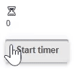
spinner("hourglass", color = "primary", size = "20px", @iif("spinner_count <10")),
p("{{spinner_count}}"),
btn("Start timer", @click(:spinner_start), loading = :spinner_start),
]Reactive code
@app begin
    @out spinner_count = 0
    @in spinner_start = false
    @onbutton spinner_start begin
        while spinner_count <= 10
            @show spinner_count
            spinner_count += 1
            sleep(0.5)
        end
        spinner_count = 0
    end
end
<q-spinner-hourglass color="primary" v-if="spinner_count <10" size="20px"></q-spinner-hourglass>
<p>
{{spinner_count}}
</p>
<q-btn :loading="spinner_start" label="Start timer" v-on:click="spinner_start = true"></q-btn>Programmatic use
spinner(spinner_type::Union{String,Symbol} = "", args...; kwargs...)The spinner component is used to show the user which process is currently running. This is an important UX feature that gives the user the feeling that the system is still running to perform long-term tasks, such as receiving data from the server or any complex calculations.
Examples:
-
Model:
julia > @vars SpinnerModel begin box::R{String} = "box" comment::R{String} = "comment" hourglass::R{String} = "hourglass" end -
View:
julia > spinner(color = "primary", size = "3em")
julia > spinner(:box, color = "orange", size = "5.5em")
julia > spinner(:comment, color = "green", size = "3em")
julia > spinner(:hourglass, color = "purple", size = "4em")
Arguments
-
size::String— the size of the component in CSS units. You can specify a specific value with a unit of measurement or a standard size name. Supported values:xs,sm,md,lg,xl. Examples:16px,2rem,xs,md. -
color::String— the color of the component from the Quasar color palette. Examples:primary,teal,teal-10. -
thickness::Int— line thickness (stroke-width). It is used to control the visual "fatness" of a component. Example:thickness = 5.
The time field
Time field

Show the code
-
JULIA
-
HTML
timefield(
    "Start time",
    :Timefield_start_time,
    timepicker_props = Dict(
        :nowbtn => true,
        :nounset => true,
        :format24h => true,
        :withseconds => true,
    ),
    textfield_props = Dict(:bgcolor => "blue-1"),
)
Reactive code
@app begin
    @in Timefield_start_time = Dates.Time(now())
end
<q-input filled="" label="Start time" v-model="Timefield_start_time" clearable="" bg-color="blue-1">
<q-icon name="alarm" class="cursor-pointer" style="height: 100%;">
<q-popup-proxy cover="" transition-show="scale" transition-hide="scale">
<q-time with-seconds="" format24h="" v-model="Timefield_start_time" now-btn="" no-unset="" mask="HH:mm:ss"></q-time>
</q-popup-proxy>
</q-icon>
</q-input>Programmatic use
timefield(args...; kwargs...)A complex type of input that combines a text field with an icon, a time selector, and a pop-up window. The time selector is hidden by default and is displayed when the icon is clicked. The popup window is used to hide the time selector when the user clicks outside of it. A number of common arguments are defined that are passed to the text field, icon, popup window, and time selector. In addition, keyword arguments can be passed to each of these components individually using keyword arguments. textfield_props, icon_props, popup_proxy_props and timepicker_props.
Choosing the time
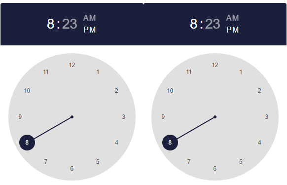
Timing
Show the code
-
JULIA
-
HTML
[
    timepicker(:timepicker_time, mask = "HH:mm"),
    timepicker(:timepicker_time, mask = "HH:mm:ss"),
]
Reactive code
@app begin
    @in timepicker_time = Dates.Time(20, 23, 5)
end
<q-time v-model="timepicker_time" mask="HH:mm"></q-time>
<q-time v-model="timepicker_time" mask="HH:mm:ss"></q-time>Programmatic use
tabpanelgroup(args...; kwargs...)The "Time Selection" component provides a method for entering time.
Examples:
-
Model:
julia > @vars TabPanelModel begin time::R{Time} = Dates.Time(t -> Dates.minute(t) == 20, 23) timewithseconds::R{Time} = Dates.Time(t -> Dates.second(t) == 12, 20, 23) end -
View:
julia > Html.div(
    class = "q-gutter-md",
    [timepicker(:time, mask = "HH:mm"), timepicker(:timewithseconds, mask = "HH:mm:ss")],
)
Arguments
-
Behaviour
-
name::String— the name of the component. It is useful when working with forms that are sent directly by URL (for example,car_id). -
landscape::Bool— display the component in landscape orientation. -
format24h::Bool— force the use of the 24-hour time format instead of AM/PM. -
options::String— allows you to limit the allowed selection time. Redefined by parametershour-options,minute-optionsandsecond-optionsif they are set. For best performance, it is recommended to set the value from the scope, rather than inline. Example:options!="(hr, min, sec) ⇒ hr ⇐ 6". -
optionshour::Array— a list of acceptable hours. Overridesoptions, if set. Example:optionshour!="[3,6,9]". -
optionsminute::Array— a list of acceptable minutes. Overridesoptions, if set. Example:optionsminute!="[3,6,9]". -
optionssecond::Array— a list of allowed seconds. Overridesoptions, if set. Example:optionssecond!="[3,6,9]". -
withseconds::Bool— allows setting the time based on seconds.
-
-
Content
-
nowbtn::Bool— Displays a button to select the current time.
-
-
Model
-
mask::String— formatting mask used for parsing and displaying the value. Example:HH:mm:ss. -
withseconds::Bool— allows time selection with seconds (duplicates the behavior parameter of the same name).
-
-
Condition
-
readonly::Bool— switches the component to read-only mode. -
disable::Bool— switches the component to a disabled state.
-
-
Style
-
color::String— the color of the component from the color palette. -
textcolor::String— text color (redefines the primary color, if necessary). Values from are used Quasar color palettes. -
dark::Bool— indicates that the component is used on a dark background. -
square::Bool— removes the rounding of corners, making the component square. -
flat::Bool— applies a "flat" style (without shadows, used by default). -
bordered::Bool— adds a standard border around the component.
-
Timeline
Timeline
Show the code
-
JULIA
-
HTML
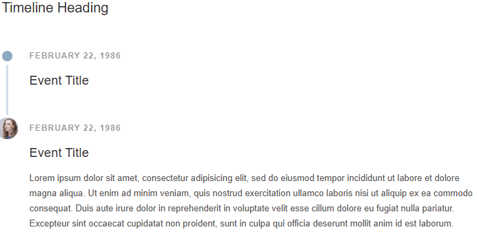
[
    timeline(
        color = "secondary",
        [
            timelineentry("Timeline Heading", heading = true),
            timelineentry(title = "Event Title", subtitle = "February 22, 1986"),
            timelineentry(
                title = "Event Title",
                subtitle = "February 22, 1986",
                avatar = "https://cdn.quasar.dev/img/avatar2.jpg",
                [
                    Html.div(
                        "Lorem ipsum dolor sit amet, consectetur adipisicing elit,\n                  sed do eiusmod tempor incididunt ut labore et dolore magna aliqua.\n                  Ut enim ad minim veniam, quis nostrud exercitation ullamco laboris\n                  nisi ut aliquip ex ea commodo consequat. Duis aute irure dolor in\n                  reprehenderit in voluptate velit esse cillum dolore eu fugiat nulla pariatur.\n                  Excepteur sint occaecat cupidatat non proident, sunt in culpa qui officia\n                  deserunt mollit anim id est laborum.",
                    ),
                ],
            ),
        ],
    ),
]
<q-timeline color="secondary">
<q-timeline-entry heading="">
Timeline Heading
</q-timeline-entry>
<q-timeline-entry title="Event Title" subtitle="February 22, 1986"></q-timeline-entry>
<q-timeline-entry avatar="https://cdn.quasar.dev/img/avatar2.jpg" title="Event Title" subtitle="February 22, 1986">
<div>
Lorem ipsum dolor sit amet, consectetur adipisicing elit,
sed do eiusmod tempor incididunt ut labore et dolore magna aliqua.
Ut enim ad minim veniam, quis nostrud exercitation ullamco laboris
nisi ut aliquip ex ea commodo consequat. Duis aute irure dolor in
reprehenderit in voluptate velit esse cillum dolore eu fugiat nulla pariatur.
Excepteur sint occaecat cupidatat non proident, sunt in culpa qui officia
deserunt mollit anim id est laborum.
</div>
</q-timeline-entry>
</q-timeline>Programmatic use
timeline(args...; kwargs...)The Timeline component displays a list of events in chronological order. It is usually a graphic design that shows a long strip marked with dates and, as a rule, events. Timelines can use any timeline, depending on the topic and data.
Examples:
-
View:
julia > Html.div(
    class = "q-px-lg q-pb-md",
    [
        timeline(
            color = "secondary",
            [
                timelineentry("Timeline Heading", heading = true),
                timelineentry(
                    title = "Event Title",
                    subtitle = "February 22, 1986",
                    [
                        Html.div(
                            "Lorem ipsum dolor sit amet, consectetur adipisicing elit,
                         sed do eiusmod tempor incididunt ut labore et dolore magna aliqua.
                         Ut enim ad minim veniam, quis nostrud exercitation ullamco laboris
                         nisi ut aliquip ex ea commodo consequat. Duis aute irure dolor in
                         reprehenderit in voluptate velit esse cillum dolore eu fugiat nulla pariatur.
                         Excepteur sint occaecat cupidatat non proident, sunt in culpa qui officia
                         deserunt mollit anim id est laborum.",
                        ),
                    ],
                ),
                timelineentry(
                    title = "Event Title",
                    subtitle = "February 21, 1986",
                    icon = "delete",
                    [
                        Html.div(
                            "Lorem ipsum dolor sit amet, consectetur adipisicing elit,
                         sed do eiusmod tempor incididunt ut labore et dolore magna aliqua.
                         Ut enim ad minim veniam, quis nostrud exercitation ullamco laboris
                         nisi ut aliquip ex ea commodo consequat. Duis aute irure dolor in
                         reprehenderit in voluptate velit esse cillum dolore eu fugiat nulla pariatur.
                         Excepteur sint occaecat cupidatat non proident, sunt in culpa qui officia
                         deserunt mollit anim id est laborum.",
                        ),
                    ],
                ),
                timelineentry(
                    title = "Event Title",
                    subtitle = "February 22, 1986",
                    avatar = "https://cdn.quasar.dev/img/avatar2.jpg",
                    [
                        Html.div(
                            "Lorem ipsum dolor sit amet, consectetur adipisicing elit,
                         sed do eiusmod tempor incididunt ut labore et dolore magna aliqua.
                         Ut enim ad minim veniam, quis nostrud exercitation ullamco laboris
                         nisi ut aliquip ex ea commodo consequat. Duis aute irure dolor in
                         reprehenderit in voluptate velit esse cillum dolore eu fugiat nulla pariatur.
                         Excepteur sint occaecat cupidatat non proident, sunt in culpa qui officia
                         deserunt mollit anim id est laborum.",
                        ),
                    ],
                ),
            ],
        ),
    ],
)
Arguments
-
Behaviour
-
side::String— the side on which the timeline elements are placed in the modesdenseandcomfortable. For the modeloosethe parameter is ignored and redefined by the propertysidefor individual elements (timelineentry). Default value:right. Acceptable values:left,right. -
layout::String— timeline layout mode. Default value:dense. Supported values:-
dense— Compact mode: the contents and signatures are arranged on one side (default value); -
comfortable— the content is located on one side, the signatures on the opposite side.; -
loose— the content is located on both sides of the timeline.
-
-
-
Style
-
color::String— the main color of the component from the Quasar color palette. Examples:primary,teal-10. -
dark::Bool— indicates that the component is used on a dark background.
-
Toggle switch
Toggle switch

Show the code
-
JULIA
-
HTML
toggle("Toggle", :Toggle_value, color = "blue")Reactive code
@app begin
    @in Toggle_value = "true"
end
<q-toggle color="blue" label="Toggle" v-model="Toggle_value"></q-toggle>Toggle switch with a custom value of true/false

Show the code
-
JULIA
-
HTML
toggle(
    "Click me!",
    :ToggleValue_value,
    color = "blue",
    var"true-value" = "On",
    var"false-value" = "Off",
)
Reactive code
@app begin
    @in ToggleValue_value = "true"
end
<q-toggle color="blue" false-value="Off" true-value="On" label="Click me!" v-model="ToggleValue_value"></q-toggle>Multiple toggle switch
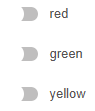
Show the code
-
JULIA
-
HTML
Html.div(
    @recur("toggle in ToggleMultiple_toggle_list"),
    toggle(:toggle, :ToggleMultiple_toggle_states, val = :toggle, color = :toggle),
)
Reactive code
@app begin
    @out ToggleMultiple_toggle_list = ["red", "green", "yellow"]
    @out ToggleMultiple_toggle_states = ["true", "false", "true"]
end
<div v-for="toggle in ToggleMultiple_toggle_list">
<q-toggle :color="toggle" :val="toggle" :label="toggle" v-model="ToggleMultiple_toggle_states"></q-toggle>
</div>Programmatic use
toggle(label::Union{String,Symbol}, fieldname::Union{Symbol,Nothing}, args...; kwargs...)The toggle switch component is another basic element for user input. It can be used to turn settings, functions, or input on and off. true/false.
Examples:
-
Model:
julia > @vars ToggleModel begin value::R{Bool} = false selection::R{Vector{String}} = ["yellow", "red"] end -
View:
julia > toggle("Blue", color = "blue", :selection, val = "blue")
julia > toggle("Yellow", color = "yellow", :selection, val = "yellow")
julia > toggle("Green", color = "green", :selection, val = "green")
julia > toggle("Red", color = "red", :selection, val = "red")
Arguments
-
Behaviour
-
name::String— the name of the component. It is useful when working with forms that are sent directly by URL. Example:car_id. -
indeterminatevalue::Union{Int, Float64, String, Bool}— the value of the model, which is considered the "undefined" state. Default value:null. Example:"not_answered". -
toggleorder::String— defines the order of switching states. Default value:"tf". Available:-
t— conditiontrue; -
f— conditionfalse; -
i— conditionindeterminate.If
toggle-indeterminate=true, the order will be:indet → first state → second state → indet → …. Otherwise:indet → first state → second state → first state → …. Examples:"tf","tft".
-
-
toggleindeterminate::Bool— determines whether it is necessary to switch through the state when clicking/tappingindeterminate. -
keepcolor::Bool— whether to keep the specified component color when turned off.
-
-
Content
-
icon::String— the name of the icon according to the Quasar convention. Make sure that the icon library is enabled if the prefix is not used.img:. If the value is specified"none", then the icon is not displayed (but the place for it is saved). Examples:map,ion-add,img:https://cdn.quasar.dev/logo/svg/quasar-logo.svg,img:path/to/some_image.png.
-
-
General parameters
-
tabindex::Union{Int, String}— the value of the HTML attributetabindex. Example:0,100.
-
-
Icons
-
checkedicon::String— the icon displayed when enabled (checked). -
uncheckedicon::String— the icon displayed when turned off (unchecked). -
indeterminateicon::String— the icon displayed when the status isindeterminate.
-
-
Signature
-
label::Union{String, Symbol}— the text of the signature displayed next to the component. Example:I agree to terms and conditions. -
leftlabel::Bool— if specified, the signature will be displayed to the left of the component.
-
-
Model
-
val::Union{Bool, Int, Float64, String, Vector}— used when the model (value) is an array (Array). Defines which value to add or remove from the model when the component is turned on/off. Example:["a", "b", "c"]. -
truevalue::Union{Bool, Int, Float64, String, Vector}— the value of the model, which is considered the "enabled/marked" state. Default value:trueExample:"Agreed". -
falsevalue::Union{Bool, Int, Float64, String, Vector}— the value of the model, which is considered to be the "off/unchecked" state. Default value:false. Example:"Not agreed".
-
-
Condition
-
disabled::Bool— puts the component in a disabled state (unavailable for interaction).
-
-
Style
-
size::String— the size of the component in CSS units or the standard size name. Supported values:xs,sm,md,lg,xl. Examples:16px,1.5rem,xs,md. -
color::String— the main color of the component from the Quasar color palette. Example:primary,teal-10. -
dark::Bool— indicates that the component is used on a dark background. -
dense::Bool— Compact display mode (takes up less space). -
iconcolor::String— redefines the icon color (applies only to the statustrue). The color is set by a value from the Quasar color palette. Example:primary,teal-10.
-
The Toolbar
Toolbar

Show the code
-
JULIA
-
HTML
[
    toolbar(
        class = "text-primary",
        [
            btn(flat = true, round = true, dense = true, icon = "menu"),
            toolbartitle("Toolbar"),
            btn(flat = true, round = true, dense = true, icon = "more_vert"),
        ],
    ),
]
<q-toolbar class="text-primary">
<q-btn flat="" round="" label="" icon="menu" dense=""></q-btn>
<q-toolbar-title>
Toolbar
</q-toolbar-title>
<q-btn flat="" round="" label="" icon="more_vert" dense=""></q-btn>
</q-toolbar>Programmatic use
toolbar(args...; kwargs...)The toolbar is a component that is usually included in the header and footer of the layout, but it can be used anywhere on the page.
Examples:
-
View:
julia > toolbar(
    class = "text-primary",
    [
        btn(flat = true, round = true, dense = true, icon = "menu"),
        toolbartitle("Toolbar"),
        btn(flat = true, round = true, dense = true, icon = "more_vert"),
    ],
)
Arguments
-
inset::Bool— applies an insert to the content (useful for subsequent toolbars).
Hint
Hint
Show the code
-
JULIA
-
HTML
[
    icon("warning", size = "25px", [tooltip("Fire!")]),
    btn("Hover me", color = "primary", [tooltip("Additional info")]),
]
<q-icon name="warning" size="25px">
<q-tooltip>
Fire!
</q-tooltip>
</q-icon>
<q-btn color="primary" label="Hover me">
<q-tooltip>
Additional info
</q-tooltip>
</q-btn>Programmatic use
tooltip(args...; kwargs...)Loader
Loader
Show the code
-
JULIA
-
HTML
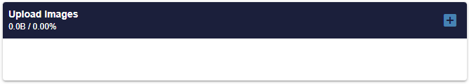
uploader(
    multiple = true,
    accept = :upl_acceptext,
    maxfilesize = :upl_maxsize,
    maxfiles = 10,
    autoupload = true,
    hideuploadbtn = true,
    label = "Upload Images",
    nothumbnails = true,
    style = "max-width: 95%; width: 95%; margin: 0 auto;",
    @on("rejected", :rejected),
    @on("uploaded", :uploaded),
    @on("finish", :finished),
    @on("failed", :failed),
    @on("uploading", :uploading),
    @on("start", :started),
    @on("added", :added),
    @on("removed", :removed)
)
Reactive code
@app begin
    @out upl_acceptext = ".jpg, .jpeg, .pdf, image/* "
    @out upl_imgsrc = "https://placehold.co/600x400"
    @out upl_maxsize = 1 * 1024 * 1024
    @out upl_caption = "No image selected"
    @onchange fileuploads begin
        if !(isempty(fileuploads))
            @info "File was uploaded: " fileuploads
            filename = Random.randstring(10) * "_" * base64encode(fileuploads["name"])
            try
                isdir(joinpath("public", "uploads")) ||
                    mkpath(joinpath("public", "uploads"))
                mv(fileuploads["path"], joinpath("public", "uploads", filename))
            catch e
                @error "Error processing file: $(e)"
                notify(__model__, "Error processing file: $(fileuploads["name"])")
            end
            upl_imgsrc = "/uploads/$(filename)"
            fileuploads = Dict{AbstractString,AbstractString}()
            @show upl_imgsrc
        end
    end
    @event rejected begin
        @info "rejected"
        notify(__model__, "File rejected. Please make sure it is a valid image file.")
    end
    @event added begin
        @info "added"
    end
    @event removed begin
        @info "removed"
    end
    @event started begin
        @info "started"
    end
    @event uploading begin
        @info "uploading"
    end
    @event uploaded begin
        @info "uploaded"
    end
    @event finished begin
        @info "finished"
        notify(__model__, "Upload finished.")
    end
    @event failed begin
        @info "failed"
    end
end
<q-uploader v-on:start="function(event) { handle_event(event, 'started') }" label="Upload Images" hide-upload-btn="" auto-upload="" v-on:failed="function(event) { handle_event(event, 'failed') }" v-on:uploaded="function(event) { handle_event(event, 'uploaded') }" no-thumbnails="" v-on:removed="function(event) { handle_event(event, 'removed') }" v-on:finish="function(event) { handle_event(event, 'finished') }" :url="'/____/upload/' + channel_" v-on:rejected="function(event) { handle_event(event, 'rejected') }" max-files="10" v-on:uploading="function(event) { handle_event(event, 'uploading') }" multiple="multiple" :accept="upl_acceptext" v-on:added="function(event) { handle_event(event, 'added') }" style="max-width: 95%; width: 95%; margin: 0 auto;" :max-file-size="upl_maxsize"></q-uploader>Video
Video
Show the code
-
JULIA
-
HTML
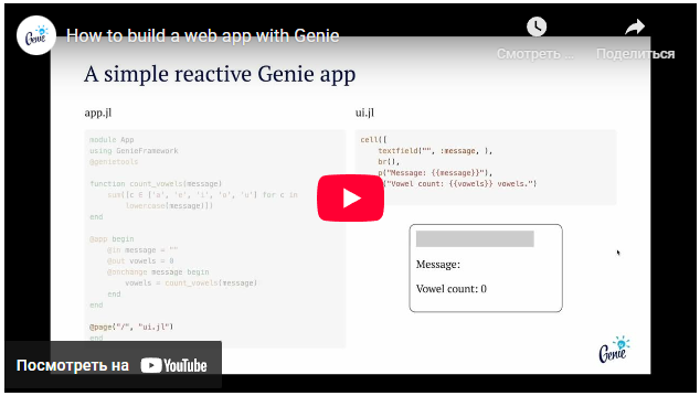
video(
    src = "https://www.youtube.com/embed/G2iIXMjIIcA?si=n8nETlgI-mRELVBF?cc_load_policy=1",
    var":ratio" = "16/9",
)
<q-video src="https://www.youtube.com/embed/G2iIXMjIIcA?si=n8nETlgI-mRELVBF?cc_load_policy=1" :ratio="16/9"></q-video>Programmatic use
video(args...; kwargs...)Using the "video" component makes it easier to embed videos such as Youtube. In addition, by default, the size of the container changes according to it.
Examples:
-
Model:
julia > @vars RadioModel begin v_ratio::R{String} = "16/9" end -
View:
julia > video(src = "https://www.youtube.com/embed/dQw4w9WgXcQ")
julia > video(ratio = :v_ratio, src = "https://www.youtube.com/embed/k3_tw44QsZQ?rel=0")
Arguments
-
Availability
-
title::String— the value of the native HTML attributetitlefor an internal iframe. It is used to improve accessibility (for example, for screen announcers).
-
-
Behaviour
-
fetchpriority::String— sets the relative priority of loading the iframe document. Acceptable values:auto,high,low. Default value:auto. -
loading::String— specifies how the browser should load the iframe. Acceptable values:eager— upload immediately,lazy— delayed loading. Default value:eager. -
referrerpolicy::String— determines which oneRefererit will be sent when the iframe resource is loaded. Acceptable values:no-referrer,no-referrer-when-downgrade,origin,origin-when-cross-origin,strict-origin,strict-origin-when-cross-origin,unsafe-url. Default value:strict-origin-when-cross-origin.
-
-
Model
-
src::String— The URL of the resource displayed inside the iframe.
-
-
Style
-
ratio::Union{String, Int, Float64}— the aspect ratio of the displayed content. If the value is set as a string, it is recommended to specify an already calculated value (rather than an expression like16/9). Example:ratio = "1.7777".
-