Preparing charts for publication
All of us have ever faced the need to make a report on GOST and pass a standard check, even for the tenth time. Remember how valuable templates were for Word and how inconvenient it was to make graphs in Excel. In this post, I want to show how Engee helps make graphs suitable for reports. And there are three ways to do this!
Chart requirements
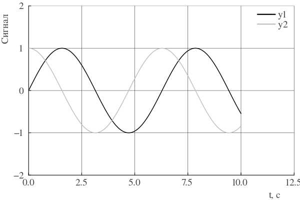
Let our standard control have the following requirements for the design of schedules:
- Axis signatures and graphics - Times New Roman font, 12th size
- The X-axis signature is located on the right side of the axis
- The Y-axis signature is located on the upper side of the axis
- Legend - without frame, in the upper right corner of the axes
- The grid is black
- Lines are shades of gray
- Line thickness - 1.5
Overview of Engee features for graphs
The Plots.jl library provides three approaches to setting up graphs:
- Specifying attributes during plotting, as an argument to the command
plot - Using themes
- "Recipes" for graphs
Additionally, the library provides several backends for drawing graphs. Engee uses the plotlyjs backend by default. However, this backend does not support some attributes, so we will use the classic GR backend.
Using the plot() command
The easiest way is to set the attributes while invoking the plot command. Let's try to build our graph. To do this, we will first generate the data:
x = 0:0.01:10;
ys = hcat(
    sin.(x),
    cos.(x),
);
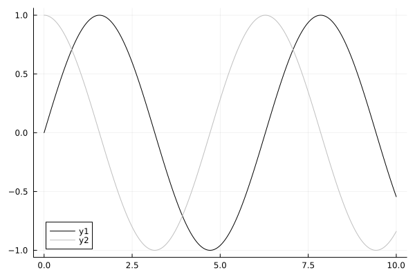
How do I make grayscale lines? You can change the palette of graphs.:
using Plots
gr()
plot(x,ys,palette=:grays)

However, we see that some of the lines are lost - their color is too bright! But the graph library makes it possible to create your own palette. Let's create it taking into account that we don't need too light lines. And there will be exactly the same number of colors in the palette as the rows for which we are plotting. To create a palette, I wrote this auxiliary function:
function gen_gs_pallete(data)
    nseries = data isa AbstractVector ? 1 : size(data, 2)
    if nseries > 1
        GS_Pallete = [ RGB(t, t, t) for t in range(0.0, 0.75; length=nseries)]
    else
        GS_Pallete = RGB(0.0,0.0,0.0);
    end
    GS_Pallete
end

gspalette = gen_gs_pallete(ys)

Let's try to apply it:
plot(x,ys,palette=gspalette)
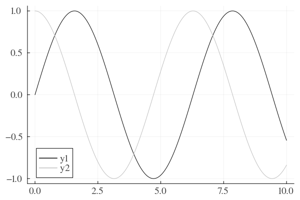
It got better. Now let's change the font and size. You can do this by setting attributes such as titlefont, guidefont, tickfont, legendfont. The font object is used to control the font.:
GOST_font = font(12, "times");
titlefont  = GOST_font;
guidefont  = GOST_font;
tickfont   = GOST_font;
legendfont = GOST_font;
Apply the settings:
plot(x,ys,palette=gspalette,titlefont=titlefont,guidefont=guidefont,tickfont=tickfont,legendfont=legendfont)
Now let's set up the legend view, its position, the grid, and the position of the axis labels.:
plot(x,ys,
    palette=gspalette,
    titlefont=titlefont,
    guidefont=guidefont,
    tickfont=tickfont,
    legendfont=legendfont,
    xguidefonthalign = :right,
    yguidefontvalign = :top,
    legend=(0.94,0.95),
    foreground_color_legend = nothing,
    background_color_legend = nothing,
    gridalpha = 1
    )
xlabel!("t,c")
ylabel!("The signal")
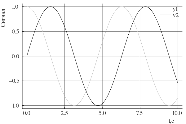
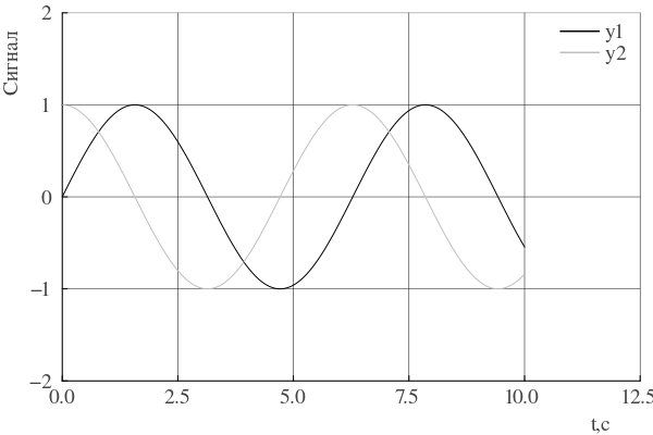
Note how the location of the legend is indicated. I set it as the position relative to the upper-right corner of the graph. It almost worked, but let's change the axis boundaries. To do this, we will calculate the new dimensions using this function:
function lim_helper(x,y)
    xlim = (x[1],x[end] + x[end]/4)
    yh = ceil(maximum(y) + maximum(y)/4)
    ylim = (-yh,yh)
    xlim,ylim
end

(xlim,ylim) = lim_helper(x,ys)
The final schedule will look like this:
plot(x,ys,
    palette=gspalette,
    titlefont=titlefont,
    guidefont=guidefont,
    tickfont=tickfont,
    legendfont=legendfont,
    xguidefonthalign = :right,
    yguidefontvalign = :top,
    legend=(0.94,0.95),
    foreground_color_legend = nothing,
    background_color_legend = nothing,
    gridalpha = 1,
    xlim = xlim,
    ylim = ylim
    )
xlabel!("t,c")
ylabel!("The signal")
Applying themes
Above, the plot command has become too bloated. The Plots library allows you to create your own graph design theme, which allows you to configure all attributes once and distribute them to subsequent graphs. The theme is created using the PlotTheme command, and the necessary attributes act as its arguments.:
gsTheme = PlotTheme(
    linewidth = 1.5,
    titlefont  = GOST_font,
    guidefont  = GOST_font,
    tickfont   = GOST_font,
    legendfont = GOST_font,
    xguidefonthalign = :right,
    yguidefontvalign = :top,
    legend=(0.94,0.95),
    foreground_color_legend = nothing,
    background_color_legend = nothing,
    gridalpha = 1
    );
After we have created a theme, we need to register it.:
PlotThemes.add_theme(:gstheme, gsTheme);
Now you can use this theme to build graphs. In the code below, the theme is applied globally to subsequent graphs.:
theme(:gstheme,palette=gen_gs_pallete(ys))
(xlim,ylim) = lim_helper(x,ys)
plot(x,ys,xlim = xlim,ylim = ylim)
xlabel!("t,c")
ylabel!("The signal")

If we want to return to the default theme, then we need to run the command:
theme(:default)
Recipes for charts and custom charts
The Plots library allows you not only to create themes, but also to create custom graph types based on "recipes".
Recipes is a mechanism that allows you to define rules for data visualizations. They are applied before the graphs are drawn in this order:
-
User Recipes (
@userplot): Create new functions for plotting graphs with a user interface (for example,andrewsplot). -
Type Recipes: Define how a specific Julia type is (for example,
DistributionorSimResult) must be converted to arrays for rendering. -
Plot Recipes: Describe the visualization of data before rows are created (for example, creating complex layouts).
-
Series Recipes: The lowest level; defines how to draw a specific series (for example, describes the transformation of a histogram into a set of columns).
These 4 points are included in the so-called pipeline of charting. The pipeline is described in more detail in the documentation. Also, these recipes do not depend on the Plots library! The widely used StatsPlots package.jl just uses the recipe engine. For our graph, we will create a new graph type, GOSTPlot.:
@userplot GOSTPlot

@recipe function f(p::GOSTPlot)
    x = p.args[1]
    y = p.args[2]

    # number of series
    nseries = y isa AbstractVector ? 1 : size(y, 2)
    if nseries == 1
        linecolor := :black
    else
        palette := [RGB(t, t, t) for t in range(0.0, 0.75; length=nseries)]
    end

    linewidth := 1.5
    seriestype := :path
    fontfamily := "Times"
    fontsize = 12;
    titlefont  := font(fontsize, "Times")
    guidefont  := font(fontsize, "Times")
    tickfont   := font(fontsize, "Times")
    legendfont := font(fontsize, "Times")
    foreground_color := :black
    background_color := :white

    legend := (0.94,0.95)
    xlabel := "t, with"
    ylabel := "The signal"
    xlim := (x[1],x[end] + x[end]/4)
    yh = ceil(maximum(y) + maximum(y)/4)
    ylim := (-yh,yh)
    xguidefonthalign := :right
    yguidefontvalign := :top
    grid := true
    gridalpha := 1.0
    foreground_color_legend := nothing
    background_color_legend := nothing
    x, y
end
Please note that our graph now automatically creates a palette and assigns axis signatures by itself. Since the recipe for our graph is a macro, we can call any code inside the function that calculates attribute values. You should also pay attention to the fact that we are returning x and y - they are needed for subsequent drawing of graphs.
Let's try out our new schedule!
gostplot(x,ys)
Conclusions
In this publication, I have considered three options for plotting graphs that meet the popular requirements of regulatory control. Three methods of configuring graphs were considered and the features of the Plots library were reviewed.