Data approximation
Data approximation — application Engee to select an analytical relationship between two sets of points (for example, Vector X and Vector Y). The application automatically finds the parameters of the selected model, builds a curve on top of the source data, and calculates quality metrics. This is effective for saving time: without programming, you can get visual graphs and a ready-made function expression.
To open the app, go to the page with example and alternately click Open example in Engee → Start Engee → Save and open. This will open the engee_curve_fitting_app.ngscript file in script editor ![]() in the workspace Engee.
in the workspace Engee.
To launch the application, follow the instructions provided in the engee_curve_fitting_app.ngscript file. After launching, the data approximation application will open in a separate browser tab.:
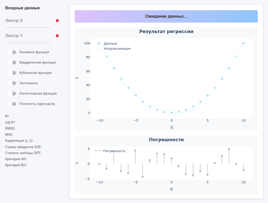
The upper colored line shows the equation of the found function (if there is no data, then it writes * "Waiting for data…"). On the left is a panel for entering input data and for selecting the type of function, as well as displaying metrics. There are two graphs in the center: * Regression result (dots + curve) and Errors (residuals).
Data entry
The application reads data from the workspace Engee (the values should appear in variable window  ). In the fields Vector X and Vector Y, specify the names of the available variables. Status indicators are displayed next to the fields.:
-
🔴 — vector not found;
-
🟡 — only one vector is set, or the vectors do not match in length, and the model calculation has not started.;
-
🟢 — the vectors are set, the model is built.
|
Data requirements:
|
This is the main way to work with input data, but the application supports other data input options.:
-
Direct assignment of arrays
X = [1, 2, 3, 4, 5]
Y = [2.1, 4.0, 5.9, 8.3, 10.2]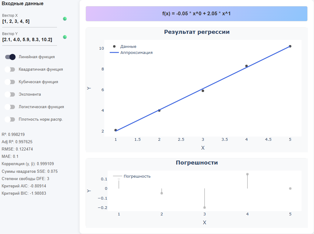
-
From the DataFrame by column
using DataFrames
x = DataFrame(a = [1,2,3,4,5], b = [1,3,5,7,9])
Conclusion:
5×2 DataFrame
 Row │ a      b
     │ Int64  Int64
─────┼──────────────
   1 │     1      1
   2 │     2      3
   3 │     3      5
   4 │     4      7
   5 │     5      9
Then in the application:
-
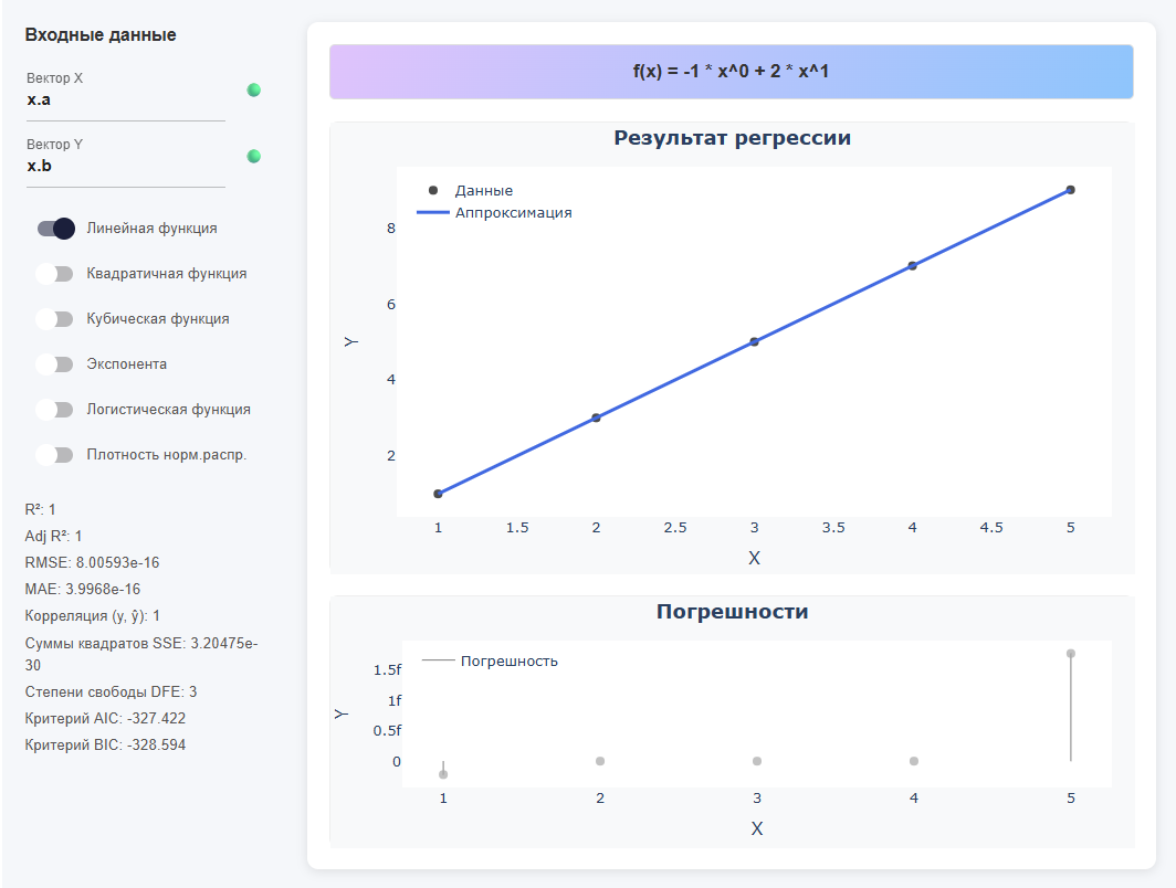
As expressions (operations on arrays)
-
A hybrid of a variable and an expression
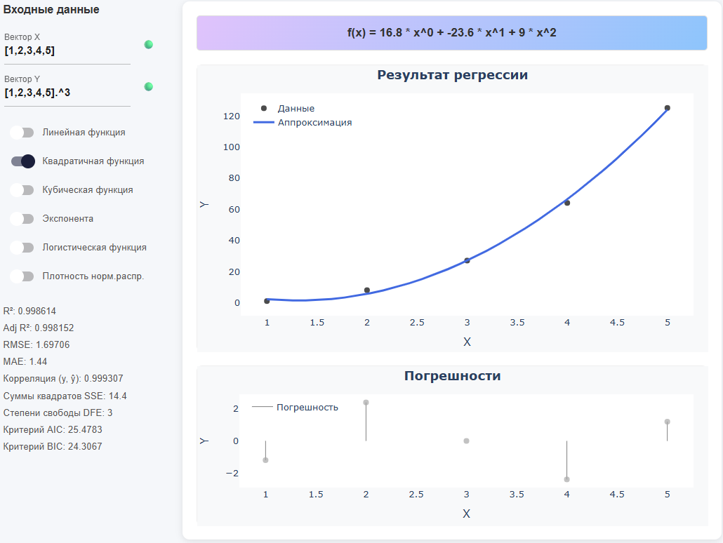
X = [1,2,3,4,5]
Y = X .^ 3 # Piecemeal exponentiation (dot before ^ is required)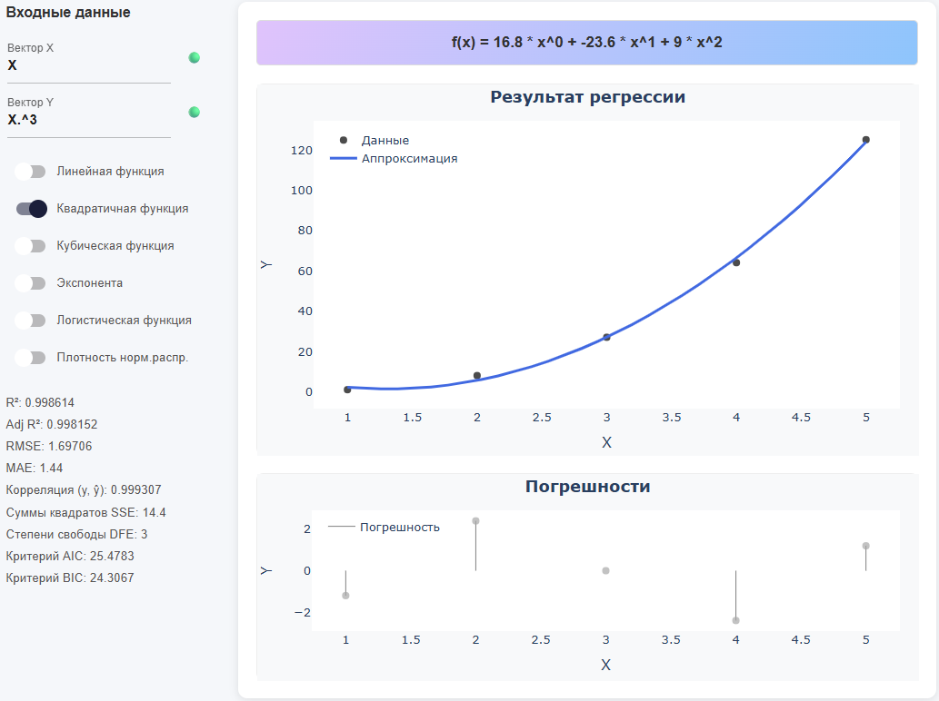
Selection of the approximation function
Turn on one of the switches in the left panel.:
-
Linear function — describes a constant rate of change of magnitude without curvature; suitable for approximately rectilinear trends and fast "first approximation". The equation: .
-
Quadratic function — captures one "arc" (parabolic curvature) and allows you to simulate the presence of a single extremum (minimum/maximum). The equation: .
-
Cubic function — makes it possible to simulate inflection (change of curvature) and asymmetric profiles; useful for S-shaped trends without saturation. The equation: .
-
Exponent — describes proportional growth/decline when the relative change is approximately constant; requires positive values
Y, parameters are selected through linearizationln(y). The equation: . -
Logistic function — a model of limited growth with saturation (S-shaped curve); suitable for fractions/probabilities and quantities with natural limits (lower and upper). The equation: .
-
The density of norms. distribution — adjusts the Gauss "bell" to symmetric peak data; it is appropriate when
Yreflects the density/frequencies around the average with a decline towards the edges. The equation: .
| For polynomials, choose the order that is justified by the data. Excessive complexity can impair generalizing ability. Compare the models by Adj R2, AIC and BIC. |
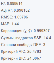
Quality metrics
After each approximation, metrics are calculated (displayed under the list of functions):
-
R2 (coefficient of determination) — shows the fraction of variation
Y, explained by the model; lies in the range of 0..1 (closer to 1 is better). Important: a high R2 does not guarantee the absence of bias and "good" residuals. -
Adj R2 (adjusted R2) — the R2 version, taking into account the number of model parameters; penalizes excessive complexity and is therefore more honest when comparing different models. Formula:
wheren— number of points,p— the number of features (without a constant). -
RMSE is the root of the root mean square error (units are the same as
Y); convenient as the "typical scale" of the error. Formulas: , . -
MAE is the average absolute error; interpreted "in the same units", less sensitive to outliers than RMSE. It is useful when the "modulo average" error is important.
-
Correlation (y, ŷ) is a linear relationship between the actual
yand predictionsŷ(from −1 to 1). High correlation means consistency of direction, but it does not guarantee small errors or the correct shape of the model. -
Sum of Error Squares (SSE) — ; the base "cost" for many methods. It depends on the scale of the data, so by itself it is less suitable for comparing different sets.
-
Degrees of freedom (DFE) — usually (points minus parameters and a constant); used in calculating variances, confidence estimates, and Adj R2.
-
AIC criterion is an information criterion: a balance between the quality of the fit and the number of parameters; only models are compared on the same dataset*. Less is better; the absolute value is not interpreted.
-
The BIC criterion is like the AIC, but with a tougher penalty for complexity (prefers simpler models more strongly). Less is better.
| When choosing a model, focus on Adj R2/AIC/BIC in conjunction with the analysis of the remainder graph: random, "structureless" residues are a sign of an adequate model; a systematic pattern is a reason to choose a different type of function. |
Working with charts
-
Regression result — black dots (source data) and blue line (model):
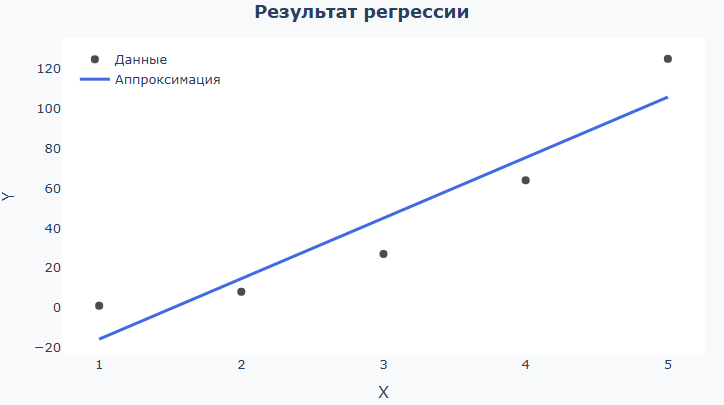
See how much the line coincides with your expectations, fits "along the cloud" of points over the entire range. If the data is simple and the line is too meandering, the model is most likely too complex. If the line is almost straight and many points are too far away from it, the model is too simple. For the logistic function, check that the line is smoothly "saturated" to the borders. For a normal density, check that the "bell" is similar in shape and width to the data. If you want to remove a certain range of data from consideration (for example, points along the edges of a vector), in the input field instead of
x_dataandy_dataYou can enterx_data[10:end-10]andy_data[10:end-10]. This way you will build a model for all points except the 10 outermost ones (on both sides). -
Errors — columns of differences
y − ŷwith a zero line: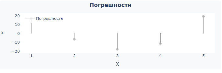
A good sign is that the columns of residuals are located around the 0 line in random directions, with approximately the same amplitude of deviations without an obvious pattern. If a "pattern" (arc, wave) is being viewed or the bars are offset, the model is most likely incorrectly shaped. If the bars become noticeably higher towards the edges, the errors grow at the borders (perhaps there is not enough data or the wrong type of function is selected). Individual very high bars are outliers; they should be checked separately or excluded from the vector in order to obtain cleaner metrics.
The functionality of the Plotly library is available for convenient work with graphs.:

-
 — download graph as PNG;
 -
 — the ability to select an area and enlarge its contents;
 -
 — a tool for moving a graph on a coordinate plane;
 -
 — zooms in on the coordinate plane;
 -
 — reduces the scale of the coordinate plane;
 -
 — returns the default scale of the coordinate plane;
 -
 — reset the coordinate axes.
Checking the result on the command line Engee
-
Copy the model equation from the top line of the application. For example:
-
Insert the expression in command prompt
 and build a graph:
# Example: Insert an expression from the application f(x) = -46.2 * x^0 + 30.4 * x^1 # Plot the values of f on the interval 1..10 plot(1:10, f) -
The graph will be plotted in the charts window. Engee:
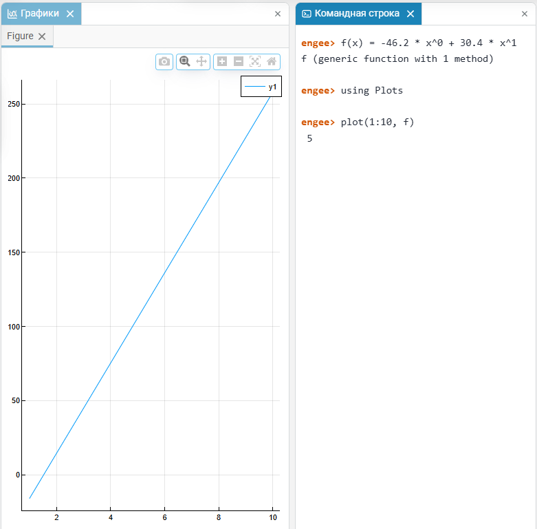
If the equation involves piecemeal operations on the vector, then use the syntax with dots.: .^, .*, ./.
|
A short work scenario
-
Upload the input data to Engee. For example, declare
XandY(variables, arrays, DataFrame, or expression). -
Specify the vectors
XandYas input data in the application and select the desired function type. -
Compare the metrics (Adj R2, AIC, BIC) for different functions and visually evaluate the remainder graph.
-
Copy the resulting equation and use it in further calculations in Engee.