Electrocardiogram signal visualization and analysis
Introduction
This step-by-step exercise is an introduction to the processes of reading, displaying, and analyzing the electrocardiogram signal. An electrocardiogram, also known as an ECG, is an electrical signal that is produced when the heart contracts. An ECG is widely used because it can quickly identify the state of heart health, as well as various abnormalities such as arrhythmias, heart attacks, or tachycardia.
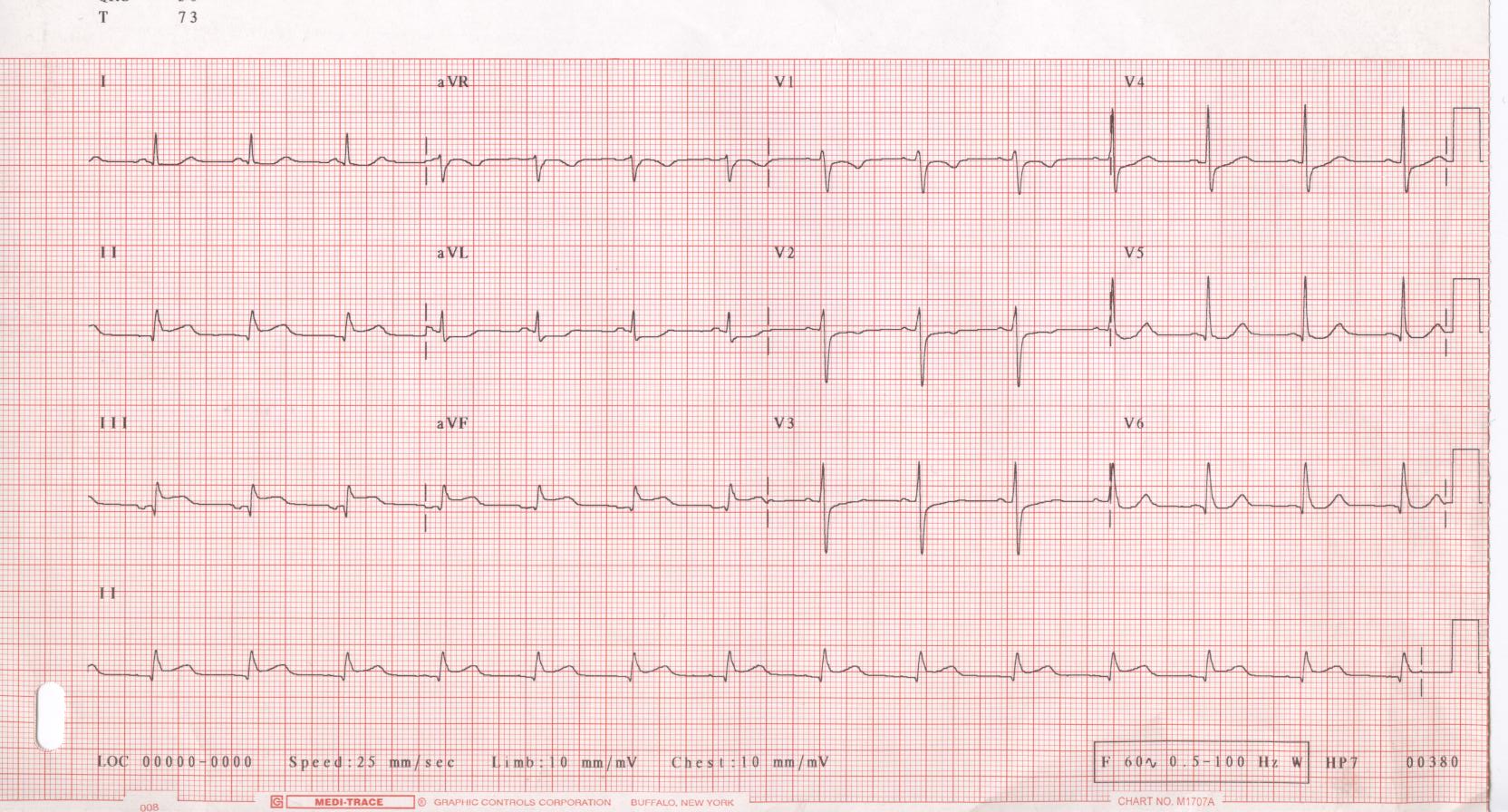
The image below shows a typical ECG.
An internet connection is required to run this demo
ECG analysis
Downloading and displaying an ECG from a file on your computer
The first step is to import the data from the electrocardiogram.dat file.
Then we import the data from the ecgdata.dat file into the ecg variable as a matrix (1x50000).
Pkg.add(["CSV", "Findpeaks"])
using CSV, DataFrames
ecg = Matrix( CSV.read("$(@__DIR__)/electrocardiogram.dat", DataFrame, header = 0, delim=';') );
The typeof() command allows you to get the characteristics of a variable.
typeof(ecg)
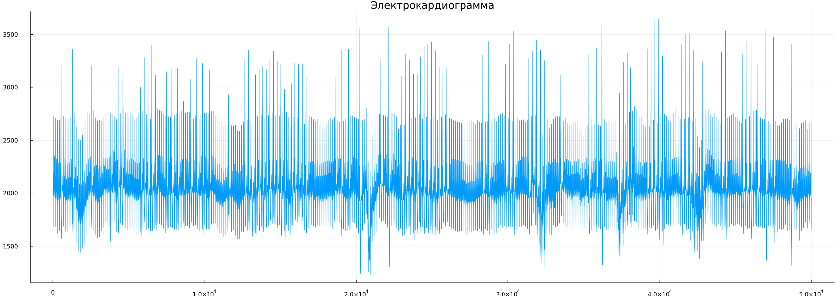
This file contains 250 seconds of ECG recording, and since the sampling rate is 200 Hz, the file contains 50,000 samples. Now we can display the ECG using the plot command.:
using Plots
gr(size=(1700, 600), legend=false)
plot(ecg,label=false)
title!("Electrocardiogram")
This signal was read from the website http://people.ucalgary.ca /~ranga/. In the section Lecture notes, lab exercises, and signal data files you will find a large number of signals from various data collection methods (ECG, EEG, EMF, etc.). You can save files from the browser to the hard disk, and then open them using the download command, as indicated above.
Independent work
Try to read and display other files from the website or from the folder containing the materials of this laboratory work.
The approach
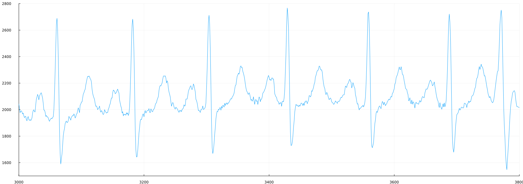
As you can see from the graph, the number of samples can make it difficult to observe the details of each cardiac cycle. We can set the graph approximation parameters by adding ylimits and xlimits to the plot command.
plot(ecg, label=false, ylimits=(1500,2800), xlimits=(3000, 3800))
Independent work
Examine the ECG. You can change the values of ylimits and xlimits to consider different regions of the signal. Is the ECG the same everywhere? For what reasons can an ECG look different?
Detection of ECG peaks using threshold processing
One interesting and simple exercise with this signal is to detect the peaks of each cycle – areas of the signal that exceed a certain value. For example, we can arbitrarily set the threshold at 2400 and generate a new signal to compare the ECG with the threshold.:
peaks_1 = ecg .> 2400;
At the same time, we can create a time-appropriate signal, which will be useful in the future.:
time_1 = (1:length(ecg))/200;
Now we can plot the original signal in the time domain.:
plot(time_1, ecg)
title!("Electrocardiogram")
We can compare two signals, the source and the threshold, by plotting them together. We can overlay one graph on another by using an exclamation mark after the command.
Since the threshold signal will have values from 0 to 1, we need to scale it so that the two signals are in the same ranges. We can do this inside the cutter command by multiplying the logical vector by the peak value we are interested in.
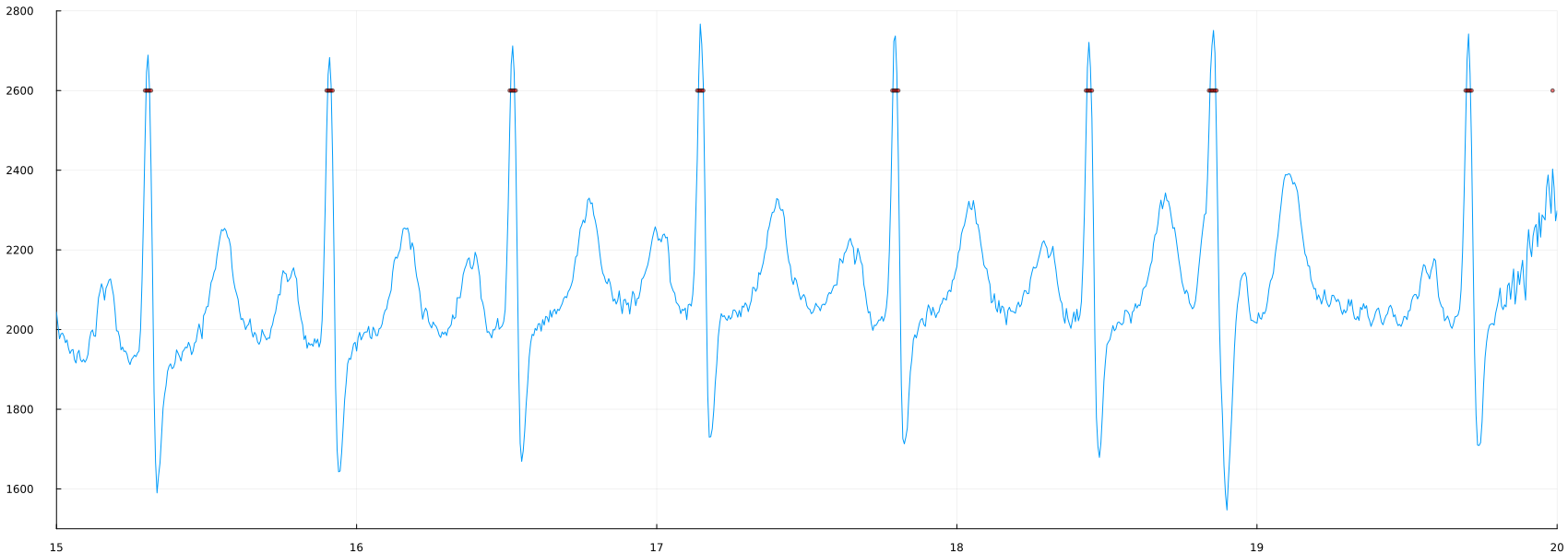
plot(time_1, ecg, label=false, ylimits=(1500,2800), xlimits=(15, 20))
scatter!(time_1, 2600*(peaks_1), mc=:red, ms=2, ma=0.5)
Independent work
Change the threshold value (2400) to other values. What's going to happen? Are you detecting more or fewer peaks?
Peak Size
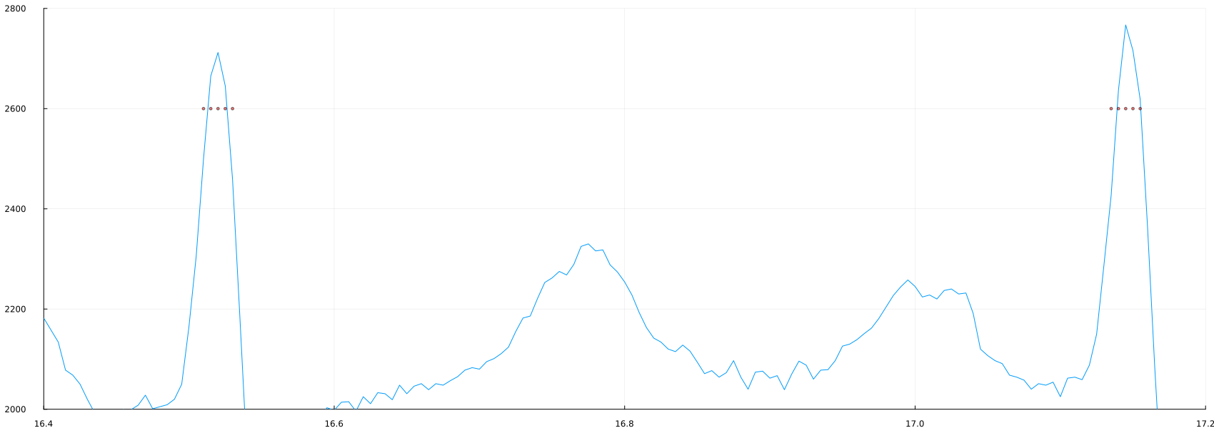
Note that since we are now using time, the axis instruction has changed. If we look closely, we may discover the problem.:
plot(time_1, ecg, label=false, ylimits= (2000, 2800), xlimits = (16.4, 17.2))
scatter!(time_1, 2600*(peaks_1), mc=:red, ms=2, ma=0.5)
Peak detection using the "Findpeaks" package
The threshold provides a value for each individual location where the signal exceeds a preset value, which is not exactly the same as peak detection. Fortunately, Julia has a package (always check if Julia has packages for what you need. It is very likely that you will be able to find a package that will make your work easier) for detecting peaks, called Findpeaks.
First, you need to import the Findpeaks package.
using Pkg
Pkg.add(url="https://github.com/tungli/Findpeaks.jl")
After completing the package import, we need to change the ecg variable type to AbstractArray and then the Findpeaks package can be used as follows:
using Findpeaks
ecg = vec(ecg::AbstractArray)
peaks_3 = findpeaks(ecg)
plot(time_1, ecg, labels=false)
scatter!(time_1[peaks_3], ecg[peaks_3])
It seems that there are a lot of "peaks" where they shouldn't be. Let's zoom in:
plot(time_1, ecg, label=false, ylimits=(1500,2800), xlimits=(15, 17))
scatter!(time_1[peaks_3], ecg[peaks_3])
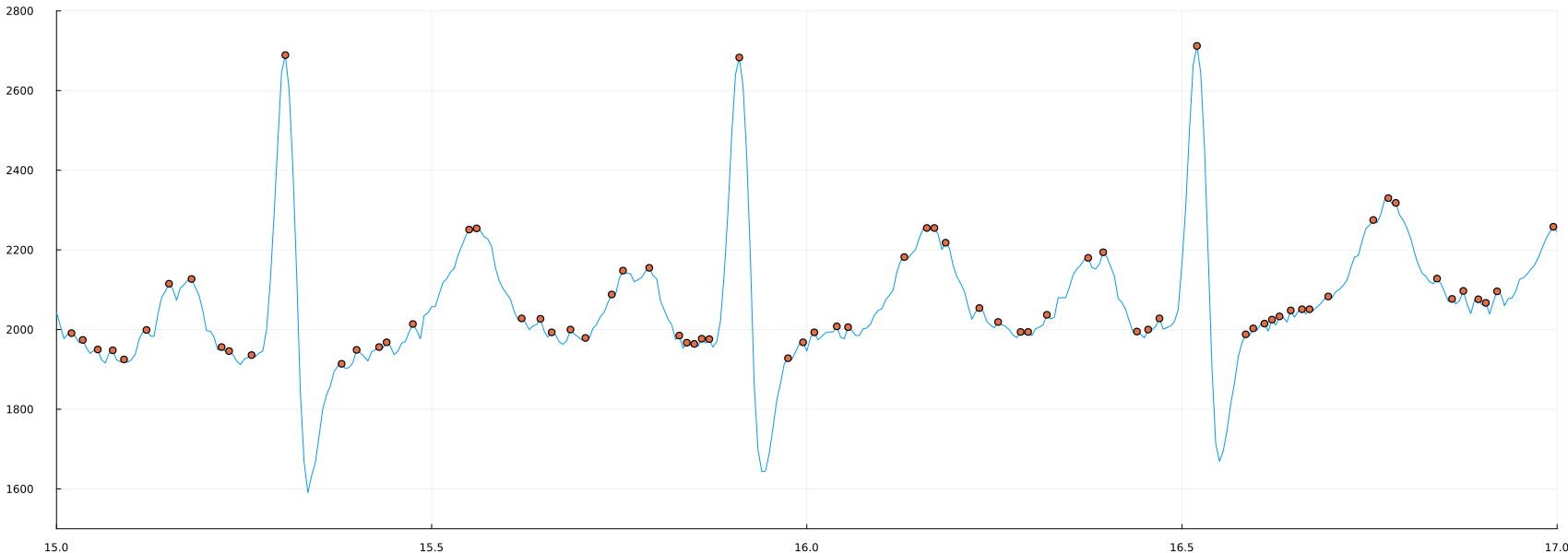
This is a good example of the specifics of some processing methods. Peak detection is the detection of ANY point that is higher than its neighbors, which is different from what we are trying to detect. This leads to the question, what kind of "peaks" do we need?
Refinement of peak detection
We need relatively large peaks (not the ones most likely associated with noise), as well as sharp and high peaks that should be closely related to heart rate. This can lead to the following rules: peaks that:
a) are above a certain level (again, 2400 may be a good threshold),
b) not too close to each other.
The second rule may not be immediately clear, so let's take them one at a time. First, let's discard all peaks below the threshold and display the result.:
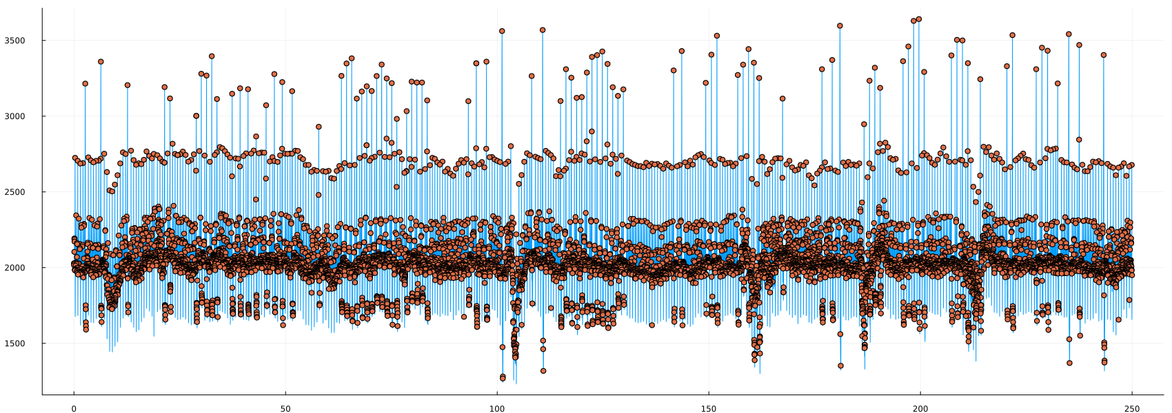
peaks_4 = findpeaks(ecg, min_height = 2400.)
plot(time_1, ecg, label=false, ylimits=(1500,3300), xlimits=(20, 23))
scatter!(time_1[peaks_4], ecg[peaks_4])
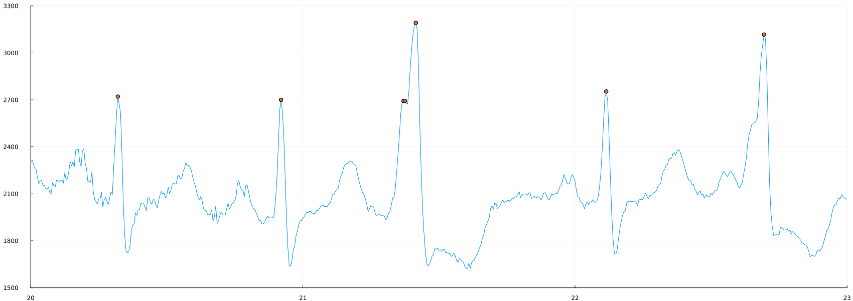
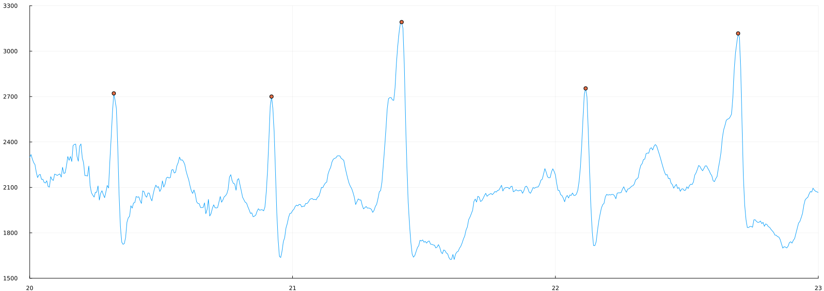
Now we can see how the second rule will affect the result, since two positions are found in one "peak". Let's repeat and find only those vertices that are at least 10 positions away from each other.:
peaks_5 = findpeaks(ecg, min_height = 2400., min_dist = 10)
plot(time_1, ecg, label=false, ylimits=(1500,3300), xlimits=(20, 23))
scatter!(time_1[peaks_5], ecg[peaks_5])
As a final step, we can display the ECG, and below it, the time differences between the peaks, meaning we can see the heart rate derived from these peaks. We can display two signals in one drawing using the subplot command as follows:
peaks_5 = sort(peaks_5);
s = 60*diff(peaks_5/200);
a = peaks_5[2:end];
p1 = plot(time_1, ecg, label=false, title = "ECG");
s1 = scatter!(time_1[peaks_5], ecg[peaks_5]);
p2 = plot(time_1[a], s, legend=false, title = "Heart rate");
plot(p1, p2, layout=(2,1))
Finally, we displayed the heart rate extracted from the ECG.
Checking the analysis
Please note that the heart rate is relatively stable at about 40 beats per minute, which is lower than the usual 60 beats per minute. However, there is one sudden peak around 100, this is most likely due to a processing error.
Independent work:
- Try to analyze the code to understand why there is a peak of about 100 beats/min.
- Try to improve the code to avoid such problems.
- In addition to the aforementioned peak, you may notice significant fluctuations in your heart rate. Do you think this is due to the patient's irregular heartbeat? Or with signal processing? Or with problems at the stage of receiving the signal? Towards the end there is an area where the value drops below 20, what happens there?
- Try to read other signals and apply this simple step-by-step analysis.
- Can you think of other ways to visualize ECG and other biomedical signals?