Creating complex graph layouts using Makie
This example demonstrates the tools of the Makie library for creating professional scientific visualizations by combining graphs of various types (scatter plots, contour plots, 3D models, and time series) into a single complex layout using nested GridLayout, linked axes, custom legends, and color scales, as well as advanced element positioning and space management techniques to create informative and colorful illustrations.
1. Package installation and data preparation
Pkg.add("Makie")
Pkg.add("CairoMakie")
Preparing data for the first chart:
seconds = 0:0.1:2
measurements = [8.2, 8.4, 6.3, 9.5, 9.1, 10.5, 8.6, 8.2, 10.5, 8.5, 7.2,
                8.8, 9.7, 10.8, 12.5, 11.6, 12.1, 12.1, 15.1, 14.7, 13.1]

using CairoMakie
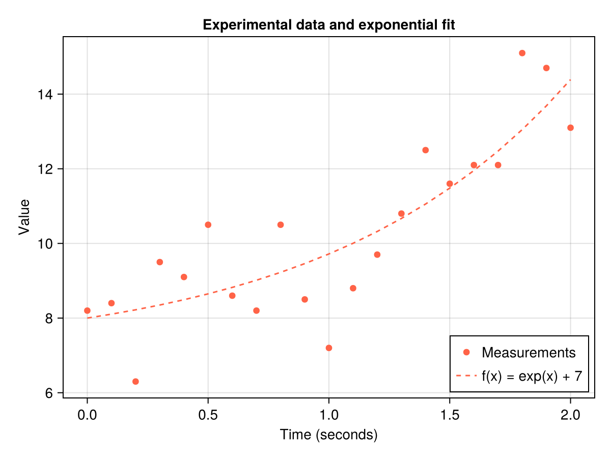
2. Creating a basic chart
Let's start with a simple visualization of experimental data and an exponential model.
Main components:
Figure()creates a container for graphsAxis()defines a coordinate system with captionsscatter!()adds measurement pointslines!()draws the model lineaxislegend()creates a legend
Displaying a graph with experimental data and an exponential model:
f = Figure()
ax = Axis(f[1, 1],
    title = "Experimental data and exponential fit",
    xlabel = "Time (seconds)",
    ylabel = "Value",
)
CairoMakie.scatter!(
    ax,
    seconds,
    measurements,
    color = :tomato,
    label = "Measurements"
)
lines!(
    ax,
    seconds,
    exp.(seconds) .+ 7,
    color = :tomato,
    linestyle = :dash,
    label = "f(x) = exp(x) + 7",
)
# Adding a legend to the bottom right corner
axislegend(position = :rb)

# Shape Display
f
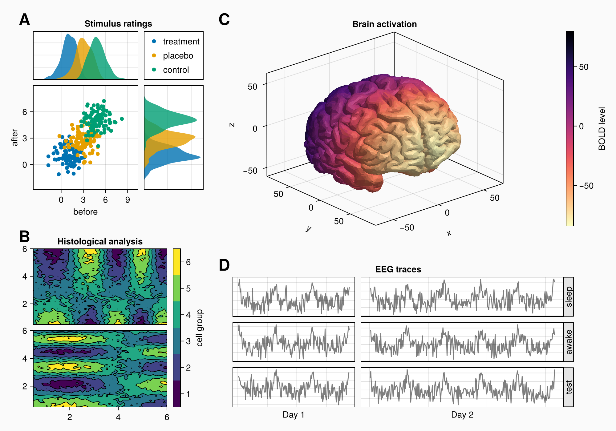
3. Forming a complex layout
Creating a complex graphic object (shape) with several areas for plotting:
- We use
GridLayoutfor organizing nested grids - We define 4 main areas (A, B, C, D)
- Adjust the background and shape size
- We connect the axes to synchronize the scales
using CairoMakie
using Makie.FileIO  # For working with files

# Activating the backend and creating a shape
CairoMakie.activate!()
f = Figure(
    backgroundcolor = RGBf(0.98, 0.98, 0.98),
    size = (1000, 700)
)

# Creating nested grids
ga = f[1, 1] = GridLayout()  # Area A
gb = f[2, 1] = GridLayout()  # Area B
gcd = f[1:2, 2] = GridLayout()  # Container for C and D
gc = gcd[1, 1] = GridLayout()  # Area C (3D brain)
gd = gcd[2, 1] = GridLayout()  # Area D (EEG signals)

# Creating related axes for Area A
axtop = Axis(ga[1, 1])        # Upper distribution
axmain = Axis(ga[2, 1],       # The main schedule
    xlabel = "before",
    ylabel = "after")
axright = Axis(ga[2, 2])      # The right distribution

# Linking axes for synchronization
linkyaxes!(axmain, axright)  # The overall Y scale
linkxaxes!(axmain, axtop)    # The overall X scale

f
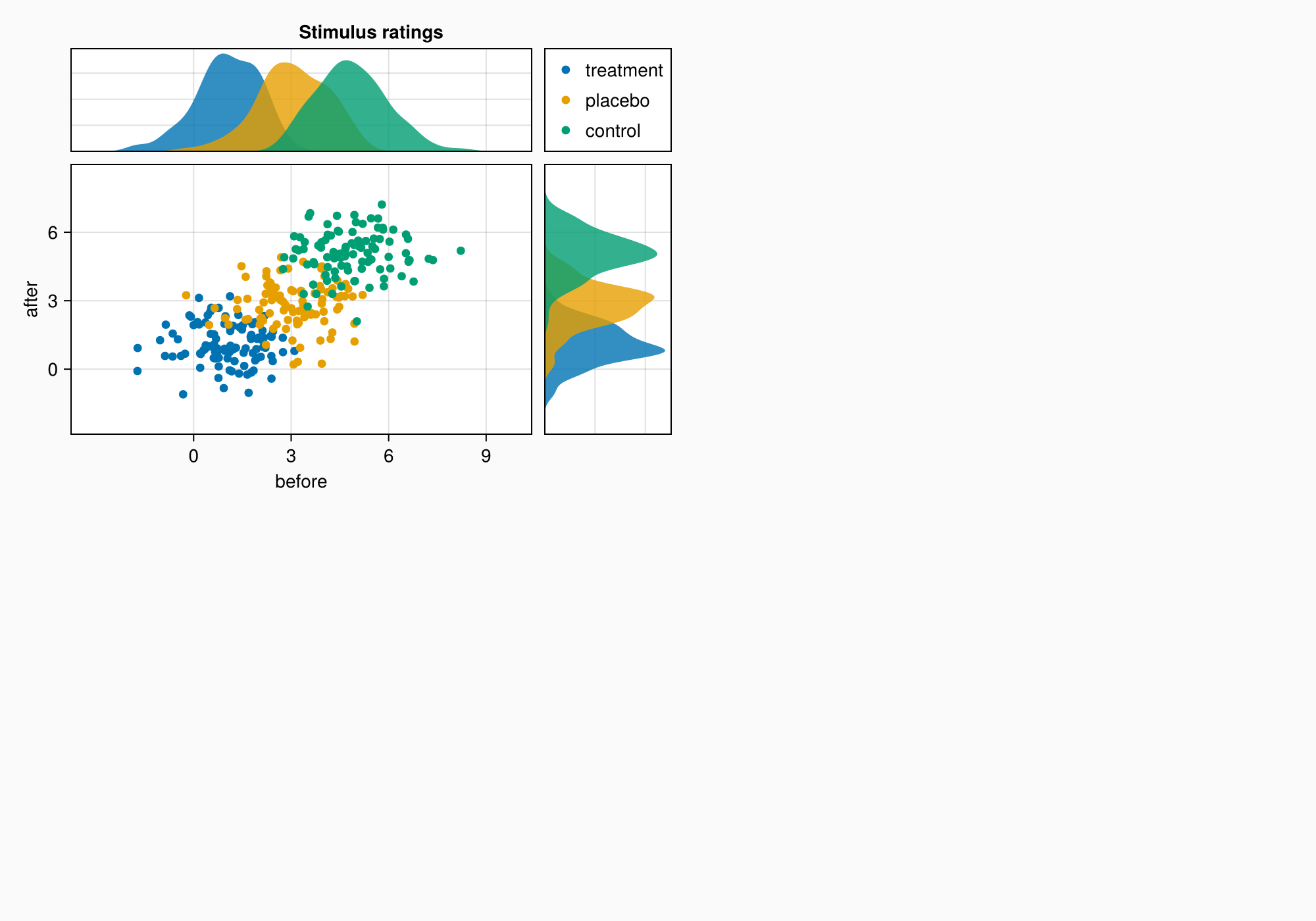
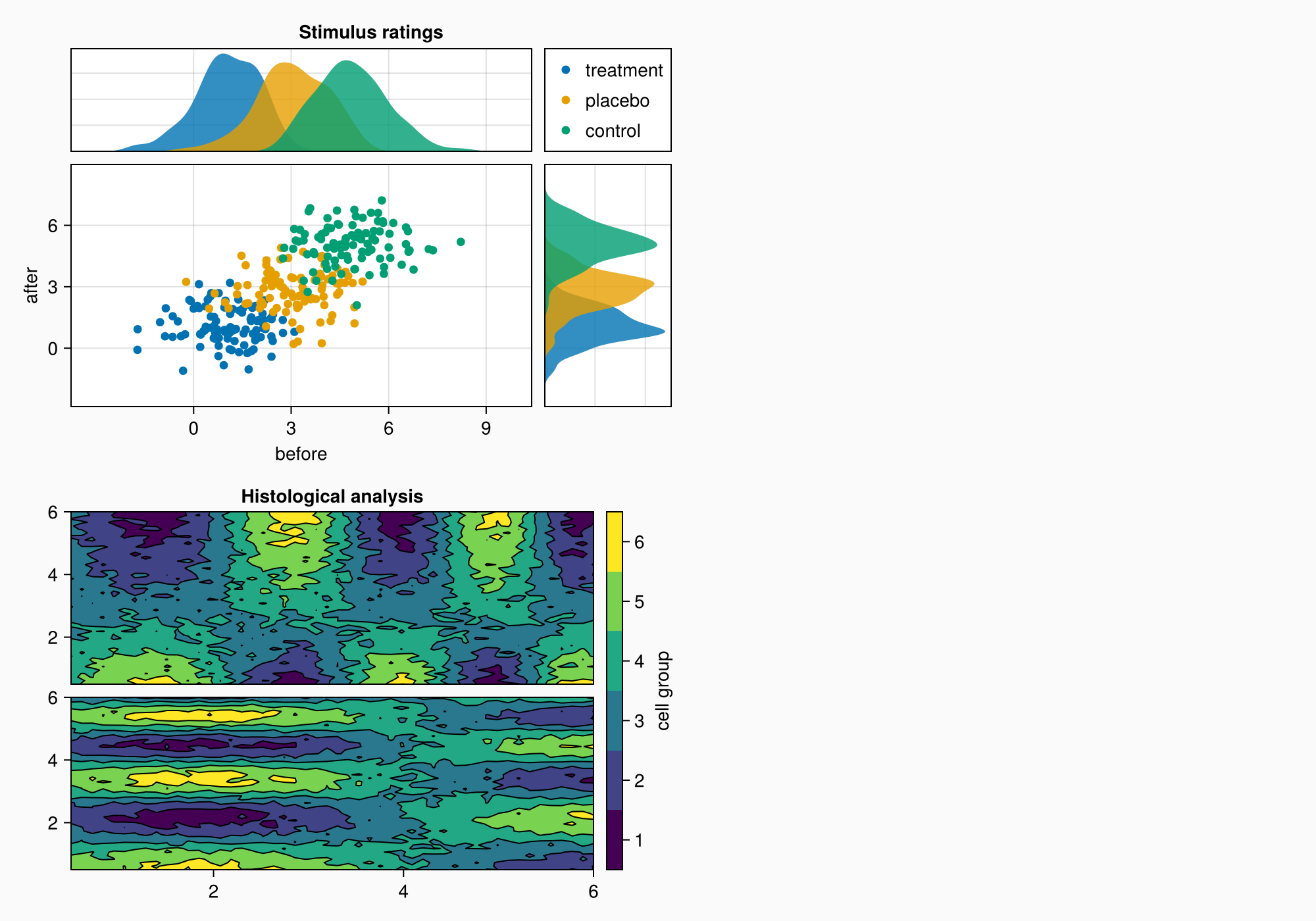
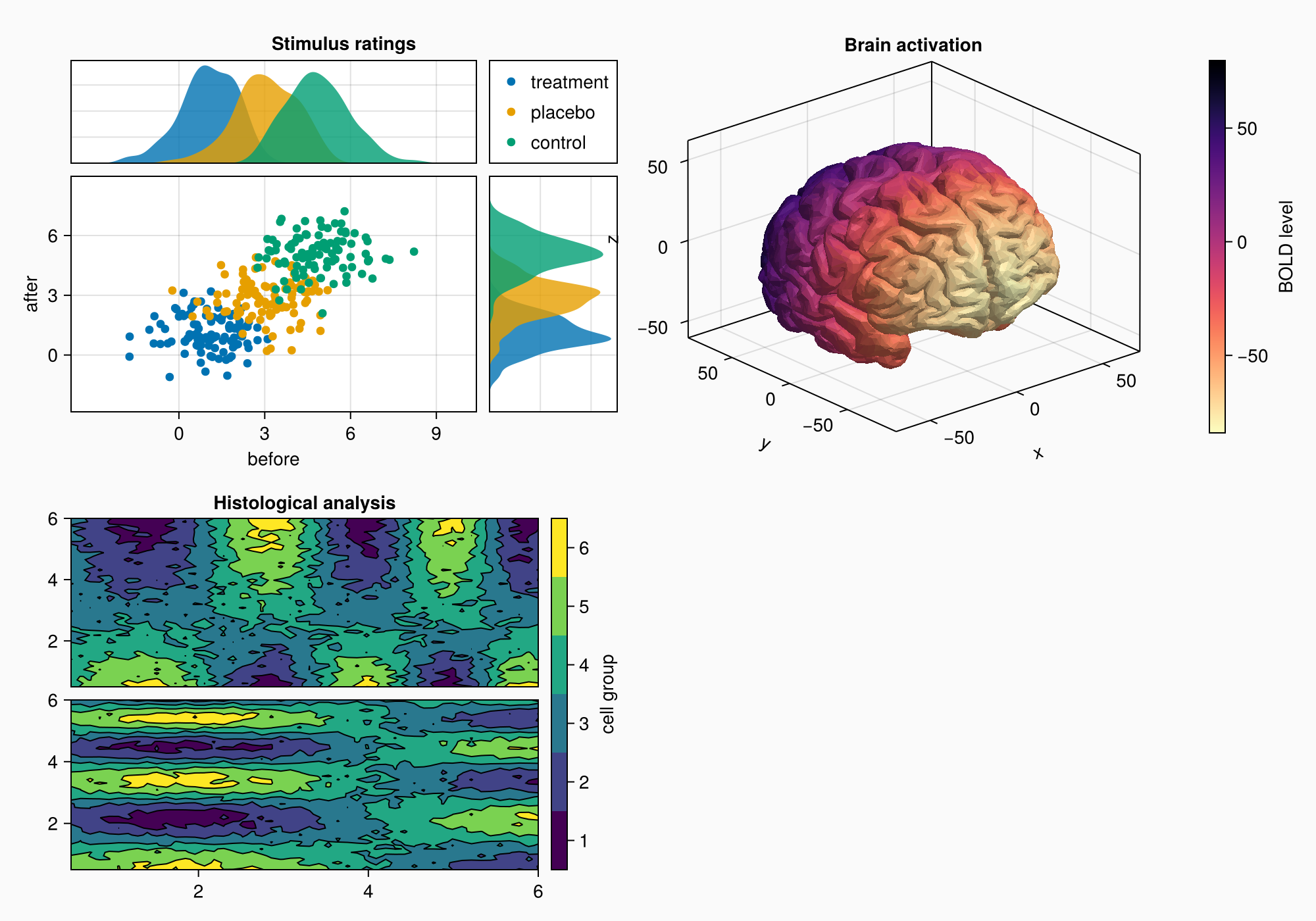
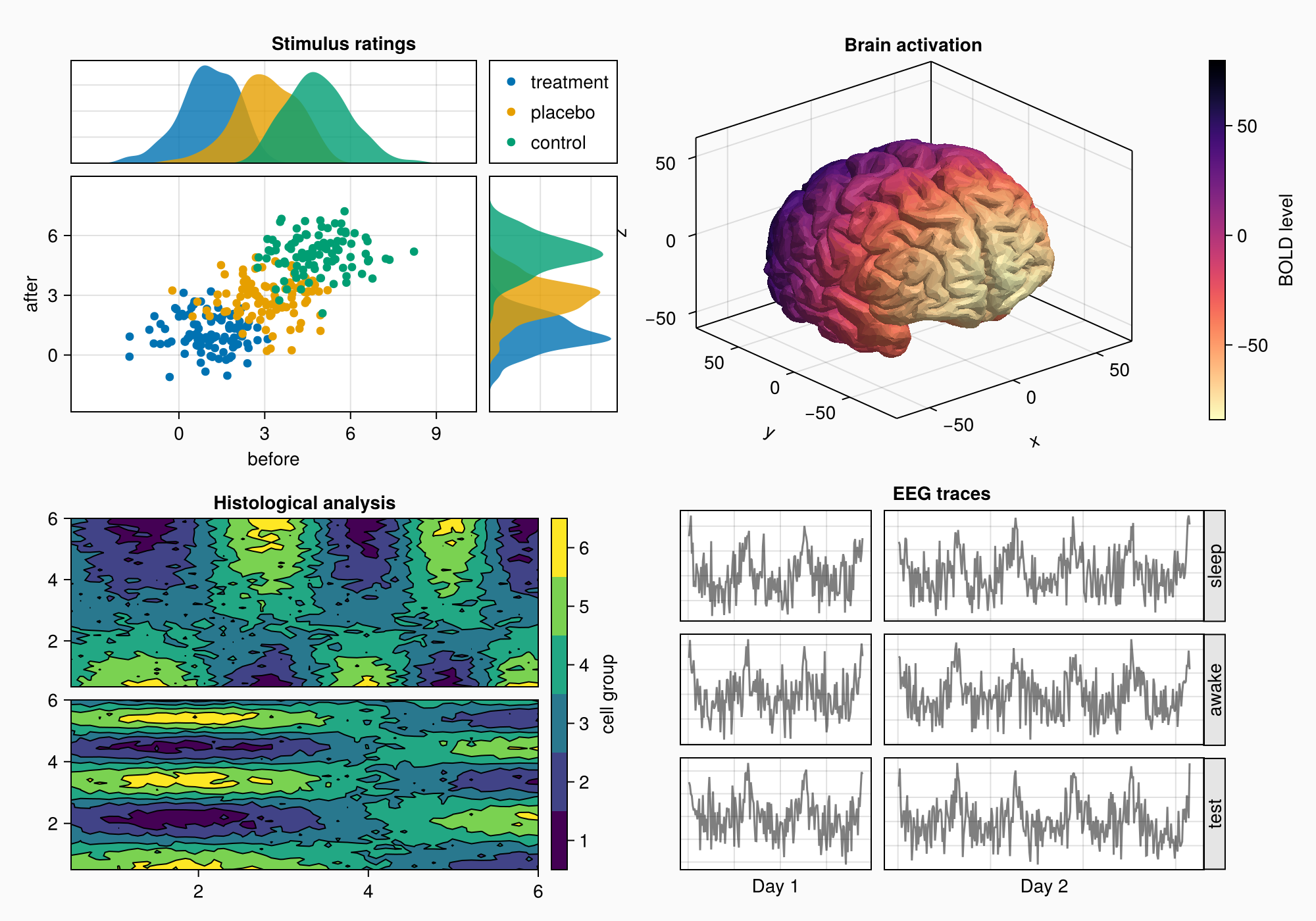
4. Area A: Scattering and distribution diagrams
Area A demonstrates:
- Grouping of data through color coding
- Related axes with common scales
- Distributions at the edges of the main graph
- Automatic legend placement
- Fine-tune the margins between the elements
# Generating test data for three groups
labels = ["treatment", "placebo", "control"]
data = randn(3, 100, 2) .+ [1, 3, 5]  # 3 groups × 100 points × 2 dimensions

# Visualization of each group
for (label, col) in zip(labels, eachslice(data, dims = 1))
    CairoMakie.scatter!(axmain, col, label = label)
    CairoMakie.density!(axtop, col[:, 1])  # Top-down distribution
    CairoMakie.density!(axright, col[:, 2], direction = :y)  # Distribution on the right
end

# Setting Axis boundaries
CairoMakie.ylims!(axtop, low = 0)
CairoMakie.xlims!(axright, low = 0)

# Setting labels on axes
axmain.xticks = 0:3:9
axtop.xticks = 0:3:9

# Adding a legend and hiding unnecessary elements
leg = Legend(ga[1, 2], axmain)
hidedecorations!(axtop, grid = false)
hidedecorations!(axright, grid = false)
leg.tellheight = true  # Fixing the height of the legend

# Adding an area header
Label(ga[1, 1:2, Top()], "Stimulus ratings", valign = :bottom,
    font = :bold,
    padding = (0, 0, 5, 0))

# Setting the distances between the elements
colgap!(ga, 10)
rowgap!(ga, 10)

f
5. Area B: Contour plots
Area B shows:
- Contour graphs for visualization of 2D data
- Graph hierarchy: contourf+ contour
- Custom color scale with bin labeling
- Alignment of elements via
Mixedalignmode - Precise control over the distances between the graphs
# Preparing data for contour plots
xs = LinRange(0.5, 6, 50)
ys = LinRange(0.5, 6, 50)
data1 = [sin(x^1.5) * cos(y^0.5) for x in xs, y in ys] .+ 0.1 .* randn.()
data2 = [sin(x^0.8) * cos(y^1.5) for x in xs, y in ys] .+ 0.1 .* randn.()

# Building contour graphs
ax1, hm = CairoMakie.contourf(gb[1, 1], xs, ys, data1, levels = 6)
ax1.title = "Histological analysis"
CairoMakie.contour!(ax1, xs, ys, data1, levels = 5, color = :black)
hidexdecorations!(ax1)  # Hiding placemarks on the X-axis

ax2, hm2 = CairoMakie.contourf(gb[2, 1], xs, ys, data2, levels = 6)
CairoMakie.contour!(ax2, xs, ys, data2, levels = 5, color = :black)

# Setting the color scale
cb = CairoMakie.Colorbar(gb[1:2, 2], hm, label = "cell group")
low, high = CairoMakie.extrema(data1)
edges = range(low, high, length = 7)
centers = (edges[1:6] .+ edges[2:7]) .* 0.5
cb.ticks = (centers, string.(1:6))  # Custom tags

# Optimizing alignment
cb.alignmode = Mixed(right = 0)

# Setting distances
colgap!(gb, 10)
rowgap!(gb, 10)

f
6. Area C: 3D visualization of the brain
Area C demonstrates:
- Download and visualization of 3D models (STL format)
- Use
Axis3for 3D graphs - Color coding based on Y coordinates
- Inverted color map for better perception
- Integration of 3D visualization into the overall layout
# Downloading and visualizing a 3D brain model
brain = load(assetpath("brain.stl"))

ax3d = Axis3(gc[1, 1], title = "Brain activation")
m = mesh!(
    ax3d,
    brain,
    color = [tri[1][2] for tri in brain for i in 1:3],
    colormap = Reverse(:magma),  # Inverted color map
)
Colorbar(gc[1, 2], m, label = "BOLD level")  # Color scale

f
7. Area D: EEG signals
Area D shows:
- Arrays of axes for grouping graphs
- Generation of artificial EEG signals
- Dynamic scaling of axes by the number of points
- Rotated labels to save space
- Automatic alignment of column sizes
# Creating a grid of axes for EEG signals
axs = [Axis(gd[row, col]) for row in 1:3, col in 1:2]
hidedecorations!.(axs, grid = false, label = false)  # Simplifying the design

# Generation and visualization of EEG signals
for row in 1:3, col in 1:2
    xrange = col == 1 ? (0:0.1:6pi) : (0:0.1:10pi)  # Different ranges
    eeg = [sum(sin(pi * rand() + k * x) / k for k in 1:10)
           for x in xrange] .+ 0.1 .* randn.()
    lines!(axs[row, col], eeg, color = (:black, 0.5))  # Translucent lines
end

# Axis signatures and heading
axs[3, 1].xlabel = "Day 1"
axs[3, 2].xlabel = "Day 2"
Label(gd[1, :, Top()], "EEG traces", valign = :bottom,
    font = :bold,
    padding = (0, 0, 5, 0))

# Adding rotated placemarks
for (i, label) in enumerate(["sleep", "awake", "test"])
    Box(gd[i, 3], color = :gray90)  # Placemark background
    Label(gd[i, 3], label, rotation = pi/2, tellheight = false)  # Vertical text
end

# Autoscaling by number of points
n_day_1 = length(0:0.1:6pi)
n_day_2 = length(0:0.1:10pi)
colsize!(gd, 1, Auto(n_day_1))
colsize!(gd, 2, Auto(n_day_2))

# Setting distances
rowgap!(gd, 10)
colgap!(gd, 10)
colgap!(gd, 2, 0)  # Removing the indentation from the column with labels

f
8. Final settings and labels
Additional settings:
- Adding A/B/C/D labels
- Fine-tune the column proportions
- Row height balancing
- Optimization of the overall arrangement of the elements
# Adding Area labels
for (label, layout) in zip(["A", "B", "C", "D"], [ga, gb, gc, gd])
    Label(layout[1, 1, TopLeft()], label,
        fontsize = 26,
        font = :bold,
        padding = (0, 5, 5, 0),
        halign = :right)
end

# Adjusting the proportions
colsize!(f.layout, 1, Auto(0.5))  # Reducing the width of the first column
rowsize!(gcd, 1, Auto(1.5))       # Increasing the height of the 3D visualization

# Displaying the final result
f