Vector representation of graphs in the model
We will consider the possibilities of plotting graphs in the model using the example of a graph of a signal in the frequency domain, as well as analyze the differences between vector and matrix representations of data and differences in their representation in the models. Next, we will study the implemented model itself – it is very simple, we generate a sinusoid and present it in various dimensions.
Now let's move on to the dimensions and their graphs. Simply put, we can divide the data by type of dimensions into two types – rows and columns.
X = ones(10,1)
X1 = reshape(X,10)
X and X1 are columns, and they are characterized by a display in the form of a vector signal, that is, we consider each frame as a single stream of information, and not as an independent channel. Accordingly, such signals are characterized by the following display of chart settings.
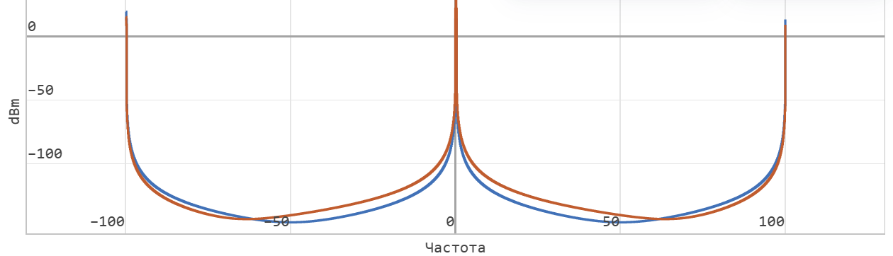
And the graphs themselves describe the spectrum relative to all available data.
.png)
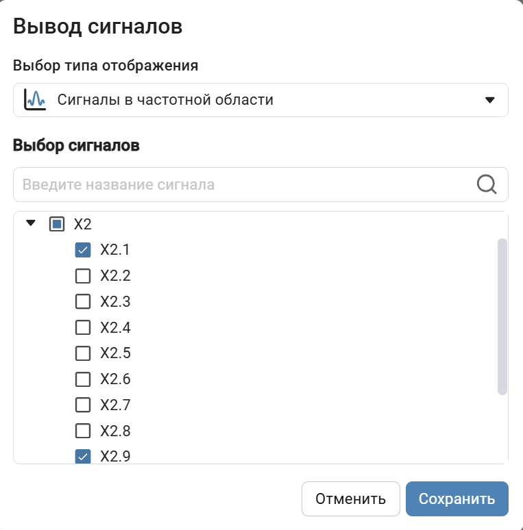
If we represent the data as rows, then each column is perceived as a separate channel and we can only display for a part of the channels.
X2 = reshape(X,1,10)
.png)
.png)
We will see the same effect when using matrix dimensions.
X3 = reshape(X,2,5)
.png)
.png)
Conclusion
This example demonstrates the possibilities of using vector and matrix representations of data to visualize individual input stream channels, which can be useful in the development of communication systems and for digital signal processing.